Tag: Excel Chart
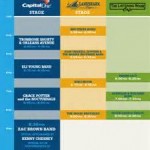
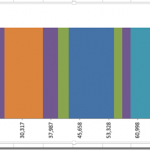
Friday Challenge – Create a Chart to Display a Music Festival Schedule
Here is an interesting question that I saw and I thought I would present it as the next in the series of Friday Challenges.
This...
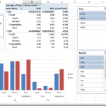
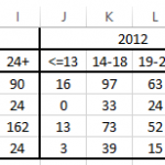
How-to Graph Three Sets of Data Criteria in an Excel Clustered Column Chart
Here is a very simple solution to a common Excel Charting question when a user wants to graph “Three sets of data criteria on...
How-to Create a Dynamic Excel Pivot Table Dashboard Chart
In my last 2 posts:
I showed you how to setup your data in preparation for creating a dynamic dashboard chart
Part 1: think-like-a-database-designer-before-creating-an-excel-dashboard-chart
And then I...
Better Formulas for Pipeline Matching Stacked Bar Chart Colors to Products without VBA Solution
Hands off to Leonid :) for this awesome solution with much Much BETTER formulas for a recent Friday Challenge.
Here was the original Challenge:
friday-challenge-pipeline-usage-chart
Here was...
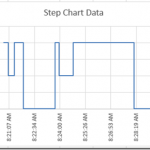
How-to Create a Time Data Series Step Chart in Excel
In our recent Friday challenge, we were asked by Anna how can we make our popular Excel Step Chart work for data that is...
Pipeline Challenge Matching Stacked Bar Chart Colors to Products without VBA
In our recent Friday Challenge, we were tasked with creating a Stacked Bar Chart where the colors matched the products. You can check out...
Friday Challenge – Stumped on How to Display Data in an Excel Chart
I had some great responses to the last Friday Challenge, so I didn't want to stop the momentum with my answer to the last...
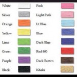
Match Product Chart Colors to Excel Spreadsheet Cells – Pete’s VBA Solution
In the recent Friday Challenge: Create Pipeline Usage Chart
A user wanted to create a bar chart where the values had a specific color by...
Excel Christmas Gift from Poland
Hi All,
I just got a wonderful Christmas gift from our friend Piotr in Poland.
He emailed me his awesome rendering of a Christmas tree in...
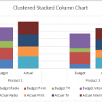
How-to Make an Excel Clustered Stacked Column Chart with Different Colors by Stack
In a popular post, I showed you how to easily create a Clustered Stacked Column chart in Excel using Multi-Level Category Axis options.
Here is...

