Here is an interesting question that I saw and I thought I would present it as the next in the series of Friday Challenges.
This is a similar problem that I ran into at a recent company. They had a project schedule that they would create and send to clients from Excel. However, like this challenge, they used Cell Merging to create the Gantt Chart. It was a nightmare to update the project schedule because Excel won’t let you drag and drop the merged cells on top of other merged cells. That meant that you couldn’t shift the schedule one cell to the right when it was delayed because it typically overlapped the same merged cell. So I would have to unmerge the cells and copy/paste to the new area, then remerge the cells. Alternately, I could move the merged cells to another row and them move it back to the right spot, but this caused all sorts of formatting issues with the cells I had moved back and forth. Anyway, enough complaining 🙂 on to the problem at hand.
Here is the question from the user:
“I use an Excel spreadsheet to visually show the set times and stage for an artist/band at a music festival. Here is a Sample: 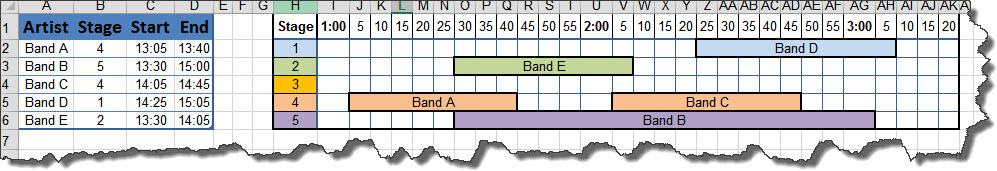 Each stage is a row and the column is a 5 minute increment of time. I created this schedule with merged cells and then added a thick border around the cell. This works, except when I have a large number of artists to book (around 160). Can I use a chart to achieve the same result?”
The Challenges:
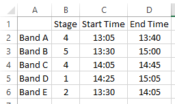
Just like the sample provided by the client, here is what the data you will start with for this challenge:
Pick your challenge or do both and receive extra credit
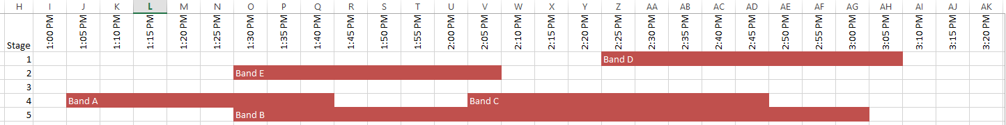
1) Create the Same Graphic using Worksheet Cells and Conditional Formatting where all the user has to do is input the Band Name, Stage and Start/End Times.
* PS: This one might be the tougher one 🙂
Here is what my final conditional Music Festival chart looks like:
or
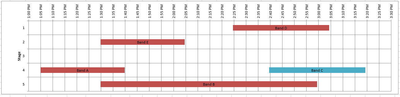
2) Create a Similar Visual using Excel Charts where all the user has to do is input the Band Name, Stage and Start/End Times.
** PSPS: This one is tough too 🙂
Here is what my final Excel Music Festival Chart looks like:
Here is your sample file for the challenges:
Friday-Challenge-Data-Create-a-Chart-to-Display-a-Music-Festival-Schedule.xlsx
Good luck!
Steve=True


