I had some great responses to the last Friday Challenge, so I didn’t want to stop the momentum with my answer to the last challenge, so I will post that next week. So here is another challenge to cut your teeth.
This is a great challenge for any budding Excel Analyst and Excel Dashboard Creator. You may very well run across a set of data like this and need to create a chart for your company.
This Excel user was confused on what chart to create from this data set:
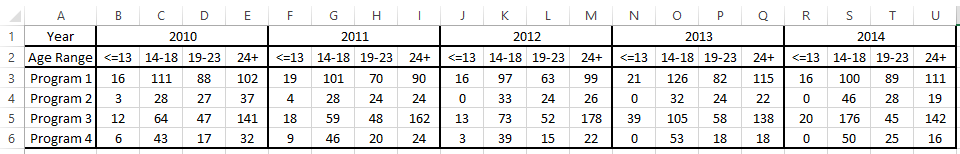
Lots of users may have this same sort of problem. The main issue that faces users with this type of data set is that the data looks like it may need a 3rd axis and it can throw some for a loop.
So what type of chart would you create from this data set?
Can you make I dynamic?
Download the data and leave me a comment on what type of chart you would make.
Also, if you would like to share your solution with others, send me a contact request at the bottom of the form and I will send you an email to submit your reply.
Stumped Chart Challenge Data.xlsx
Good Luck!
Steve=True


