Okay Excel Fans, in a previous challenge, we had a problem that we solved for a specific data set. We wanted to remove white space in a clustered column chart. If you don’t remember or are new to the blog, here is a link to the previous challenge and answer:
Challenge:
Is it Possible to make this Excel Column Chart?
Answer:
Remove Excel Chart Whitespace from Empty or Zero Columns (Part 1)
Now I promised that there would be a harder and more challenging Part 2. And low and behold, here it is!
The Problem:
Clustered Column Chart – Removing Gaps for Zero Value Series
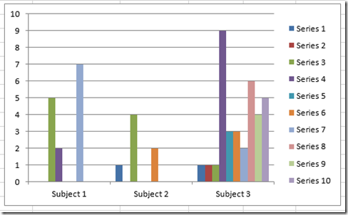
So this question has been asked many different ways, but I can’t find a workable solution. I have a clustered column chart that has, for example, 3 categories and 10 series. The third category has a value for each series, while the other two only have values in some of the series. The resulting graph leaves gaps/spaces for those series that don’t have values. Is there a way to resolve this to where those gaps/spaces are not there? I’ve tried populating the 0 value cells with =NA(), but that just removes the data labels.
The problem visually:
But what I REALLY want is this graph: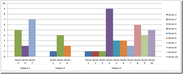
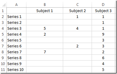
Here is your data set. You can copy and paste this directly into your Excel Spreadsheet:
Excel 2012
| A | B | C | D | |
|---|---|---|---|---|
| 1 | Subject 1 | Subject 2 | Subject 3 | |
| 2 | Series 1 | 1 | 1 | |
| 3 | Series 2 | 1 | ||
| 4 | Series 3 | 5 | 4 | 1 |
| 5 | Series 4 | 2 | 9 | |
| 6 | Series 5 | 3 | ||
| 7 | Series 6 | 2 | 3 | |
| 8 | Series 7 | 7 | 2 | |
| 9 | Series 8 | 6 | ||
| 10 | Series 9 | 4 | ||
| 11 | Series 10 | 5 |
Can you figure it out? If so, please add a comment below with your email address so that I can contact you. Then you can send me your solutions. Good luck!!!!
Steve=True

