Here is my response to the recent Friday Challenge on Creating a Chart for Multi Years by Month.
You can read more about the original challenge here:
Friday Challenge – Excel Mutli-year Graph by Month
Also, you can see and download the other samples here:
Friday Challenge Answer – Using Excel Slicers to Create Dynamic Charts
Friday Challenge Answer – Dynamic Excel Chart Using Checkboxes for Multi Year by Month Data
My solution to the challenge would be to create 2 charts:
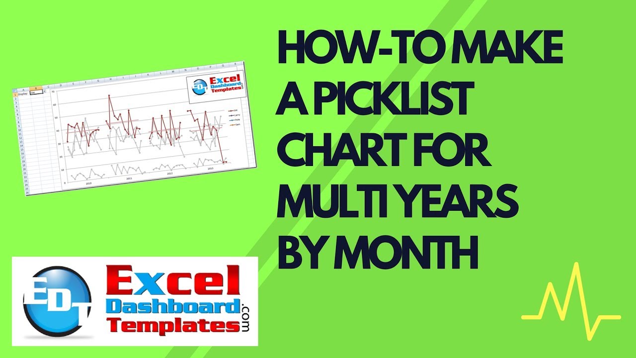
1) A Excel graph that uses a picklist to displays all or highlights just one data series with the data grouped by years with in each month.
2) A Excel chart that uses a picklist to displays all or highlights just one data series with the data grouped by month for all years.
This is a very involved chart creation and so you want to check out how I did it here:
You can download the Free sample file here:
Friday-Challenge-Excel-Chart-of-Months-by-Year-My-Solutions.xlsx
Let me know if you like this chart and if you can use it in your next Excel dashboard.
Steve=True
Beautiful! I tried, but could not get all the pieces to work. Great job.
Thanks Don! That means a lot. Let me know what you had problems with as I will be writing it up as well and would like to know what is not working for folks. Thanks much!
I did not mean that I could not get your graph to work. It worked great. I meant that I missed some big steps in trying to solve the challenge. I think the biggest thing I missed was your using one name for non-contiguous columns of data. The other thing was starting with a bar graph.
Again, great job.
Wonderful. So cool to make a hard challenge for such a great Excel Guru. Thanks for the “great job” and glad you liked it. Steve=True
Great Job !!
I have a question; if the range of my data point is so large i.e. if Joe is doing around 10 while Larry is doing around 1000 then the Y axis will be stretchered and the small values (Joe’s values) will not be shown properly. is there any work around to make the Y axis flixsable based on the the pick list selection?
Thanks
Hi Obaida,
You can do this, but it may confuse the reader as the columns will be skewed and look closer than they values really are.
I will have to create a posting on this to show people how to do this.
Thanks