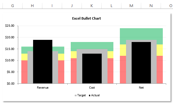
Our good friend Pete sent me his take on the Recent Bullet Chart posting. I was dumb founded on how he created it. In fact, if he hadn’t told me how he did it, I am not sure I could have figured it out. It is not too difficult, but you need to think out side of the column. I mean box.
Here is what Pete wrote:
“Here is my take on the bullet chart that you presented. I like bullet charts and I use them all of the time. I do, however, prefer a better contrast between the Target and Actual values, so in that regard, I prefer to use a wide grey background for the Target and a black column of a different width (usually narrower) for the Actual values…..[comment removed because Pete told me how he did it here]….”
So download Pete’s chart to see how it is made and then post a comment below and let me know how you think he pulled off this magic chart. Good luck!
Petes-Bullet-Chart-Challenge.xlsx
Thanks Pete! You are a rock star.
PS. Sorry Pete, you are not eligible to compete as you already know the answer 🙂
Steve=True


