Have you ever wanted to create a graph but then let users dynamically change the Excel chart type with a drop down pick list? Well then this tutorial is for you.
In previous posts I showed you how to create pick lists in Excel and then I also showed you how to change the chart data displayed using that picklist. If you missed those posts, you can see the Step-by-Step tutorial and video here:
Creating Pick Lists in Excel for your Dynamic Dashboard
How-to Create Dynamic Excel Dashboards Using Picklists
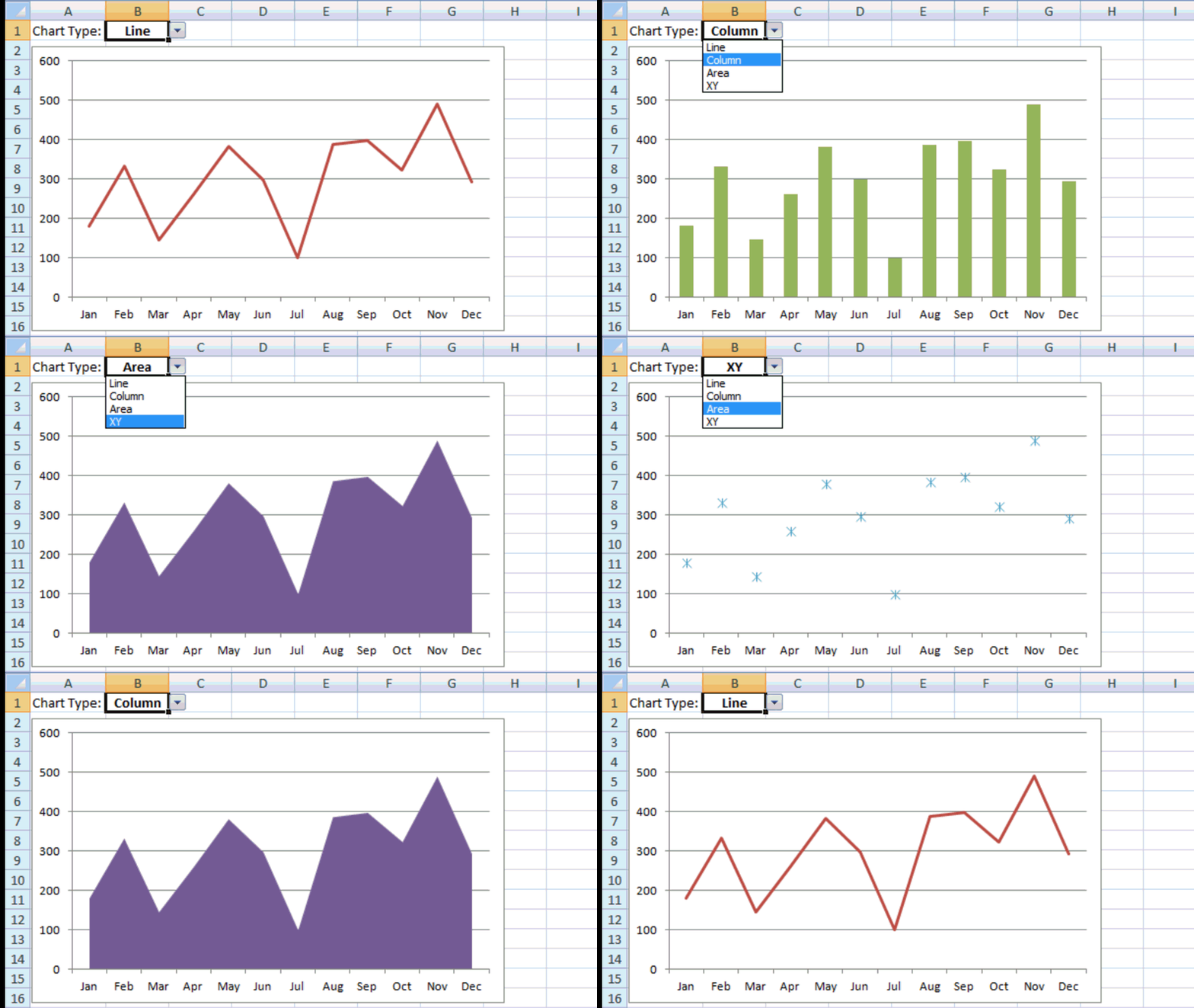
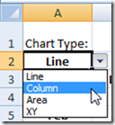
In this post we are going to use a drop down picklist NOT to change the data of the chart, but to let users change the chart type. So we will use this pick list:
To change the chart from a line chart to a column chart to an area chart to an XY scatter chart.
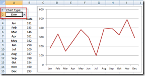
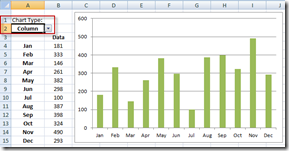
Line Chart: Column Chart:
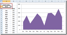
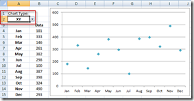
Area Chart: XY Scatter Chart:
Pretty cool huh? I thought so. So let’s get to it already.
The Breakdown
1) Create the Chart Data Range
2) Create a Drop Down Picklist
3) Create the Picklist Dependent Conditional Formula
4) Create the Chart
5) Change the Chart Types
6) Move XY Scatter to Primary Axis
7) Remove the Legend
Step-by-Step Tutorial
1) Create the Chart Data Range
First we need to set up the data range for the chart. Nothing much here except to set up your data for a normal chart like you see in column A and column B. Also, notice that in cell B1 we have a space for our chart type picklist. Then we also set up columns for the data for each chart type in columns C:F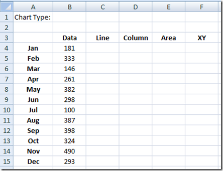
2) Create a Drop Down Picklist
Now we need to create our picklist in cell B1. Do this by first selecting the cell B1. Then go to the Data Ribbon and select the Data Validation button from the Data Tools group: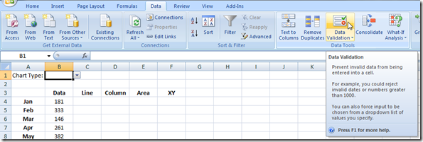
Then from the Data Validation dialog box, select List from the Validation Criteria pick list and then click in the Source field and highlight cells C3:F3 in the worksheet: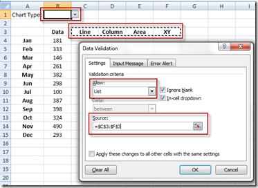
Then press the OK button and your Excel Data Validation pick list is all done.
3) Create the Picklist Dependent Conditional Formula
Now we need to create our chart data that will hide different values based on the value of our picklist in cell C3
Put this cell in cell C4 =IF(C$3=$B$1,$B4,NA())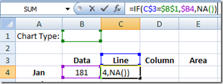
If you don’t understand what the NA() function is doing or why there are $ signs in different places in the formula, then you should check out these posts:
How-to Hide a Zero Pie Chart Slice or Stacked Column Chart Section
Referring to Ranges in Formulas for your Excel Dashboard Templates
QUICKLY Change Microsoft Excel Dashboard Template Cell References
Essentially, our formula will put the values from column C in the column that matches cell B1. Now that you have put that formula in cell C4, you need to copy that formula to the right Area column and down to the bottom Dec row. Your chart data range should look like this: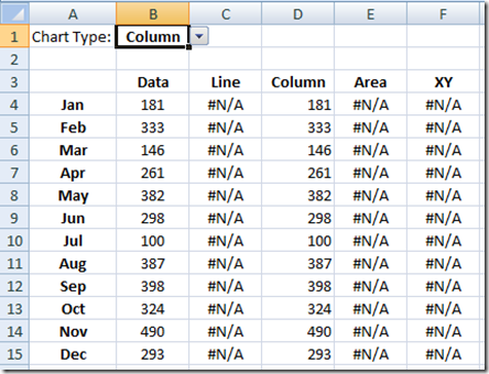
See how the data is placed in the column that matches the cell B1. #N/A is placed in the other columns and will not be plotted in the chart.
4) Create the Chart
Now it is finally time to make the chart. Highlight the range of data (Cells A3:F15):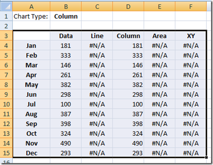
And go to the Insert Ribbon and choose a Line Chart:
Your initial chart should look like this: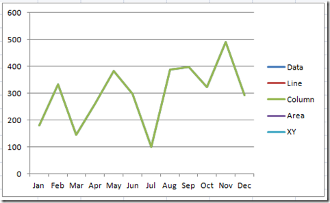
5) Change the Chart Types
Now we need to change the Excel chart type of each series. To do this, you need to select each series and change its chart type to match its column name. It may be difficult to select each data series, so if you are having trouble doing that you should check out this post:
How-to Select Data Series in an Excel Chart when they are Un-selectable?
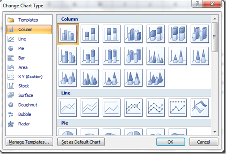
First you should select the data series called “Data” and hit your delete key as we won’t need it in the chart. Then, after you select any of the other data series, and then you need to go to the Design Ribbon and choose the Change Chart Type button in the Type group:
Then pick the chart type for that column of data:
Line Chart: Column Chart:
Area Chart: XY Scatter Chart:
Once you have done this for each series you are pretty close to being done. Your chart will look like one of the charts above based on your chart type you have chosen in worksheet cell B1.
6) Move XY Scatter to Primary Axis
When you change the data series for the XY Scatter you will notice that it puts it on the Secondary Axis, but it doesn’t need to stay there. You can move it to the primary axis. To do this, select the XY series in the chart 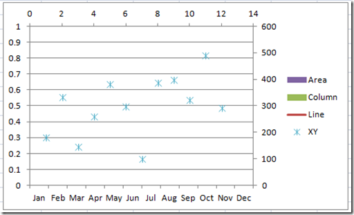 and then press CTRL+1 to bring up the Format Data Series dialog box and then change the “Plot Series On” to the Primary Axis:
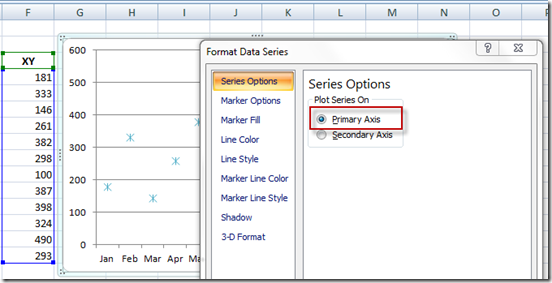
Your secondary axis should now be gone
7) Remove the Legend.
Now the final step is to remove the legend as it is not relevant. Delete the legend by selecting the legend and then press your delete key.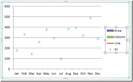
Here is what your final Dynamic Excel Chart will look like:![Dynamic Chart Type Change Gif[4] Dynamic Chart Type Change Gif[4]](https://www.exceldashboardtemplates.com/wp-content/uploads/2013/07/Dynamic-Chart-Type-Change-Gif4_thumb.gif)
Now isn’t that cool? Check out the video so you can see each step demonstrated in detail.
Video Tutorial
Check out this video demonstration on how-to make this Excel dashboard chart:
Let me know what you thought of this technique in the comments below. Also, don’t forget to subscribe to my blog so that you get the next post emailed directly to you.
Steve=True

