Friday Challenge – My Answer – Chart This Data in Excel
Challenge – Chart This Data in Excel - My Answer
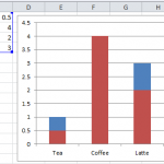
A few Fridays ago, I posted this challenge:
Link here: friday-challenge-chart-this-data-in-excel
Where I asked you to send...
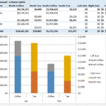
How-to Make an Excel Stacked Column Pivot Chart with a Secondary Axis
In this previous post:
Stopping Excel Pivot Chart Columns from Overlapping When Moving Data Series to the Second Axis
I had a fan question - How...
Why is Excel Overlapping Columns When I Move them to the Secondary Axis?
Why is Excel Overlapping Columns in this chart? Why EXCEL, WHY are you doing this??? I don’t understand. Have you ever asked yourself this...
How-to Concatenate Excel Column or Row Data Using Google Docs
Yesterday I demonstrated how to find and replace a hard return in an Excel spreadsheet. I presented the last topic before this one so...
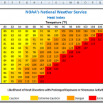
How-to Make a Non-Chart Excel Dashboard Chart (Heat Index)
So I saw this chart in an Excel forum and a user was asking this:
“chart - not sure about this one
I've created a...
Replace Numbers with Text in Excel Radar Chart Axis Values
Replace Numbers with Text in Excel Radar Chart Axis Values
This is a cool Excel Trick that I just created based on a user request...
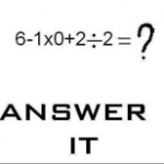
Friday Challenge: What is your answer vs. Excel?
There is a Facebook post going around and I thought it would be a fun Friday Challenge edition.
What is your answer to this this...
How-to AverageIf Excluding Zeros and Blanks for Non-Contiguous Ranges in Excel
In our last Friday Challenge, I asked you figure out a way to calculate an average for a non-contiguous (non-adjacent) range that will exclude...
How-to Add a Hard Return to an Excel Concatenate Formula
Like most Excel users, one of the first formulas that you ever learned to master was the Concatenate Function.
But how do you add other...
How-to Make a Dynamic Hotel Ballroom Occupancy Chart
In a previous Friday’s challenge, I presented the following user request.
Here was the question again and what you would have seen in the download...


