Not sure if you knew this or not, but Excel is amazing!
The makers of Microsoft Excel even went so far as to make sure that your charts will be plotted in the correct order when you have dates as your Horizontal Category Labels.
For instance, lets say that your chart data is not in order, like this: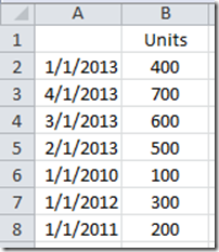
You might think that Excel will chart this data in order from the top cell to the bottom like this: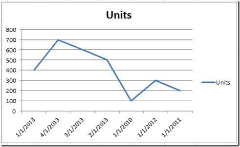
But you would be wrong if your chart’s horizontal axis is set to have a Date Format. If that is the case (as the default when you have dates as your categories), then Excel will plot your chart in the right order like this: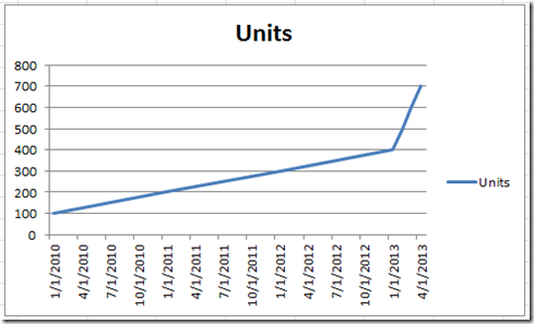
Isn’t that cool?
Excel will plot your data in the graph in chronological order when the horizontal axis is set to date and dates are in your labels. It will ignore the way the data is set in your worksheet and graph it by date.
Also, when Excel plots your data in this way in the chart, Excel will compress or elongate your line as though all dates are actually plotted so that your chart is not skewed. Look at this snapshot and see how Excel plots the data points in each year as well as the data points in 2013. The data points in 2013 are plotted in a much smaller area than the data points in the previous years.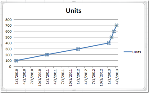
So if you are making a line chart and using dates as your categories, don’t worry about the order or the placement in the chart as Excel will take care of you. No worries mate!
Video Tutorial
Check out the video showing you how Excel works with dates when plotted in a chart. http://youtu.be/c-maLQM66bQ
Did you know that Excel doesn’t care about the order of your data when you use dates in a chart? What else do you think that people don’t know about Excel?
Let me know in the comments below and please sign up for the RSS Email feed so you get the next post.
Steve=True


