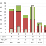
Friday Challenge Answers – Food Donation Excel Dashboard Chart
Last week we presented a chart challenge to see how you represent Food Donation data.
Don said that we should keep it simple and sent...
How-to Make a Sales Pipeline Funnel Excel Chart Template
You probably have seen this type of Funnel Chart in Business Intelligence (BI) software packages and wondered how-to make this type of chart in...
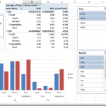
How-to Create a Dynamic Excel Pivot Table Dashboard Chart
In my last 2 posts:
I showed you how to setup your data in preparation for creating a dynamic dashboard chart
Part 1: think-like-a-database-designer-before-creating-an-excel-dashboard-chart
And then I...
How-to Show Decades and Highlight a Year in the Horizontal Axis
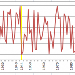
Recently in an Excel Forum, a user had data similar to this format:
Here is what he wanted to do:
How do I set the Horizontal...
How-to Make an Excel Single Image Goal Chart
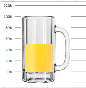
Recently, a healthcare company employee contacted me about a chart he wanted to create. The company that he works for is trying to save...
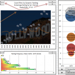
Top Movies – Excel Dashboard – Brian’s Friday Challenge Entry
This was our final entry in the most recent Friday Challenge for the Internet Movie Database Top 250.
Below you can download an awesome Excel...
How-to Quickly Mock-up Data for a Dashboard Template
I frequently need to create and test a chart design concept for Excel Dashboards. Therefore, I need chart data that is representative of the actual data,...
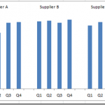
How-to Create an Excel Dashboard Column Chart with 2 Axis Groupings
Recently I saw this in the MrExcel Forums. The title “Weird Charts with 3 Axis” intrigued me.
I determined that they were looking to put...
Incredible Excel 2012 Olympic Medal Count Dynamic and Interactive Dashboard
People are awesome and so creative. We have been talking about building an Olympic Medal Count Dashboard using Excel and I asked for your...
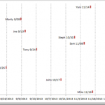
How-to Make a Tenant Timeline Excel Dashboard Chart
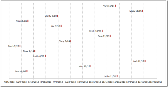
So last week, I posted this question that I responded to in an Excel forum. I also asked you how you would solve this...

