Friday Challenge Answers: Year over Year Chart Comparisons
Thanks for the submissions for the Friday Challenge.
You can get the sample data and chart request here: friday-challenge-help-new-to-excel-yoy-comparisons
Here are some other submissions:
A) In the...
How-To Make a Dynamic Excel Scroll Bar Chart Part 2
Wow, it has been over 2 years. I am so sorry if you have been waiting all this time. Probably not, but I will finish...
Friday Challenge: Help! New to Excel! YOY Comparisons
Luckily I was able to help this user, but I think that we can even do more. Here was the original request:
"Help Please! I’m...
Friday Challenge: What Charts Would You Make?
This Friday Challenge involves Network Data Usage. You will find over 17,000 data points representing 2 days of network data usage in the linked file.
With...
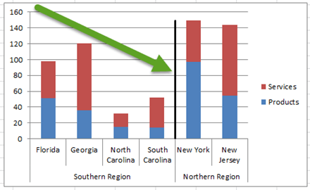
How-to Add Lines in an Excel Clustered Stacked Column Chart
I have posted several Excel chart samples related to Clustered Stacked Column Charts.
In case you missed them, you can check them out here: Excel...
How-to Add a Grand Total Line on an Excel Stacked Column Pivot Chart
Today I answer a viewer question. "How do I add a cumulative grand total amount as a line above a stacked column pivot chart...
How-to Easily Hide Zero and Blank Values from an Excel Pie Chart Legend
If you have ever used a Pie Chart in Excel, then you probably ran into this need.
The need to hide Pie Chart Legend entries...
How-to Make a Thermometer Goal Chart in Excel
How-to Make a Thermometer Goal Chart in Excel
A friend and co-worker asked me if I had a tutorial on a building a Thermometer Goal...
3 Ways to Add a Target Line to an Excel Pivot Chart
Add a Target Line to an Excel Pivot Chart
Many Excel users use Pivot Tables and they find it very easy to create a Pivot...
Friday Challenge – The Right Graph Style For What I Want to do
A newer Excel Chart creator had this question:
"This is a scatter with smooth line and markers graph. What I would like to have displayed,...


