I saw this post in a forum yesterday and thought that everyone should know this. Lord knows that I didn’t know this until just a few years ago and it would drive me crazy.
Here was the question from the forum:
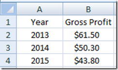
“Thanks in advance – this is embarrassing. Very basic question. My data below:Year Gross Profit2013 $61.5 2014 $50.3 2015 $43.8 I simply want to the years displayed on the X-axis on a bar chart … but it keeps displaying the years as values, so I have two values – one year and one gross profit – with data series labeled 1,2,3. Thank you.”
Here is what the Excel user’s data would look like with years on the left and gross profit on the right:
When the user created the 2-D column chart, here is what he got:
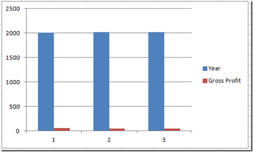
Notice that Microsoft Excel created another series for the year. It was supposed to be the categories for the horizontal axis. But instead, Excel put in the generic, 1, 2, 3 for the axis.
So how do you fix it?
Solution: Remove the column header of “Year” from the chart data range.
See what happens when you delete “Year” from row a1? The chart does what is desired.
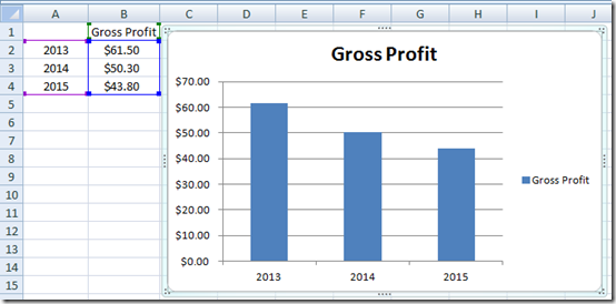
Now you can always put the year back into the column header after the fact:
It is a simple Excel Tip and Trick, but until you see it once, you probably didn’t know about it. Maybe they teach this as the first thing in all the classes, but I didn’t see this for the longest time. Now you know too
Video Tutorial
Check this out in action with this video demonstration:
Please remember to subscribe to my blog so that you get the next post delivered directly to your inbox. Also, let me know your best Excel trick in the comments below.
Steve=True
Spent over an hour trying to show the Years on the X horizontal on my Combo Excel chart, and your solution was so simple. As suggested in other posts, I tried reformatting the type of cell several ways, and it did not work that well. Thanks.
Thank you for the GREAT feedback. So glad to help!
very helpful. tnx a lot 🙂
Thanks for the nice comment.
Saved the day! Thank you.
Awesome, thanks for the great comment!
Thanks for an amazingly simple solution to a most frustrating problem. After wasting an hour and a half I can now get on with the job in hand.
you are welcome. yeah, drove me nuts for a while too.
Thanks a lot for saving the time for putting Year in X horizontal its really very simple solution.
You are welcome Shrutika. Thanks for the great comment. Glad to help out.
can anyone tell me the cause of the trick works?
Hi Sandip, of course, they do 🙂 I wouldn’t post without it really working. This is an easy one, so watch the video and give it a shot.
I think sandip is asking WHY this works.
Thanks Kelli, I missed that. Excel sees any column of numbers as another data series when it has a header text. Removing the header text tells Excel to consider this column of numbers as the category label and not a data series. NOTE: that it only works on the left most column of numbers/years. If you have a column of years in the middle of other columns of numbers, removing the header text will not remove it as a series. In essence, if you have the following columns:
Dept….Year…..Value1….Value2
If you remove the Dept and Year header text, it will create a a multi level level category label of Dept/Year and you will have 2 series of values. If you leave Year header text, the year will be considered a series and you will have 3 series of values that also includes the year.
Hope this helps!
Type a single apostrophe immediately before the year in each cell (eg ‘2020).
That is a great work around. thanks!
Isn’t working for me. I have to omit that column or it gives me a series bar and wont change the labels to 2000, 2001 etc. They stay 1, 2, 3…
Strange, let me know what version.