How-to Add Clean Breaks or Cliff Edges to an Excel Area Chart
A stacked area chart displays an area of points above other data points and connects them to the next category. However, there is no setting to Add Clean Breaks or Cliff Edges to an Excel Area Chart. If you have blank data or zeros values in the data series, Excel will plot the data as a slope from your previous data point.
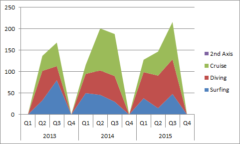
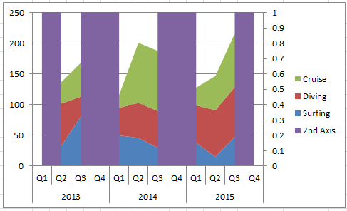
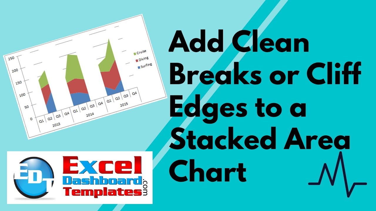
You get this from Excel Stacked Area Chart:
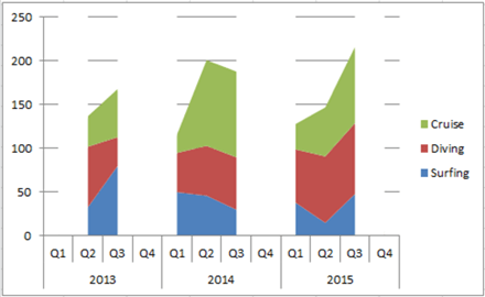
vs What you Really Want Excel with a Stacked Area Chart Gaps:
There is no standard way to add clean breaks or cliff edges to an Excel Area Chart. But, have no fear, you can trick Excel to show an area chart with multiple cliffs/edges.
Thanks to Jeff Mattson’s comment from YouTube that inspired this technique.
There is an Excel Bug with this Technique, so make sure you read the entire post or watch the entire video to make sure you know how to correct the bug and the best way to utilize this technique.
The Breakdown
Steps to Create
1) Add Filler Data Row
2) Create Stacked Column Chart
3) Move Filler Series to 2nd Axis
4) Change Filler Series Fill
5) Chart Clean Up
Bug/Issues with Area Chart Cliffs:
After Save, 2nd Axis Series does not display as previously created.
To fix this issue after opening the file again, move 2nd Axis Filler series to the Primary Axis and back to the Secondary Axis. Then make sure to delete the vertical axis that will appear.
Step-by-Step
1) Add Filler Data Row
The base of this technique is that we need to add another series that will mask the connected data points that are sloping to the next category.
Therefore, with original chart data that looks like this:
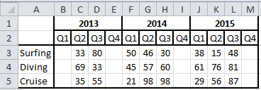
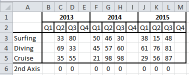
Add another data series below the last category and insert a value of zero for each matching column of data as you see here:
2) Create Stacked Column Chart
You can now create your Excel Stacked Area Chart with the data we updated in step 1. To do this, select the range from A1:M6 and then click on the Insert ribbon and then select Stacked Area chart from the Area Button in the Chart group.
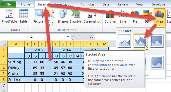
Your Excel Stacked Area chart should now look like this:
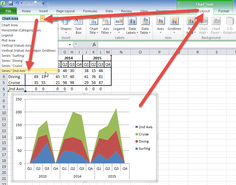
3) Move Filler Series to 2nd Axis
For this trick, we need to move the dummy “2nd Axis” series to the secondary axis.
First, click on the chart, then click on the Layout ribbon and select “Series 2nd Axis” from the Chart Elements pick list in the Current Selection group.
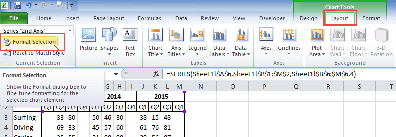
Now that you have the “2nd Axis” dummy series selected, next, click on the Format Selection button in the Current Selection group to launch the Format Data Series dialog box.
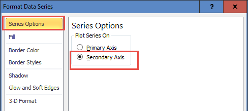
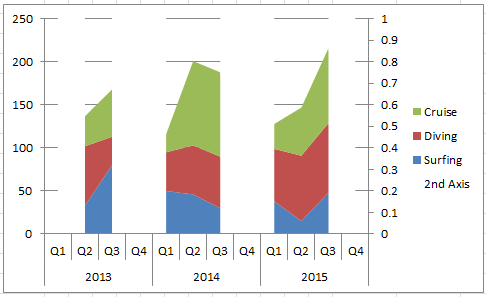
From the Format Data Series dialog box, select the Secondary Axis radio button from the Series Options.
Your Stacked Area Excel Chart with Gaps should now look like this:
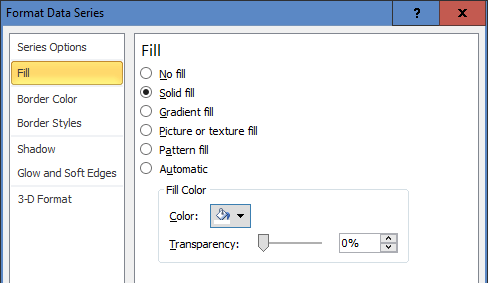
4) Change Filler Series Fill to White
We will now use the dummy 2nd Axis series to mask the slopes of the area charts to create the cliffs/gaps by matching the color of the chart background of white To do this, if you have closed the Format Data Series dialog box, either complete the first part of step 3 above or click on the chart and press CTRL+1. Then when you have the Format Data Series dialog box open, navigate to the Fill options and change the fill from Automatic to Solid Fill with a Color of white.
The chart should now mask the gaps of the Excel Stacked Area Chart and look like this:
5) Chart Clean Up
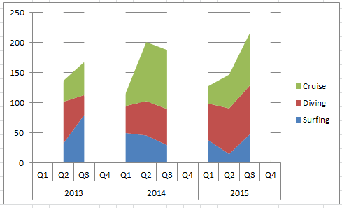
Your chart is pretty close, all we need to do is clean up the chart by deleting the secondary vertical axis of the Excel Stacked Area chart as well as the legend entry for the 2nd Axis dummy series.
To do this, select the chart, then select the secondary vertical axis and press the delete key. Then click on the legend and then select the 2nd Axis legend entry and press the delete key. Your chart will now look like this:
Bug/Issues with Area Chart Cliffs:
Please note that there is a bug that does not allow the setting of this area chart series on the secondary axis to remain after you close and open the chart. So EVERY TIME you open the chart, you will have to perform the following action to reset your chart cliffs/chart gaps in the Excel Area Chart.
To Fix this Issue Complete the Following Steps
1) Move 2nd Axis Filler Series to Primary Axis
2) Move 2nd Axis Filler Series back to Secondary Axis
3) Delete 2nd Vertical Axis
Recommendation
Only use this type of cliff chart if you are going to print or use a screenshot to show the chart.
DO NOT send as an Excel file as the cliffs will disappear when opening the file.
Video Demonstration
Check out this Video tutorial on the techniques presented above.
Sample File Download
Click here to Download the Free Sample Excel Template File:
How-to-Add-Clean-Breaks-or-Cliff-Edges-to-an-Excel-Area-Chart.xlsx
This is an interesting Trick that will work, but unfortunately, it will not hold closing and reopening the saved Excel file. Do you agree with me that it is a Bug in Excel? Let me know in the comments below.
Steve=True


