Many users have mixed reactions about this secondary axis overlap fix. You can see the post here:
Stop Excel From Overlapping the Columns When Moving a Data Series to the Second Axis
Some think it is a bug, but most appreciate understanding the fix. However, we didn’t cover how to stop the overlapping when it comes to the a Stacked Column Chart. This post will show you how to set up your data when you want to have a Stacked Column Chart with a Secondary Axis.
Essentially, what we are trying to do is go from the data you see in this picture and the chart it makes on the left to the final chart on the right:
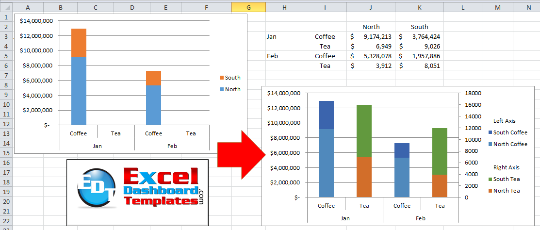
To make this type of chart, we just need a few step. First, we need to rearrange our data.
Typically you will start with this type of data:
| A | B | C | D | |
|---|---|---|---|---|
| 1 | North | South | ||
| 2 | Jan | Coffee | $ 9,174,213 | $ 3,764,424 |
| 3 | Tea | $ 6,949 | $ 9,026 | |
| 4 | Feb | Coffee | $ 5,328,078 | $ 1,957,886 |
| 5 | Tea | $ 3,912 | $ 8,051 |
However, that will not separate the data into enough series for us to chart and move the secondary axis. So we will need to create two new series that will split up the data. As you can see here, I have added a row 2 and copied the legend entries for Coffee and Tea. Also, I have added a column between North and South and also another one to the right of South. Once you have that setup completed, you can simply move the values for January and February so that the Tea values are in the correct column and row as well.
| A | B | C | D | E | F | |
|---|---|---|---|---|---|---|
| 1 | North | North | South | South | ||
| 2 | Coffee | Tea | Coffee | Tea | ||
| 3 | Jan | Coffee | $ 9,174,213 | $ 3,764,424 | ||
| 4 | Tea | $ 6,949 | $ 9,026 | |||
| 5 | Feb | Coffee | $ 5,328,078 | $ 1,957,886 | ||
| 6 | Tea | $ 3,912 | $ 8,051 |
Now you can create your chart. After creating your chart, you may have to move Switch Rows/Columns if Excel is not plotting the data in the way you desire. If you don’t know why this happens sometimes with your charts and not with others, check out this post:
Why Does Excel Switch Rows/Columns in My Chart?
Next, you can move the series that you want to the secondary axis. Check out this post if you are having a hard time selecting the right series to move:
How-to Select Data Series in an Excel Chart when they are Un-selectable?
Now you should have your final chart. However, if you want to make your chart truly awesome, check out this post where you can group your legend entries (like you see above):
How-to Group and Categorize Excel Chart Legend Entries
Video Demonstration
Sample File Download
How-to-move-a-data-series-Stacked-Column-to-the-second-axis-and-not-overlap-the-columns.xlsx
In the next post, I will show you how to format the same stacked column for a Pivot Chart on 2 axis.
Steve=True


