If you have a chart with Legends, then you should check out this tutorial.
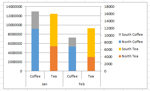
Recently when working on a solution for a fan, I noticed that it was not clear on my Stacked Column Chart which series should be compared against the left or the right vertical axis.
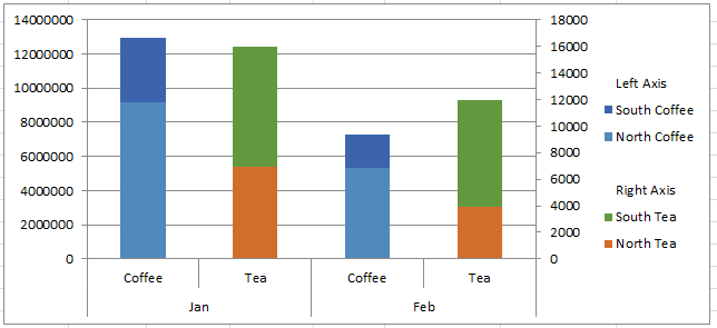
So I developed a way that you can add Custom Grouping Labels and Spaces in your Excel Chart Legend. Here is what my final chart looked like:
Let check out how you can do this:
The Breakdown
1) Add Additional Zero Series to the Chart
2) Position Zero Series in the Chart Legend
3) Set Zero Series Fill Color to No-Fill
Step-by-Step
1) Add Additional Zero Series to the Chart
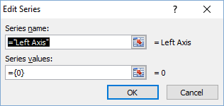
This is a real easy step, but very frequently not used. You can add a new series to the chart from the Select Data dialog box and set it to ={0}. No need to have any data in the spreadsheet, just create it directly in the chart.
For our specific example above, we want to create 3 additional series all set to 0 (zero). One for the Left Axis, one for the Right Axis and one for the blank space between the groups.
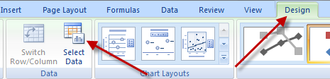
To do this, first select your chart, then click on the Design Ribbon and then select the Select Data button.
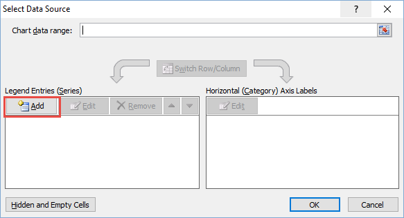
Then click on the Add button in the Legend Entries (Series) area on the left.
Create three separate series “Left Axis”, “Right Axis” and ” ” (this last series is just a space as a name so that it will produce a blank row in the chart legend.
And set the values ={0} so that the series only shows up in the legend and not visible as a column in the chart.
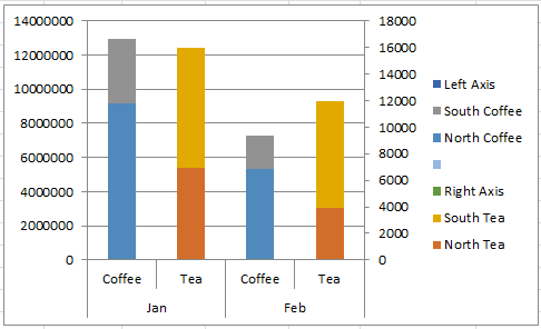
Here is what the chart looks like after this step has been completed:

2) Position Zero Series in the Chart Legend
Now that you have added the additional Zero series to the chart, you may need to move the new Zero series so that it is in the right order in the Legend.
There are 2 ways to do this.
a) From the Select Data dialog box (see how to launch it above), first click on the Zero series that you want move in the legend and then use the Up and Down arrows next to the Remove button in the Legend Entries (Series) area on the left.
b) If the above way didn’t work for you , then you may have your chart series on 2 axes, so you may have to move your label to the correct axis. If you don’t, it will never be grouped with the correct data as it may be on the wrong axis.
To move the series, you first have to select the series and then press CRTL+1 to bring up the Format Data Series dialog box. Then move it to the correct Primary or Secondary Axis as needed. You may want to watch the short video below for this step and/or read this post:
How-to Select Data Series in an Excel Chart when they are Un-selectable?
Here is what the chart looks like after you have positioned the Zero series:
3) Set Zero Series Fill Color to No-Fill
Your Zero series are now in the correct location in the Legend, but you notice that there are color bars next to the zero legend entries. This step will remove those. To remove the color bars, select the Blank, Left Axis or Right Axis series and change the fill color to No Fill. Once again, you are having problems selecting these series check out this post:
How-to Select Data Series in an Excel Chart when they are Un-selectable?
The final chart looks like this:
The video explains a lot in a short amount of time, so check it out.
Video Tutorial

Isn’t that a cool Excel Tip and Trick? What is your favorite trick that you use in Excel? Let me know in the comments below.
Steve=True


