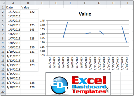
When you are build your Excel Dashboard Template charts, you may find that some of your data is not complete. For instance, you may have dates, but no corresponding data for the dates in question.
Now you are presented with a dilemma, do you just present the data as is?
If so, you may get a chart that looks like this:
Or do you fill in the gaps with interpolated values?
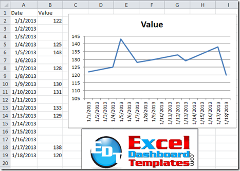
If so, your chart would look like this:To this:
Well, the decision to present the graphs in either way is yours, not mine ![]() . Be careful that the Dashboard component. you are drawing does not misrepresent the data for your audience.
. Be careful that the Dashboard component. you are drawing does not misrepresent the data for your audience.
That being said, how do you use the same data points to create both types of line charts in Excel?
The Breakdown
1) Create your data set with the gaps in your data.
2) Create the chart based on the data as is.
3) Update option on how Excel should treat gaps in the data.
Step-by-Step
1) Create your data set with the gaps in your data.
First you should create a data set that includes gaps or blanks in the data where the dates or categories exist like this: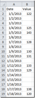
This process works with any blank value for a corresponding series category. For instance, if you did not have dates in column A, but still had blanks in column B, this line chart gap technique would still work.
2) Create the chart based on the data “as is”.
Select your data range and then go to the Insert Ribbon and then select any Line Chart from the Line Button in the Charts Group.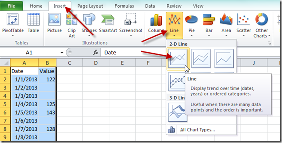
Your chart should now look like this: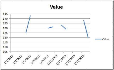
3) Update option on how Excel should treat gaps in the data.
Click on the chart and then go to the Design Ribbon and then press the Select Data Button from the Data Group: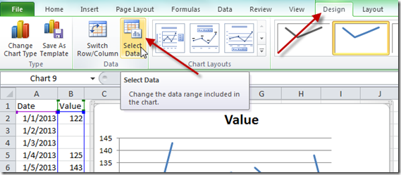
Then from the Select Data Source dialog box, you should now select the Hidden and Empty Cells button on the bottom left and then select the “Connect data points with the line” radio button from the Hidden and Empty Cell Settings dialog box settings: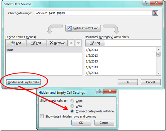
Your chart should now look like this: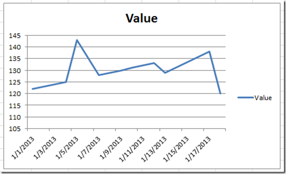
There you go, you have now connected all the gaps in your line chart. Notice that the data point from January 1, 2013 was not visible before, but now because it is being connected to the next data point, you can see it as part of the overall line.
Video Demonstration:
See this in action with a video demonstration of this technique:
Please remember to sign up for the email distribution from the RSS feed icon. That way you will get the newest Excel tip and trick posting right in your inbox.
Steve=True

