Sorry for the late posting. I was in Atlanta all week working on a new project and going out with the client at night, so I had no time to finish this post. For the previous Friday Challenge, I posted this question:
Excel Dashboard Chart Design: There is no right answer here as everyone will see the solution differently. Send me your sample chart design and I will post a poll to see which Excel Chart that everyone likes best. Here is the question and data:
How would you chart/graph this data?
Situation: “I’m tracking the number of schedules changes but would like to show the reasons on a chart as well. What is the best approach to plot the number of schedule changes in a over the period of time in the attached? – John”
| A | B | C | D | E | F | G | H | I | J | K | L | |
|---|---|---|---|---|---|---|---|---|---|---|---|---|
| 1 | Schedule Change Metric | Reason codes | ||||||||||
| 2 | Week | schedules | changes | % change | Quality | Vendor | Attainment | Ops | Planning | Consumption | R&D | Sales |
| 3 | 1 | 42 | 4 | 9.5% | 1 | 1 | 1 | 1 | ||||
| 4 | 2 | 58 | 7 | 12.1% | 2 | 4 | 1 | |||||
| 5 | 3 | 61 | 3 | 4.9% | 3 | |||||||
| 6 | 4 | 56 | 9 | 16.1% | 1 | 2 | 1 | 2 | 3 | |||
| 7 | 5 | 57 | 14 | 24.6% | 3 | 7 | 1 | 3 | ||||
| 8 | 6 | 55 | 10 | 18.2% | 5 | 4 | 1 | |||||
| 9 | 7 | 51 | 3 | 5.9% | 1 | 2 | ||||||
| 10 | 8 | 52 | 2 | 3.8% | 2 | |||||||
| 11 | 9 | 58 | 10 | 17.2% | 1 | 5 | 2 | 2 | ||||
| 12 | 10 | 47 | 3 | 6.4% | 3 | |||||||
| 13 | 11 | 48 | 1 | 2.1% | 1 | |||||||
| 14 | 12 | 45 | 2 | 4.4% | 1 | 1 | ||||||
| 15 | 13 | 28 | 1 | 3.6% | 1 | |||||||
| 16 | 14 | 42 | 7 | 16.7% | 3 | 1 | 3 | |||||
| 17 | 15 | 44 | 0 | 0.0% | ||||||||
| 18 | 16 | 41 | 1 | 2.4% | 1 | |||||||
| 19 | 17 | 41 | 0 | 0.0% | ||||||||
| 20 | 18 | 39 | 0 | 0.0% | ||||||||
| 21 | 19 | 38 | 1 | 2.6% | 1 | |||||||
| 22 | 20 | 46 | 1 | 2.2% | 1 | |||||||
| 23 | 21 | 38 | 0 | 0.0% | ||||||||
| 24 | 22 | 38 | 1 | 2.6% | 1 | |||||||
| 25 | 23 | 49 | 0 | 0.0% | ||||||||
| 26 | 24 | 34 | 2 | 5.9% | 2 | |||||||
| 27 | 25 | 33 | 3 | 9.1% | 3 | |||||||
| 28 | 26 | 32 | 6 | 18.8% | 5 | 1 | ||||||
| 29 | 27 | 18 | 0 | 0.0% | ||||||||
| 30 | 28 | 37 | 2 | 5.4% | 2 | |||||||
| 31 | 29 | 34 | 4 | 11.8% | 4 | |||||||
| 32 | 30 | 32 | 0 | 0.0% | ||||||||
| 33 | 31 | 31 | 1 | 3.2% | 1 | |||||||
| 34 | 32 | 33 | 5 | 15.2% | 5 | |||||||
| 35 | 33 | 33 | 1 | 3.0% | 1 | |||||||
| 36 | Totals | 1391 | 104 | 7.48% | 3 | 37 | 5 | 38 | 6 | 0 | 5 | 10 |
Well I received several AMAZING submissions. I won’t bias the poll results, but take a second to check out the video with a demonstration of each dashboard chart and if you want more, feel free to download the dashboard template files below.
1) Line Chart
2) Bar Chart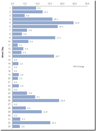
3) Stacked Column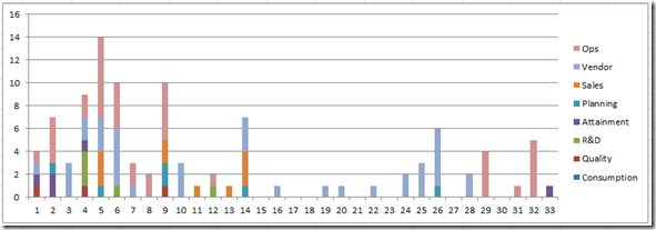
4) Stacked Line Small to Large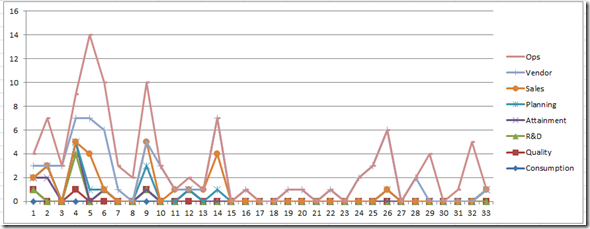
5) Dynamic Excel Dashboard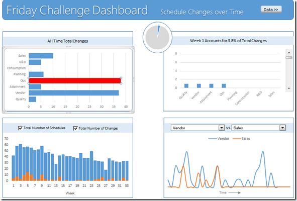
6) In Cell Chart Bar Chart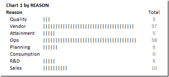
7) Column Chart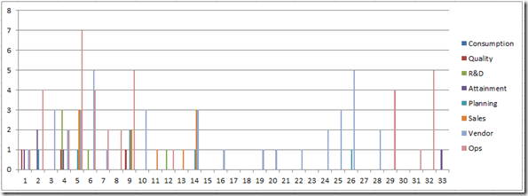
8) Stacked Column Chart of Amount Changed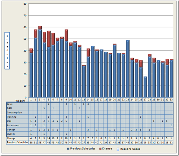
9) Stacked Area Large to Small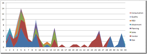
Please vote in the poll:
POLL – Friday Challenge Schedule Changes Over Time
After you have voted, check out the video that describes each of the submissions:
Here are the free Excel template download files:
File 1: Friday-Challenge-Charts-Schedule-Changes.xlsx
File 2: FridayChallengeDashboard.xlsm
File 3: Graph-Data.xlsx
File 4: Friday-Excel-Dashboard-Example.xlsx
Thanks so much to all my fans that submitted such awesome work. And is such a short period of time. You all rock!!!
Steve=True


