The following is a guest post from Pete on his answer to the most recent Friday Challenge.
Pete applied his knowledge of Six Sigma to this charting challenge.
You can read about the challenge here:
Thanks Pete for your awesome contribution to the site!! ******************************************************************************************
One way to look at the data, which can give a really good representation of what is happening, is to use a process control chart. But before we do, let’s explain where a process control chart comes from.
From Wikipedia, the free encyclopedia:
Six Sigma is a set of techniques and tools for process improvement. It was developed by Motorola in 1986,[1][2] coinciding with the Japanese asset price bubble which is reflected in its terminology.[citation needed] Jack Welch made it central to his business strategy at General Electric in 1995.[3] Today, it is used in many industrial sectors.[4]
Six Sigma seeks to improve the quality of process outputs by identifying and removing the causes of defects (errors) and minimizing variability in manufacturing and business processes. It uses a set of quality management methods, including statistical methods, and creates a special infrastructure of people within the organization (“Champions”, “Black Belts”, “Green Belts”, “Yellow Belts”, etc.) who are experts in the methods. Each Six Sigma project carried out within an organization follows a defined sequence of steps and has quantified value targets, for example: reduce process cycle time, reduce pollution, reduce costs, increase customer satisfaction, and increase profits. These are also core to principles of Total Quality Management (TQM) as described by Peter Drucker and Tom Peters (particularly in his book “The Pursuit of Excellence” in which he refers to the Motorola six sigma principles).
The term Six Sigma originated from terminology associated with manufacturing, specifically terms associated with statistical modeling of manufacturing processes. The maturity of a manufacturing process can be described by a sigma rating indicating its yield or the percentage of defect-free products it creates. A six sigma process is one in which 99.99966% of the products manufactured are statistically expected to be free of defects (3.4 defective parts/million), although, as discussed below, this defect level corresponds to only a 4.5 sigma level. Motorola set a goal of “six sigma” for all of its manufacturing operations, and this goal became a by-word for the management and engineering practices used to achieve it.
All of that being said, Lean and Six Sigma are processes designed to streamline predictable processes and eliminate waste (material, time, etc…).
Control charts, also known as Shewhart charts (after Walter A. Shewhart) or process-behavior charts, in statistical process control are tools used to determine if a manufacturing or business process is in a state of statistical control. If analysis of the control chart indicates that the process is currently under control (i.e., is stable, with variation only coming from sources common to the process), then no corrections or changes to process control parameters are needed or desired. In addition, data from the process can be used to predict the future performance of the process. If the chart indicates that the monitored process is not in control, analysis of the chart can help determine the sources of variation, as this will result in degraded process performance. A process that is stable but operating outside of desired (specification) limits (e.g., scrap rates may be in statistical control but above desired limits) needs to be improved through a deliberate effort to understand the causes of current performance and fundamentally improve the process.
I felt that since attendance can be (and should be) predictable and repeatable, that this type of analysis would prove to be very relevant and useful when applied to this data set. The charts also provide a nice visual display of what is happening, as well as the natural statistical boundaries that the data provides.
NOTE: There are many other statistical methods to analyze data, there are many that are associated with Lean Six Sigma. This example does not cover them all, nor do I attempt to do so.
The charts are a set, and have to be looked at together. They are also referred to as an XmR chart. I have laid out the data in a linear timeline from 2005 thru 2013. The charts below show the statistical natural boundaries of the data in red. The dark blue line is the actual attendance data, the black line is the average of the attendance data, and the light blue line (which is not normally used) shows the linear trend of the attendance data.
The second chart is the Moving Range (mR) portion of this XmR set. It shows the moving range between the points in the attendance data in blue, the average of the moving range in black, and the natural upper control band in red.
This type of charting is used in Lean Six Sigma type of process measuring. It shows the natural boundaries of the data in red, which means as long as the process is predictable (and I would believe that attendance would be) that as long as the data is within the red lines it is normal deviation and acceptable. Only those items that fall outside of this natural boundary are of any real concern. With this in mind, something happened at the following times that need identifying to find the cause of the attendance issue…
Mar 2005
Apr 2006
Dec 2006
Apr 2008
Apr 2009
Jul 2011
The large spike in the mR in Nov/Dec 2013 timeframe is accounted for by the missing data for those two months.
Some other items to note: there are regularly occurring spikes, which seems to be almost as regularly followed by large drops in attendance, as well as the overall lowering of attendance. The linear trend line makes it quite clear that attendance is dropping over time.
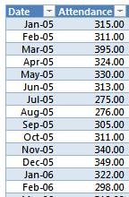
To make the chart set I rearranged the data so that it flowed in order of time, more like a timeline than the original table provided. I prefer that most of my data sets are placed into Table format in Excel. One of the advantages is that my formulas are written in Table Syntax, which is not only easier to write, but much easier to read and decipher later on. My rearranged data set resides in the range C21:J129.
This is a portion of the rearranged data set:
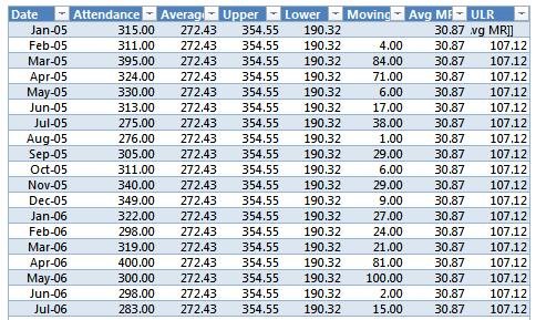
I added an Average column that calculates the average of Attendance. I The formula used is:
=AVERAGE([Attendance])
I also added an UPPER and LOWER column for the upper and lower limits. The formulas for those (show respectively) are:
=[@Average]+(2.66*[@[Avg MR]])
=[@Average]-(2.66*[@[Avg MR]])
I next added a MOVING RANGE column and an AVG MR (average moving range) column. The first (or top) cell in the moving range column is kept blank as there is no change until the second value in the attendance column. The formulas for these two columns are:
Moving Range =ABS([@Attendance]-D22)
Avg MR =AVERAGE([Moving Range])
The final column that I added is the ULR (Upper Limit Range) column. The formula for used is:
=3.47*[@[Avg MR]]
The now completed data table will look like this (partial data shown):
I then created, formatted, and stacked the two charts in the manner shown:
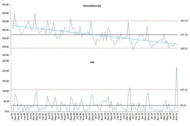
The Attendance (x) chart is based on the data in the Attendance, Average, Upper, and Lower columns of the data set.
The mR chart is based on the data in the Moving Range, Avg MR, and ULR columns.
Both charts use the Date as the Horizontal (Category) Axis Labels.
The charts are fairly straight forward Line Charts. The various data elements have been formatted to particular line styles and a linear trend line has been added for the Attendance Data in the Attendance (x) chart. Data labels have been added to the last data point on the Upper, Lower, and ULR lines as well as the Average and Avg MR lines. The horizontal axis has been removed from the Attendance (x) chart.
I hope that this explanation has been proven useful, and that it may provide some insight or inspire some idea on how you may analyze future data sets that you may be working with.
I would also like to thank Steve = True and Excel Dashboard Templates for the great site and the opportunity to share my ideas.
Respectfully,
Pete
- “The Inventors of Six Sigma”. Archived from the original on 2005-11-06. Retrieved 2006-01-29.
- Tennant, Geoff (2001). SIX SIGMA: SPC and TQM in Manufacturing and Services. Gower Publishing, Ltd. p. 6. ISBN 0-566-08374-4.
- “The Evolution of Six Sigma”. Retrieved 2012-03-19.
- “six sigma”.
Video Review
Free Download File:
Analyzing-Attendance-Records-with-Six-Sigma-Charts.xlsx
******************************************************************************************
Thanks again Pete!!!!!!!!! YOU ROCK!
Steve=True


