A big shout out to Don who sent in this solution to last week’s Friday Challenge: Analyzing Attendance Records with Charts and Trend Line. You can check out the challenge here:
Friday Challenge – Analyzing Attendance Records with Charts and Trend Line
Don provided this awesome solution that uses Sparklines within the worksheet to chart the data. However, Sparklines were first introduced in Excel 2010, so you you to have at least that version of Excel to use this solution.
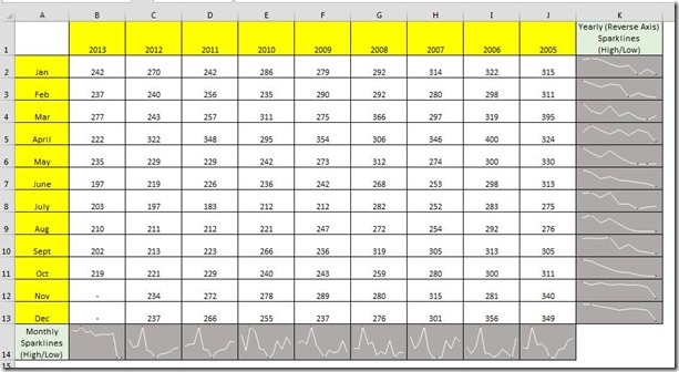
Here is what Don created for the Monthly High/Low Sparklines:
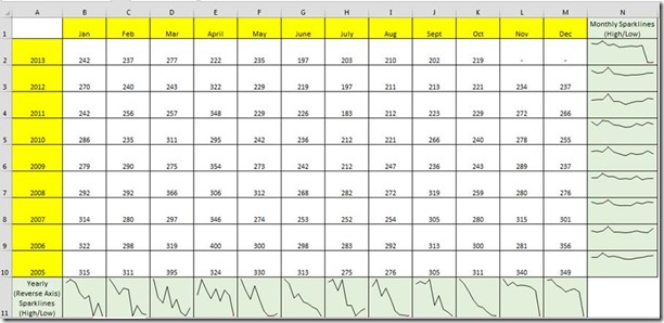
I like this one a lot as you can really see the High/Low points in the Sparkline for the Yearly data:
Sorry, I couldn’t do a video for this one as I didn’t have my laptop with 2010 ready. ![]()
Thanks again Don for this great solution. You can download the free Excel template file here:
dons-solution-for-challenge-3-7-14.xlsx
Steve=True


