Hi All,
I just got a wonderful Christmas gift from our friend Piotr in Poland.
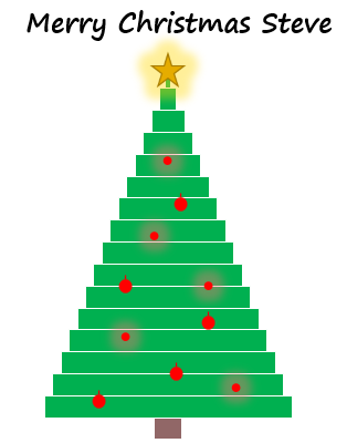
He emailed me his awesome rendering of a Christmas tree in an Excel chart. And I asked if I could share it with you all.
Isn’t it cool?
Piotr learned this technique from a Polish data visualization specialist/blogger by the name of Bartosz Czapiewski. I encourage you to check out Bartosz site. Source: http://skuteczneraporty.pl/blog/ I was able to translate the site by right clicking in my Internet Explorer browser and choosing the Translate with Bing menu option. Bartosz is doing some really cool work with scatter plots recently.
Piotr modified the chart with a few more Christmas Balls and a personal chart title to me 🙂 (THANKS PIOTR!- Merry Christmas to you as well.)
For those interested in how this chart is created, here are basics:
1) It is a Combo chart with the primary axis being comprised of a stacked bar chart where the first stacked series fill option = No Fill
This part is very similar to this Sales Funnel Chart I created that you can read about here:
How-to Make a BETTER Excel Sales Pipeline or Sales Funnel Chart
2) The secondary axis is comprised of an XY Scatter chart in Excel for the red balls (ornaments) and the star at the top.
I utilized a very similar technique in this tutorial about making a USA flag in Excel:
How-to Make an United States Flag Excel Chart (Happy 4th of July)
3) Custom shapes or pictures were created for the red balls and star and replaced as custom markers.
You can learn more about utilizing custom markers in this post:
How-to Make and Add Custom Markers in Excel Dashboard Charts
Here is the sample Excel chart file that Piotr provided:
Merry Christmas and Happy Holidays to All!
Steve=True


