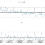
Friday Challenge – Analyzing Attendance Records with Six Sigma Charts
The following is a guest post from Pete on his answer to the most recent Friday Challenge.
Pete applied his knowledge of Six Sigma to...
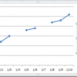
How-to Show Gaps in a Line Chart When Using the Excel NA() Function
In last Friday’s challenge, we had a Excel Analyst that needed to remove outliers from his Excel Line Chart. In essence, he wanted to...
Friday Challenge Answers – The Boss Says…
I received some great responses from lots of fans. Thank you so much for all your great comments. I agree with most and my...
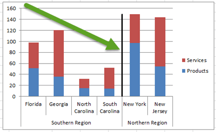
Add Vertical Line Between Columns in Excel Stacked Column Chart
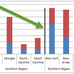
Add Vertical Line Between Columns in Excel Stacked Column Chart
In this tutorial, you will learn how to QUICKLY add a vertical line between columns...
How-to Make a Picklist Change the Chart Type for a Dynamic Excel Dashboard
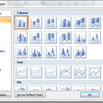
Have you ever wanted to create a graph but then let users dynamically change the Excel chart type with a drop down pick list? ...
How-to Connect Gaps in a Line Chart in Excel
When you are build your Excel Dashboard Template charts, you may find that some of your data is not complete. For instance, you may...
USA Today Charts Part 2 – Excel Area Chart with Line and Area Highlights
Well, I have been working hard on my project and it has successfully launched. But that took time away from my other passion, EXCEL!!!
So...
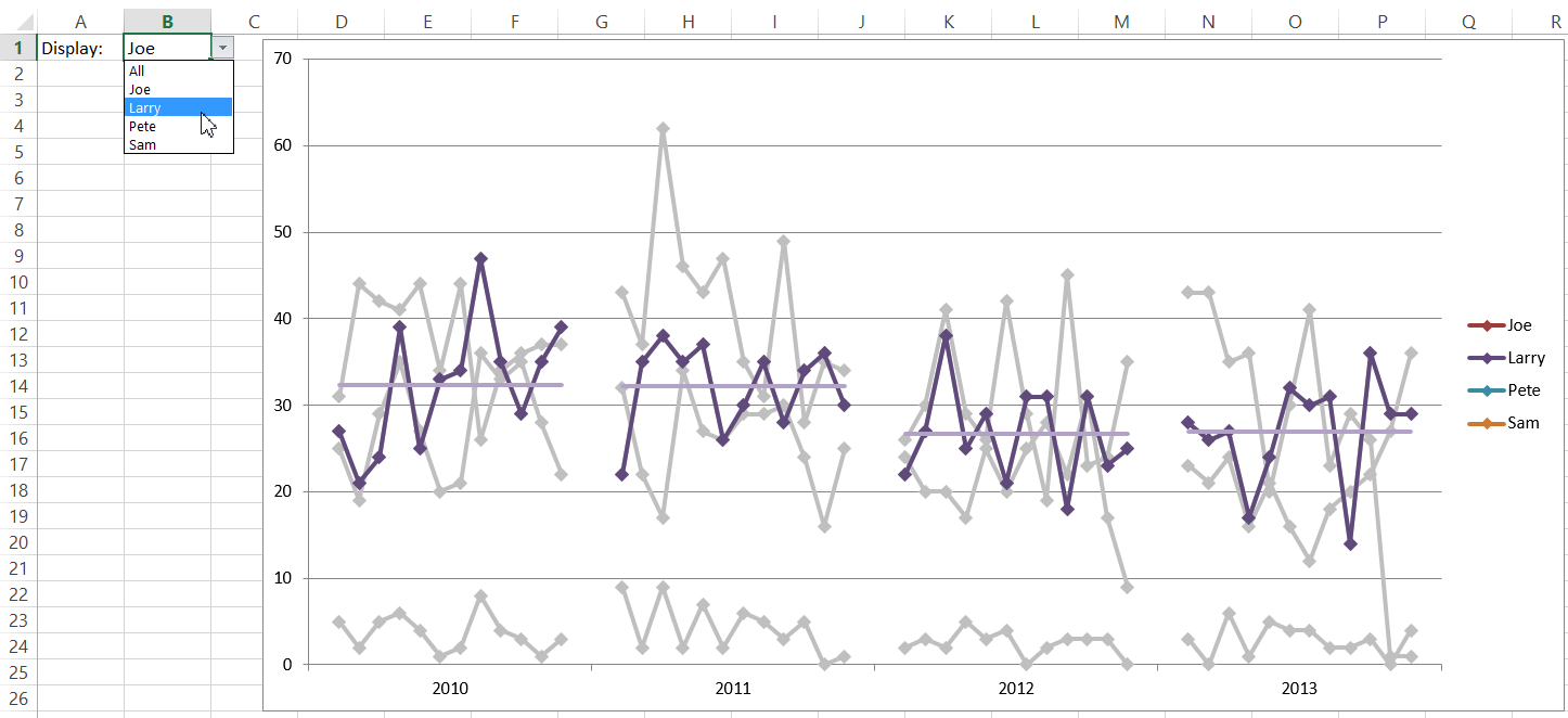
How-to Make an Excel PickList Chart for Multi Years by Month
Here is my response to the recent Friday Challenge on Creating a Chart for Multi Years by Month.
You can read more about the original...
How-to Create Sales Quota Threshold Horizontal Lines in an Excel Column Chart
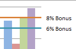
Sales executives are always pushing their sales teams. They typically do this by setting sales quota’s for their salespeople. Quotas are thresholds or minimum...
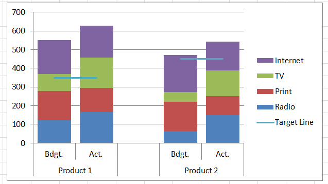
How-to Add Lines in an Excel Clustered Stacked Column Chart
I have posted several Excel chart samples related to Clustered Stacked Column Charts.
In case you missed them, you can check them out here: Excel...

