The Problem
Recently a fan contacted me and asked how she change the horizontal axis could do the as follows:
“I am trying to bold 5 months (out of 22) listed in my X Axis. I am working with a line chart. “
– Tamara
Unfortunately, there is not an easy way to do this with standard Excel Charting functionality. You can do this for individual labels on a line chart, but not the horizontal axis category labels.
However, in this tutorial, I will show you an alternate technique where you will learn how to highlight or callout certain horizontal categories.
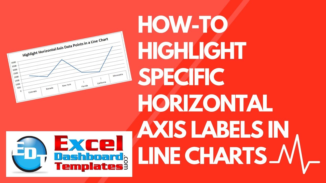
Here is what the final version of our highlighted chart will look like:
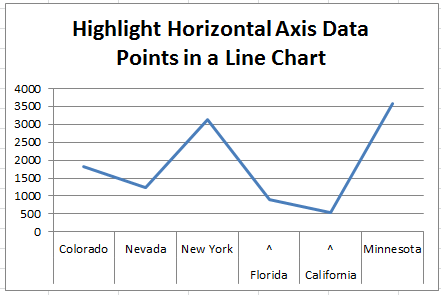
If you like the way that this this horizontal axis callout looks, then check out the tutorial below.
If you are looking for other ways, check out this previous post, where you can highlight the category or point in the chart area, but not the axis.
You can check out that tutorial here: How-to Show Decades and Highlight a Year in the Horizontal Axis
Also, I am looking for some feedback and would like to invite you to fill out my quick 3 question survey here: User Survey
The Breakdown
We will use the Multi-level Category Labels options for line charts to show which data points that the user should note.
1) Add a Picker/Highlight Column to Data Set
2) Create Chart Formulas
3) Create Line Chart
Step-by-Step
1) Add a Horizontal Axis Picker/Highlight Column to Data Set
First, we need to add a column next to our original data set. If our original data is in columns A and B, then we just need to add a column C where we will indicate if the horizontal axis label should be highlighted.
Now you can just create another column and put a text “y” or in the row you want to highlight. So our final chart will show something different for the horizontal axis for the Florida and California labels.
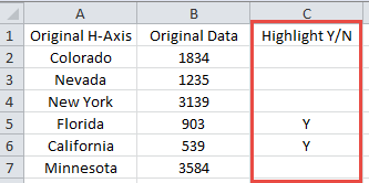
Also, you can create a formula here if you like if you want to highlight different types of data. For instance, if you want to highlight any row that has more than a certain threshold or if you want to highlight the top 5. If so, you should put a formula like this in cell c2 and copy it down to the end of your data set: =IF(RANK(B2,$B:$B)<=5,”y”,””).
2) Create Chart Formulas
Now that we have a way to determine the horizontal axis labels that will be highlighted, we can create our formulas. I will typically create the chart data range adjacent to the actual data. You can also put this on another worksheet tab, but it is your personal preference.
So we should create the following columns of data in cells E1:G1 and formulas
| E | F | G | |
|---|---|---|---|
| 1 | New H-Axis Bottom Level | New Haxis Top Level | Copy of Data |
| 2 | =IF(C2=”y”,A2,” “) | =IF(C2=”y”,”^”,A2) | =B2 |
After you create your formulas in cells E2, F2 and G2, then copy the formulas down to the end of your data range.
Formula Details
Let’s investigate these formulas to see what we are doing.
The formula in cell E2 =IF(C2=”y”,A2,” “) is looking at cell C2 (our Highlight Y/N column of data we setup in the previous step) to see if there is a “Y” value. If yes, then the formula will retrieve the value in Cell A2 (the Original Horizontal Axis). If there is not a “Y” value in the cell, then it will put in a Space ” ” as the formula result. Note that you must include this space in the formula. If you do not, then the same chart will look like this:
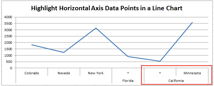
Notice that the California horizontal multi-level category label now spans 2 different states. It shouldn’t be that way, so we need to force each axis label into one column with the Space in the formula.
The formula in cell F2 =IF(C2=”y”,”^”,A2) is looking at cell C2 (our Highlight Y/N column of data we setup in the previous step) to see if there is a “Y” value. If yes, then the formula will insert a carat “^” as the formula result. This will create our highlight for that category label. If there is not a “Y” value in the cell, the resulting cell value will retrieve the value in Cell A2 (the Original Horizontal Axis).
Finally, we don’t need to do anything with the data that will be represented in the line chart, so in cell G2, we can simply put in the formula =B2 to copy over the original data values to match our new horizontal category labels.
3) Create Line Chart
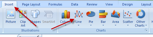
Since our data for the graph is now finalized, all we have to do is create our line chart. To do that, highlight the data range. In our case, it is E1:G7, and then go to the Insert Ribbon and then choose the Line Chart button in the Charts Group as you see here:
You can choose with or without markers. It is up to you. However, your chart may look like this, where the horizontal highlights don’t look correct:

Don’t worry, you haven’t done anything wrong, it is just Excel trying to fit the horizontal axis labels into the smaller chart. To fix this you have a few options:
1) Delete the Legend to give the chart area more space in the Plot Area.
2) Increasing the size of the Chart Area.
3) Decreasing the font size of the Horizontal Axis Labels.
Once you have cleaned up your chart size, you final chart should look like this:

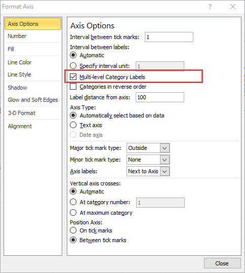
If you double click on your chart’s horizontal axis, you will see the Axis Options dialog box pop-up and you will see that Excel has already picked the “Multi-level Category Labels” check box for the line chart. If you don’t see this, then you may have numbers as your horizontal axis and you should convert those to text in your formulas above as Excel will not stack the horizontal labels like you see above because it doesn’t thin you have many text labels identified.
Alternate Setup
You can also choose other characters in your chart label like the Pipe “|” (it is above the Enter Key on your Keyboard. If you choose that character instead of the carat “^”, then your chart will look like this:

What is your preference between the ^ or | character? Let me know in the comments below.
Download Excel File
You can download the sample file here: How-to-Highlight-Specific-Horizontal-Axis-Labels-in-an-Excel-Line-Chart.xlsx
Video Tutorial
What do you think of this technique? Do you think you would use it in your Excel Dashboards? Let me know in the comments below.
Also, if you are not a subscriber, please consider subscribing now so that you get the next post and other news directly in your inbox below.
Steve=True


