The Problem
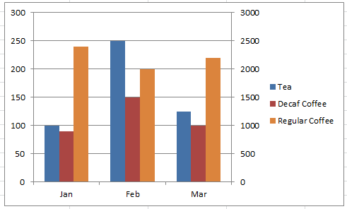
The Breakdown
Stop Excel From Overlapping the Columns When Moving a Data Series to the Second Axis
Stopping Excel Pivot Chart Columns from Overlapping When Moving Data Series to the Second Axis
Stop Excel Overlapping Columns on Second Axis for 3 Series
How-to Setup Your Excel Data for a Stacked Column Chart with a Secondary Axis
How-to Make an Excel Stacked Column Pivot Chart with a Secondary Axis
Why is Excel Overlapping Columns When I Move them to the Secondary Axis?
This is a really cool technique that I created awhile ago, but we will use it to show which columns correspond to which axis.
How-to Group and Categorize Excel Chart Legend Entries
Step-by-Step
1) Create Padding Columns
So the first steps of this process is to create padding columns for each axis. We will need 5 data series for each axis. One will be used for the Legend Grouping on each axis. Then one data series will be used for the gap between the columns. The rest are to make sure that the columns don’t overlap.
You should really check out this post to make sure you understand the technique:
Stop Excel Overlapping Columns on Second Axis for 3 Series
Your data setup should look like this:
| A | B | C | D | E | F | G | H | I | J | K | |
|---|---|---|---|---|---|---|---|---|---|---|---|
| 1 | Left Axis | Tea | Decaf Coffee | Left Pad 1 | Left Pad 2 | Right Pad 1 | Right Pad 2 | Right Pad 3 | Right Axis | Regular Coffee | |
| 2 | Jan | 150 | 140 | 4500 | |||||||
| 3 | Feb | 100 | 90 | 4000 | |||||||
| 4 | Mar | 175 | 185 | 4300 |
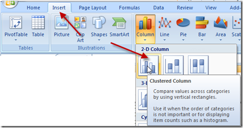
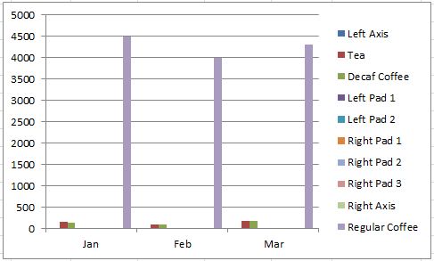
2) Create Clustered 2-D Column Chart
You are now ready to create the chart. Highlight the range A1:K4 and go to the Insert Ribbon and select Clustered Column Chart.
Your chart should now look like this:
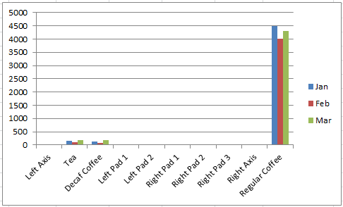
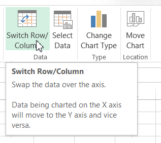
3) Switch the Chart Rows/Columns
Because of how we setup our data, we will need to switch rows/columns for the chart. You can do this by selecting your chart, then go to the Design Ribbon and then click on the Switch Row/Column button in the Data grouping.
If you want to learn more about why Excel is doing this, check out this article:
Why Does Excel Switch Rows/Columns in My Chart?
The current chart will now look like this:
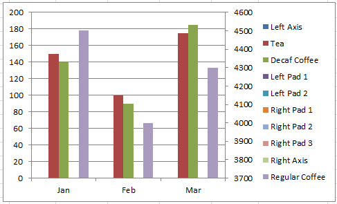
4) Move Data Series to the Secondary Axis
The next step is to move all of the data series that we want to on the secondary axis. This will include the Regular Coffee series as well as all of the Right Pad series. To do this, click in the chart and then select the Regular Coffee series and then press CTRL+1 to launch the Format Data Series dialog box. Then select the Secondary Axis radio button in the Series Options tab. Perform this for all of the Right Pad data series.
If you are having problems selecting the data series for each of the Right Padding columns, you will need to temporarily give them a large value so that you can see them or read this article on how to select hard to click on series here:
How-to Select Data Series in an Excel Chart when they are Un-selectable?
When you are done moving the series to the Excel Chart secondary axis, your graph will now look like this:
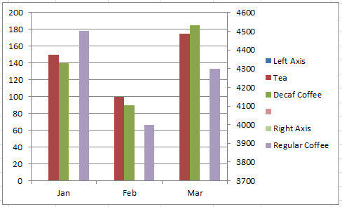
5) Remove Legend Entries
Next we want to remove any unneeded legend entries from the Filler/Padding data series.
First, delete the text that you have entered into the spreadsheet in I1 for Right Pad 3. We want to keep the legend entry as a spacer, so that means we don’t want to delete it, just remove the text so that it appears blank in the legend.
Second, we need to clean up our Legend entries and remove the ones that are not needed (the ones titled Pad), first select your chart. Then select the Chart Legend. Next select a Legend Entry and finally then press the delete key on your keyboard.
Your chart should now look like this:
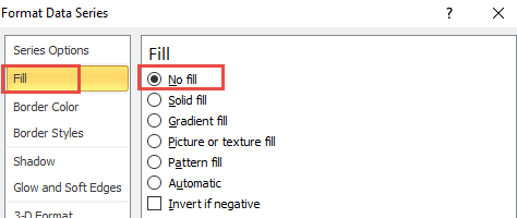
6) Change Data Series Fill Color
Finally we just have one last clean up on the Legend and that is to set the Fill type to No Fill.
We need to change this setting for the following data series: Left Axis, Right Axis and Right Pad 3 (that now has a blank label). You can do this by selecting the Excel chart and then selecting the correct data series. Then press CTRL+1 and go to the Fill options in the Format Data Series dialog box. Then Choose No Fill from the Fill tab as you see here:
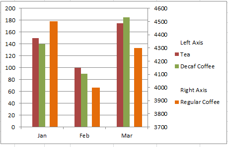
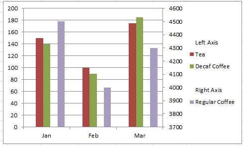
Your Final Chart will look like this:
I think that, when you have a 3rd or more data series in your chart and you use a secondary axis, this is a much better format for Excel Chart Secondary Axis Columns Overlap issues. What do you think? Let me know in the comments below.
Video Demonstration
Watch me combine these 2 techniques in this quick Video Demonstration below. Note that I have added an extra padding column in the write-up above so that the columns are all the same size.
File Download
You can download the sample file here to see the charts described above in action.
Better-Excel-Chart-on-Overlapping-Columns-with-3-Series-on-a-Second-Axis.xlsx
I think that these are really cool techniques. Excel is so powerful but it is great to have work-arounds. What is your favorite tip and trick in Excel? Let me know in the comments below.


