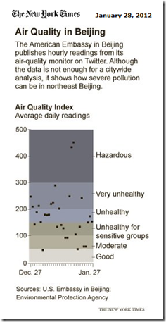
I would strongly recommend that if you want to get better at building Excel Dashboard Charts and Graphs that you should try and recreate graphs that you see in the press. I have a upcoming business trip to China and so this chart peaked my interest. The New York Times recently posted the following chart of Air Quality in Beijing. When you see an interesting chart like this, I try and see how I can recreate it in Microsoft Excel. That is how I learn to make charts that are typically built in either expensive charting programs or in a graphic software package.
Here is the original New York Times Chart:
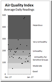
Here is my Excel Sample Chart recreating the NY Times chart using only Excel standard charts and NO VBA.
You may ask yourself. How can I practice? Well, I started out with data that mimics the NY Times chart, but it is not the exact data, so the points will not match up exactly. However, I was trying to recreate the functionality of the New York Times graph.
This is how you will learn Microsoft Excel Charting Techniques that will set you apart and make you an Expert in Excel!
Give it a try and post your sample chart in the comments. I will detail how I made this chart in a future Excel Blog post.
Do you think my chart closely represents the NY Times chart? Let me know in the comments section.
Thanks!
Steve=True


