Friday Challenge – Analyzing Attendance Records with Six Sigma Charts
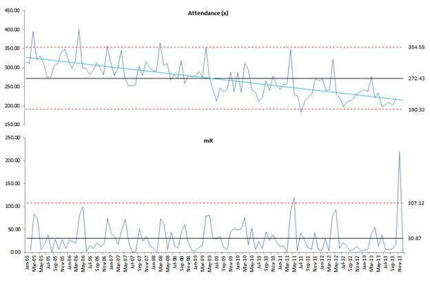
The following is a guest post from Pete on his answer to the most recent Friday Challenge.
Pete applied his knowledge of Six Sigma to this charting challenge.
You can read about the challenge here:
Thanks Pete...
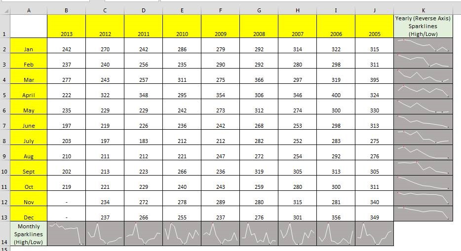
Analyzing Attendance Records with Charts and Trend Line with Sparklines
A big shout out to Don who sent in this solution to last week’s Friday Challenge: Analyzing Attendance Records with Charts and Trend Line. You can check out the challenge here:
Friday Challenge – Analyzing...
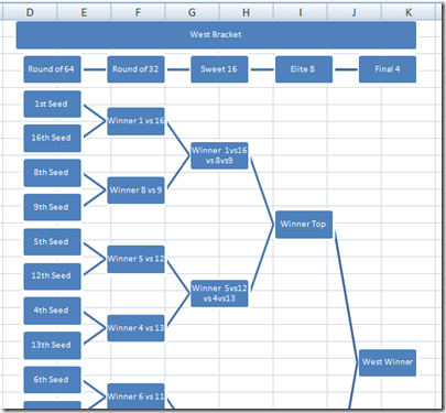
How-to Make a College Basketball Tournament Bracket Chart in Excel
Well it is March and that means that it is Madness in college basketball. And with that madness comes the bracket challenges in every office around the United States. Now if you are not...
Friday Challenge – Analyzing Attendance Records with Charts and Trend Line
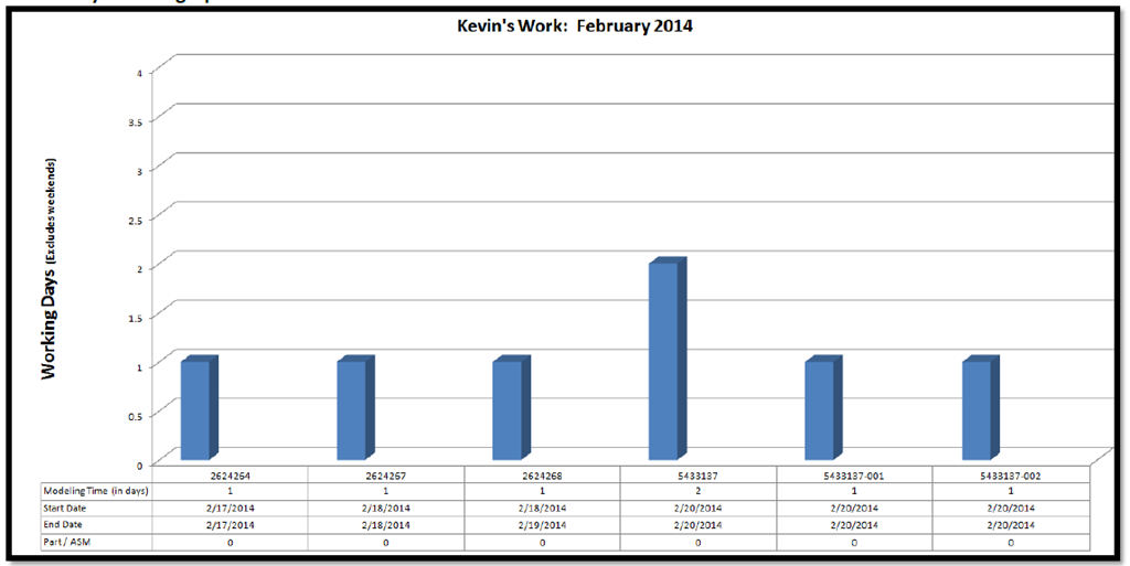
For this Friday Challenge, lets see if we can help this user with their data.
Read it over, but really, the last line of the request is my favorite “other ways”. This can be with...
How-to Fake an Excel Chart Data Table
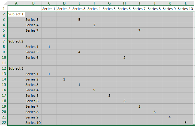
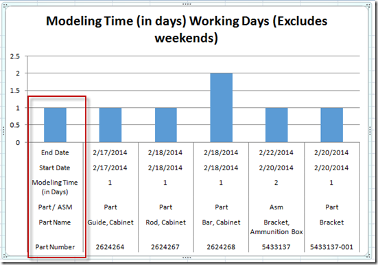
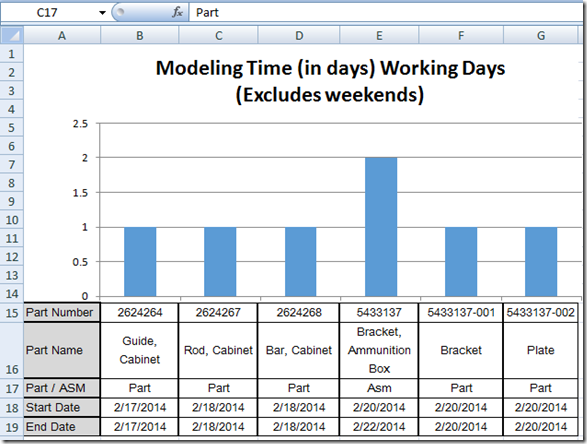
Fake an Excel Chart Data Table
Yesterday, I showed you how you can use the Horizontal Axis option of “Multi-level Category Labels” to create a new wave Excel Chart Data Table.
If you missed it, you...
How-to Show Text in an Excel Chart Data Table (Part 1)
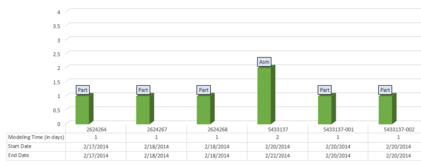
Yesterday, I showed you how you can use the new label options in Excel 2013 to help Kevin with his engineering chart. But we didn’t quite complete the final chart and challenge that Kevin...
Friday Challenge Solution – Excel 2013 Data Labels on a Range
In our last Friday Challenge,
Friday Challenge – Showing More Categories in an Excel Chart
we were trying to help Kevin with his problem.
He had followed this tutorial to add more lines to his Excel Chart...
Friday Challenge – Redo
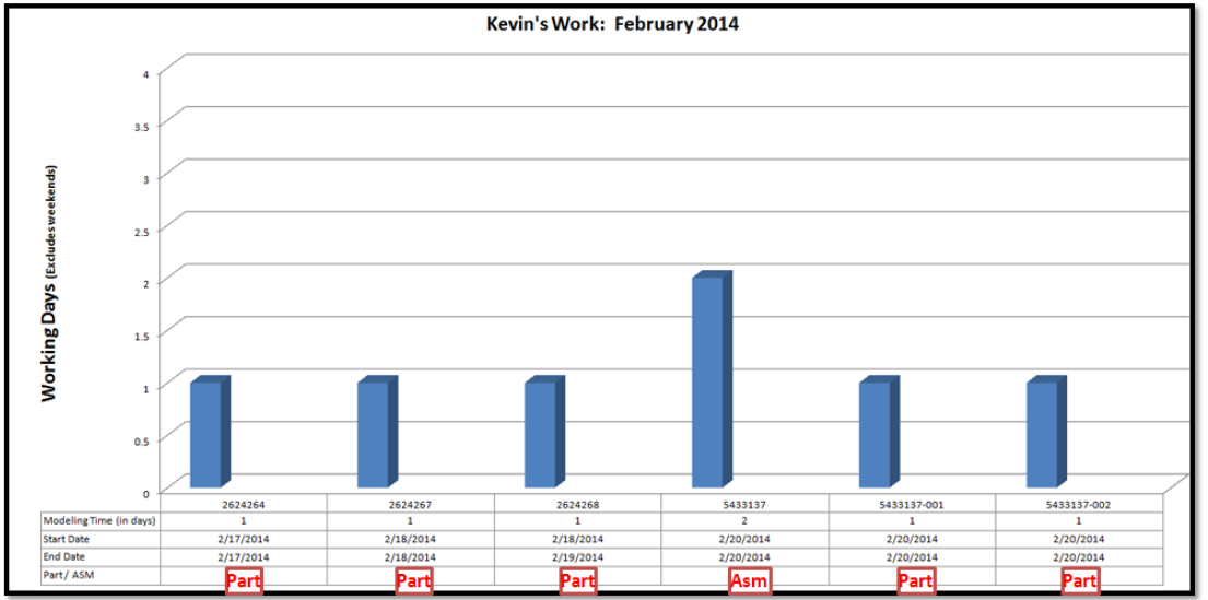
Oops, looks like I omitted a key thing. The right final chart on what the use wanted.
See if the update post helps out more :) Thanks
https://www.exceldashboardtemplates.com/friday-challengeshowing-more-categories-in-an-excel-chart/
Steve=True
Friday Challenge – Showing More Categories in an Excel Chart
Can you help Kevin with his problem?
Kevin saw this article:
How-to Add a Line to an Excel Chart Data Table and Not to the Excel Graph
“Hi Steve,
Issue at hand: I am an engineer who wants...
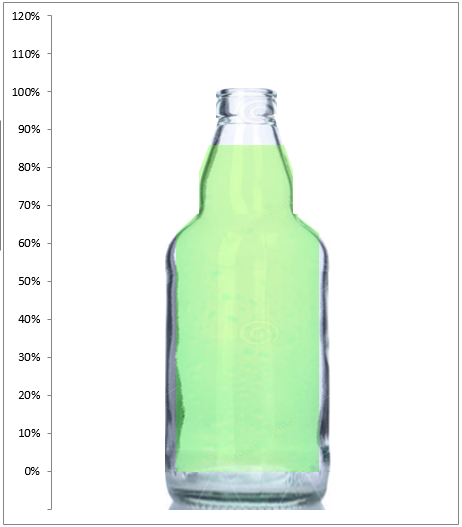
Excel Goal Chart Filling a Bottle of Soda
In a previous post, and one of my favorites, I showed you a unique company goal chart using a beer mug instead of a thermometer. Click this link for the step-by-step tutorial, file download...

