Fake an Excel Chart Data Table
Yesterday, I showed you how you can use the Horizontal Axis option of “Multi-level Category Labels” to create a new wave Excel Chart Data Table.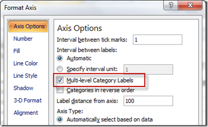
If you missed it, you can check it out here: how-to-show-text-in-an-excel-chart-data-table-part-1
Here is what the original data set looked like: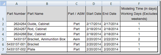
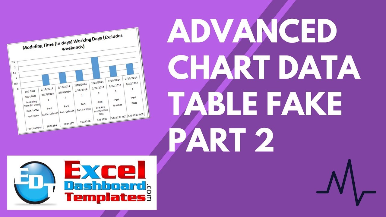
Here is what the final chart with the new chart data table looked like: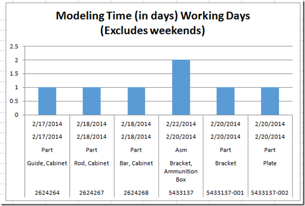
However, I wasn’t completely happy with the new chart data table because of two reasons:
A) The original data point values are not included in the new data table. This is standard in the normal Excel Chart Data Table.
B) The categories are not listed in the faked Excel data table. You can’t tell if the first row of dates are for the start or end dates and can be confusing.
So how can we fix these short comings? Essentially, we are going to make a very similar chart but change a few things. Let’s get started.
The Breakdown
1) Insert a Column that Contains the Data Points
2)Create Chart of only the Data Points
3) Delete the Legend
4) Edit the Horizontal (Categories) Axis Labels Range
5) Edit the Legend Entries (Series) Range
Step-by-Step
1) Insert a Column that Contains the Data Points
We are doing this step in order to add the original data point values in the new data table.
To do this, insert a column to the left of the original data points. For our purposes, we will insert a column in between columns C and D, like this: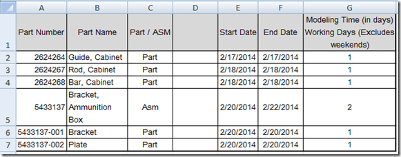
Then put this formula in Cell D1 and copy down to D7
=G1
(Note, I have changed the value in D1 so that it is smaller than our sample to 
Your final data table will now look like this: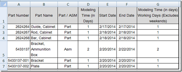
2) Create Chart of only the Data Points
There are many ways to create this chart as you have to edit most of it, but this is the way I like to do it. I start by highlighting G1:G7. Then I insert a column chart. Your chart should look like this: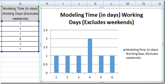
3) Delete the Legend
In this case, we don’t need a Legend in the Excel Column Chart as it is a chart with only one data series. So select the chart and then select the legend and then press your delete key. Your chart will now look like this: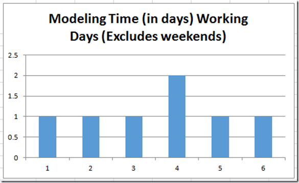
4) Edit the Horizontal (Categories) Axis Labels Range
The second to the last step is to change our Excel chart horizontal axis. To do this, select your chart, then go to the Design Ribbon. From there, press the Select Data button in the Data group.
You will then see the “Select Data Source” dialog box and you will need to press the “Horizontal (Category) Axis Labels” button on the right: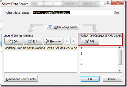
You will then see the Axis Labels dialog box and you should select A1:F7 and press the OK button: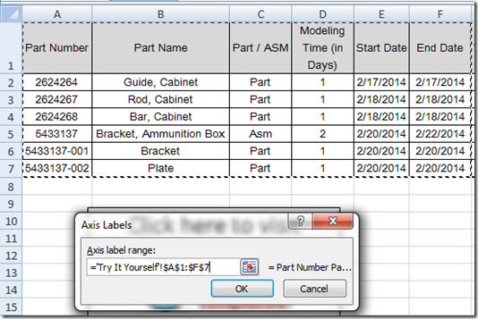
Your Chart should now look like this: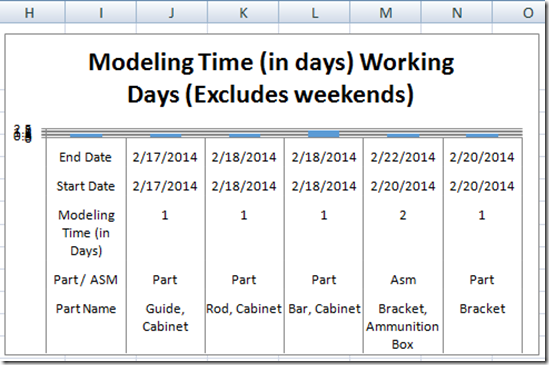
But don’t worry. If it does look like this, you may need to make the chart bigger. Select the chart and then grab a corner and make the entire chart bigger. Your chart should now look better and look like this: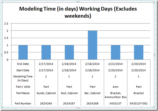
5) Edit the Legend Entries (Series) Range
We are almost there, but look at the data series and notice that the categories are now there, but they are showing up under a data series and it looks like we may be missing a data table entry on the right as well.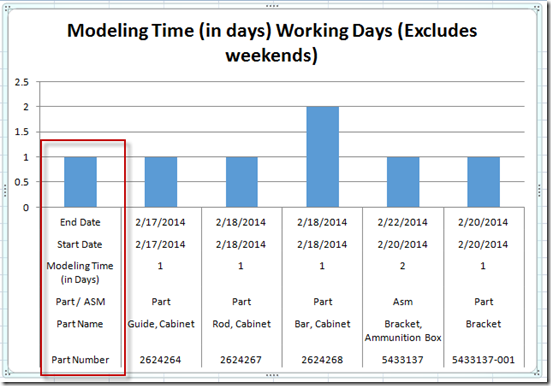
So to fix this, we have one last step to complete. Once again, as we did in the previous step, please select the chart and go to the design ribbon and then press the Select Data button. Then from the Select Data Source dialog box, press the Edit button under the Legend Entries (Series) area on the left: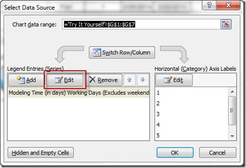
You will then need to edit the Series Values from G2:G7 to G1:G7 as you see below: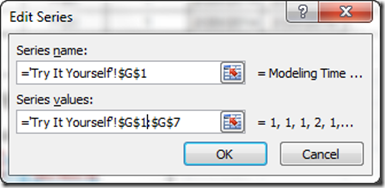
Your final chart will now look like this: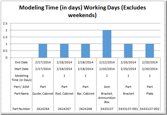
This solution is another way that one may consider when faking an Excel Chart Data Table.
Video Tutorial
See this Excel chart data table tip and trick in a video demonstration here:
Download the Free Excel Dashboard File here:
You can download the free Excel chart file for use in your dashboards here:
Fake-Excel-Chart-Data-Tables-Revisited.xlsx
I was amazed when I was able to almost replicate the Excel Chart Data Table using Multi-Level Horizontal Axis Labels. This allowed me to put in Text in the faked data table. Let me know what you think in the comments below. Thanks
Steve=True

