When building executive dasboards using Excel, you have to make the dashboard design choices that will assist your executives and the company in understanding the relationships of the data in a visually appealing and easily understandable way.
So you will frequently be presented with data, but not the way that your Executive wants to see the data. Or perhaps your executive tells you exactly the way that he/she wants the the data presented in a visual dashboard chart, but you may disagree on the best way to present the data.
So how would you represent the following data in your Excel Executive Dashboard?
| A | B | C | D | |
|---|---|---|---|---|
| 1 | Date | Gross Revenue | Price | Units |
| 2 | 10/31/2008 | $7,127 | 19.99 | 357 |
| 3 | 11/30/2008 | $8,599 | 24.99 | 344 |
| 4 | 12/31/2008 | $10,901 | 29.99 | 363 |
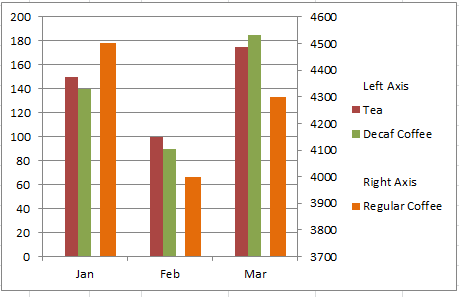
This chart should show the following:
- Trend of the data
- Relationship of the different data series.
- Allow your executive to quickly ascertain the data and its relationship.
Please send me your charts and I will post them all to the follow-up posting.
Steve=True


