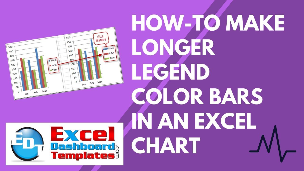
Most Excel 2D Column Charts have small color boxes in the legend to point you to the right series in the graph. However, this Excel Trick showed you how to make a longer color rectangle in your Excel Legend instead of the small box.
In a previous posting, I showed you a cool Excel Tip and Trick on how to make longer legend bars in your Excel Column Charts but I did not include a video demonstration. If you missed it, here is a link to the step-by-step tutorial:
Tips and Tricks – Longer Legend Color Bars in Excel Charts
However, for this post, I had a request for an Excel Video Tutorial demonstrating this charting technique.
You can check out the Video tutorial here:
What other cool tricks have you seen but didn’t understand how to replicate in Excel? Leave me a post and I will create a how-to video for that as well.
Also, don’t forget to sign up for the RSS Email feed so that you get the next posting in your inbox.
Steve=True


