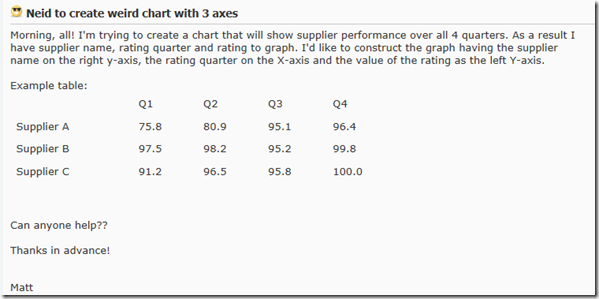
Recently I saw this in the MrExcel Forums. The title “Weird Charts with 3 Axis” intrigued me.
I determined that they were looking to put the supplier names on the secondary horizontal axis descriptions (above the columns) and put the quarter information on the primary horizontal axis. Like this: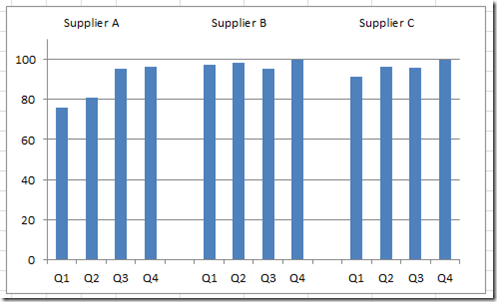
You will see this type of data axis grouping/display done in many of the print magazines when they put charts into their articles. Well lets see how to do this:
The Breakdown
1) Setup Your Data and Create an Excel Column Chart
2) Move the 2nd Series (2nd Axis Filler Series – the zeros) to the Secondary Axis
3) Show the Secondary Horizontal Axis
4) Change the 2nd Series (2nd Axis Filler Series – the zeros) Horizontal Category Axis Labels
5) Change the Format of the Secondary Horizontal Axis and Vertical Axis Maximum
6) Delete the Secondary Vertical Axis, Chart Legend and Major Gridlines
7) Sit Back and Smile at Your Results ![]()
Step-by-Step
1) Setup Your Data and Create an Excel Column Chart
Setup your data like you see below. Column A is only used as the 2nd Series Horizontal Category Axis Labels and Column D will only be used as a placeholder for a data series on the Secondary Axis.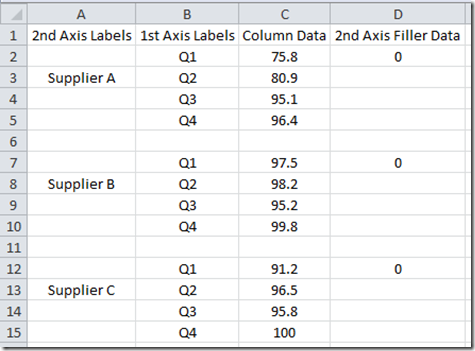
Next, we need Create your column chart from B2:D15 (do not include column a). Highlight the range B2:D15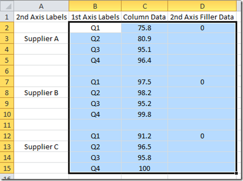
Then create a 2-D Clustered Column Chart from the Insert Ribbon in the Charts Group from the Column Button: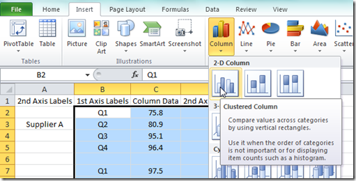
Your resulting chart should look like this: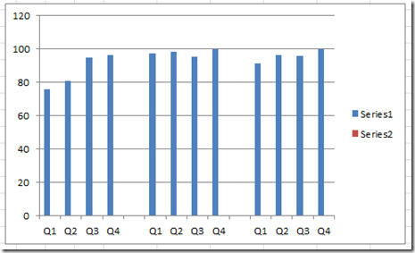
2) Move the 2nd Series (2nd Axis Filler Series – the zeros) to the Secondary Axis
Now we need to move the Series 2 to the Secondary Axis. If you don’t know how to select this series, check out this post:
How-to Select Data Series in an Excel Chart when they are Un-selectable?
When you have selected the 2nd series, press CTRL + 1 to launch the Format Data Series dialog box. Then change the Series Options to Secondary Axis.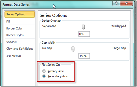 Your chart should now look like this (not much difference but you now see the secondary vertical axis in the chart on the right:
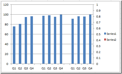
3) Show the Secondary Horizontal Axis
We now need to show the Secondary Horizontal Axis so that we can see the Supplier Categories. To do that, we need to first select the chart and then go to the Layout Ribbon and choose the Axis button. Then Select the Secondary Vertical Axis and choose left to Right Axis.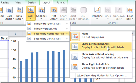 Your chart should now look like this:
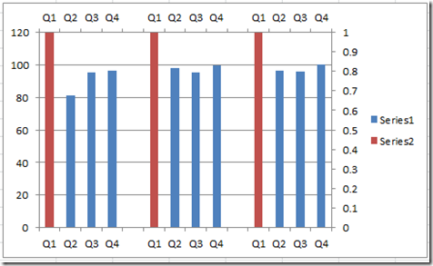
4) Change the 2nd Series (2nd Axis Filler Series – the zeros) Horizontal Category Axis Labels
We need to change the upper axis labels to the Supplier labels that we have in Column A. To do this, right click in the chart and then choose “Select Data…” from the pop up menu.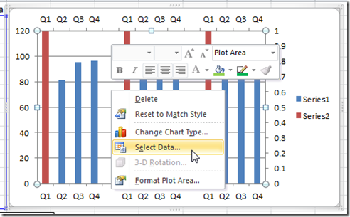
Then from the Select Data dialog box, first select SERIES2 in the Legend Entries (Series) area and then select the EDIT button in the Horizontal Category Axis Labels area.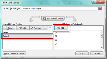
Then from the Axis Label Range Dialog Box, change the range to A2:A15 (the supplier names)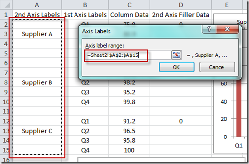 Your chart should now look like this:
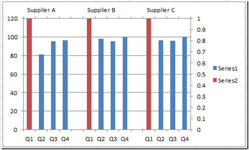 We are really close. Just a few clean up things.
5) Change the Format of the Secondary Horizontal Axis and Vertical Axis Maximum
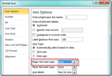
I would recommend changing the format of the secondary horizontal Axis to No Line 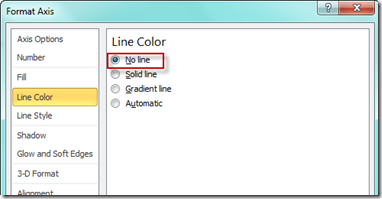
I also recommend changing the Maximum gridline value so that the upper line doesn’t appear as well.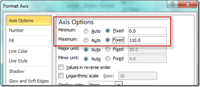
Your chart should now look like this: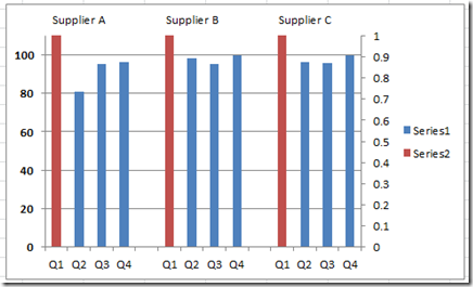
6) Delete the Secondary Vertical Axis, Chart Legend and Major Gridlines
Now lets clean up the chart to hide the red (series 2) column but do NOT delete it. All we need to do to hide the series is delete the Second Vertical Axis. Simply select it and hit the delete key. Also, lets do that with the Chart Legend. Select the Chart Legend and press your delete key. Finally, lets delete the Major Horizontal Gridlines as well. Select them and press the delete key.
Your final 2-Axis Grouping Excel Column Chart should now look like this: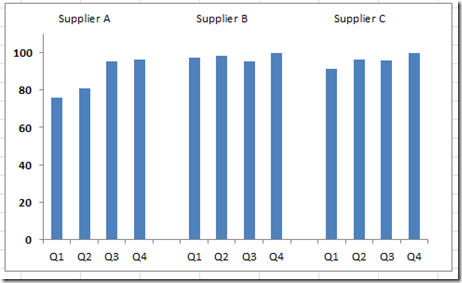
7) Sit back and smile at your results ![]() as your company executives think that you are awesome in Excel.
as your company executives think that you are awesome in Excel.
Video Demonstration
Please leave me a comment and let me know if you can use this Dashboard Technique in your next executive team meeting.
Steve=True

