Here is the scenario that thrills Excel data analysts and sends chills down most employee’s spines:
Thursday afternoon: Your department sent out an Excel spreadsheet report on your companies website speed to all the executives. The speed is derived from 3 different fixes that your team has applied.
Friday morning: You are sitting in your office or cubicle and the CEO sends you this email:
……………………“Can you please create some graphs so that the board can visually make a comparison?”
Here is what the data looks like (you can download it below): 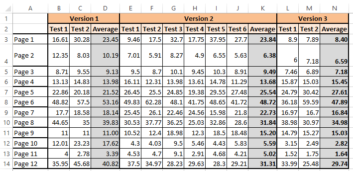
Here are the challenges:
1) What would you conclude about the Version 3 fixes you implemented?
2) What charts / graphs would you send the boss?
3) Now that you have charts, what do you conclude about your version 3 fixes?
Data File Download:
Leave me a comment below with your answers and I can also send you an email so you can send me your sample charts.
Good Luck!
Steve=True


