In our recent Friday Challenge, a user asked this:
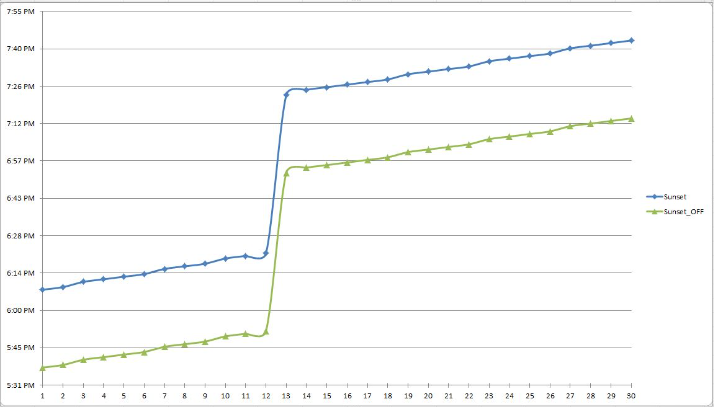
“This is a scatter with smooth line and markers graph. What I would like to have displayed, is everything above the blue line one colour, between the blue and green line another colour, and between the green line and the base a final third colour.”
We had one response from Pete and he nailed it from my perspective.
You can check out the file here: friday-challenge-the-right-graph-style-for-what-i-want-to-do
This request screams out for a Stacked Area Chart like this:
Based on the data provided, here are the steps to recreate this chart.
The Breakdown
1) Create Data Set
2) Create Stacked Area Chart
3) Remove Data Series from Chart
4) Rename Data Series for Legend
Step-by-Step
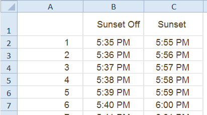
1) Create Data Set
The key to moving from the users data:
to the final chart is that we can’t use the data as-is. If we stack to these two series, the stacking will make it so that the total height is 11+ PM instead of 5:55 PM. So we can’t use the Sunset “Column C” data as a chart series. Instead, to get the desired effect, we need to calculate the difference between the two series and use that differential as the series to stack on top of the Sunset Off series. Then the total of the 2 series will equal 5:55 PM.
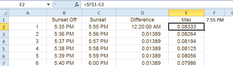
To do this, create a new series of data in Column D =C2-B2
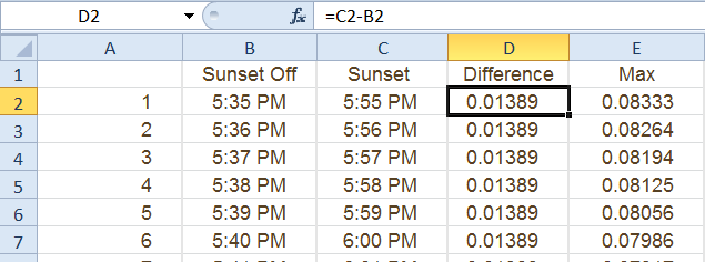
You may want to change the format of the column to a “Number” or “General” otherwise, it will look like a strange date or weird time. In our case, it is only a 20 minute difference so that is why it is such a small number.
Next we want to create the data series for the Maximum value that we want to cap out the stacked area chart.
As part of this process, it is best to use a cell to set the maximum value. I have utilized cell F1 for the Maximum value that I want to show in the chart. Then we will use this cell in our calculation of a new data series for the chart in column E. The formula in cell E2=$F$1-C2. Then copy this formula down to the end of your data. This formula is another differential formula that is a very small amount since it will be used as the next stacked area. It will look like this:
Now we are ready to create our chart.
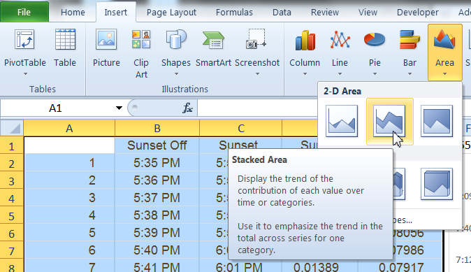
2) Create Stacked Area Chart
To create the chart, highlight cells A1:E31. Then go to the Insert Ribbon and select the Stacked Area Chart button from the Chart Group:
Your chart will now look like this:
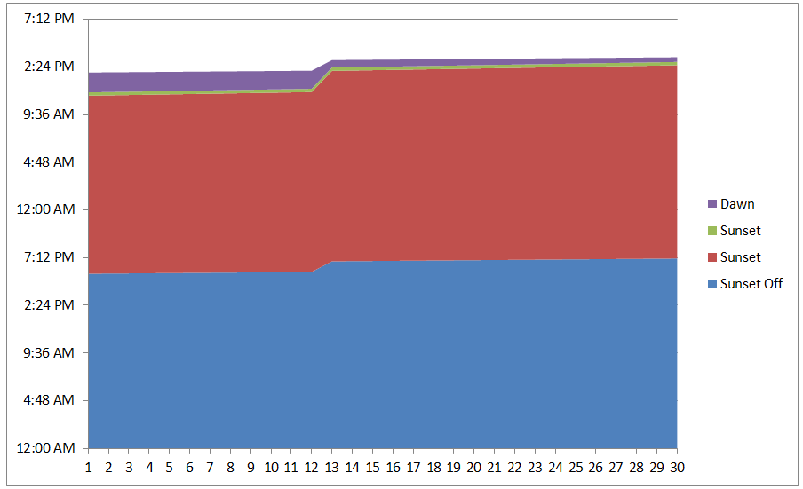
3) Remove Data Series from Chart
The chart we created has an extra series that is used in the calculations but not needed for the final chart. So click on the Sunset data series (Red Chart series) and press your delete key. This will make our stacks work perfectly. Your chart should now look like this:
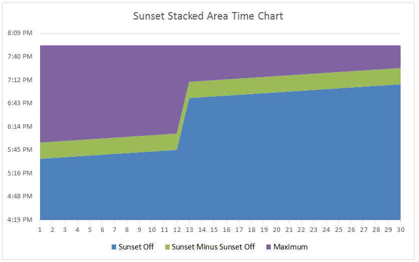
4) Rename Data Series for Legend
There are just a few things to do now and that is to update our Legend. In order to do this, we need to rename our columns in cells B2:D2 or modify the data series names in the Select Data dialog box.
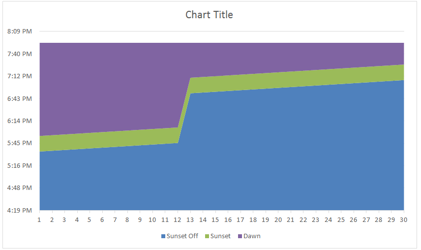
Your final chart should now look like this:

So remember, if you are using a Stacked Area Chart where the data is going to build on each other as a differential but not as cumulative values, then you want to subtract the values and chart the calculated series.
Video Tutorial
Watch a video demonstration on how-to make an Excel Stacked Area Chart that shows time differentials.
Sample File
You can download the sample file here:
Excel-Stacked-Area-Time-Chart.xlsx
Some times stacked area charts show me too much data when there are too many series. Three data series are about right for me. Do you use the Stacked Area Chart? What is the best use case for a stacked area chart? Let me know in the comments below.
Steve=True


