Dashboard Design Examples – Excel Chart X-Axis Grouping
When Designing an Excel Company Dashboard you will want to make sure that your audience can easily read and interpret the data.
Which do you...
How-to Make a Horizontal Tornado Chart Comparison
Recently in an Excel Forum, a user was asked to create a chart that compared 4 companies by month in a Column Chart.
HOWEVER, there...
Group Column Chart with Lines for Excel Dashboard Presentations
Yesterday a user in the MrExcel.com Forums asked how he could make a Column Chart in Excel and then Group those Columns with a...
How-to Make an Excel PickList Chart for Multi Years by Month
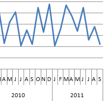
Here is my response to the recent Friday Challenge on Creating a Chart for Multi Years by Month.
You can read more about the original...
How-to Graph Three Sets of Data Criteria in an Excel Clustered Column Chart
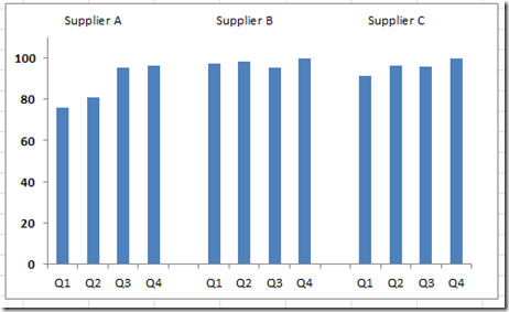
Here is a very simple solution to a common Excel Charting question when a user wants to graph “Three sets of data criteria on...

