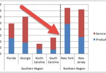
Recently in an Excel Forum, a user was asked to create a chart that compared 4 companies by month in a Column Chart.
HOWEVER, there was a twist.
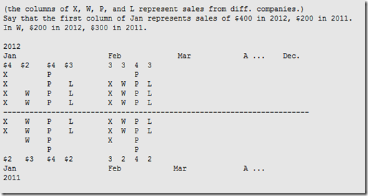
The user was asked to put the data in such a way that the data from each company would be put in an up and down or mirror image fashion. This user was stumped but here is how to make this type of chart.
Here was their sketch of the chart using text:
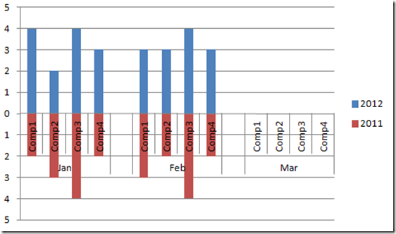
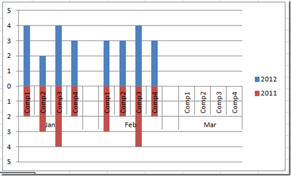
Here was my solution given their sample data:
Do you think this matched the requested chart? I thought so, so lets break it down and learn how to make this (as I call it) Horizontal Tornado Chart Grouped by Month.
The Breakdown
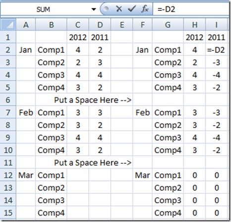
1) Create the initial data area and then Add an Extra Row and Space between each month to separate the months or create an axis grouping (See data table below).
2) Make an Excel chart area that represents your data with positive numbers for the current year and negative numbers for the previous year.
3) Move the Previous Year Data to the Secondary Axis and delete the secondary axis.
4) Change the Number format on the Primary Axis so that the Negative numbers are shown as positive.
Step-by-Step Chart Tutorial
1) The first thing we need to do is to set up the data in such a way that it makes the chart easier to create. To do this, you would want to group your Excel data with data for each month for all four companies and then we separate the next month with an additional row. Finally, for the chart to add a line break in between each group. Your data would look like this: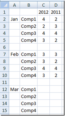
2) Now that we have the initial data set up, we would now want to create a Chart Area that represents how the Excel Chart should treat our data. Since our request was to have a mirror image of the data in an up/down manner, we need to change the previous year data to a negative number. This will then create the Tornado Chart that we are looking for when we create the Excel Graph. Finally, we need to put a space in the cell before the next month so that Excel will think it is a new group.
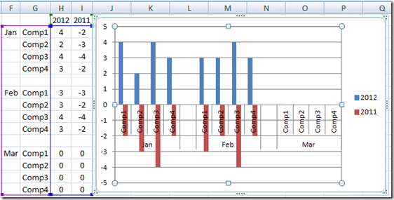
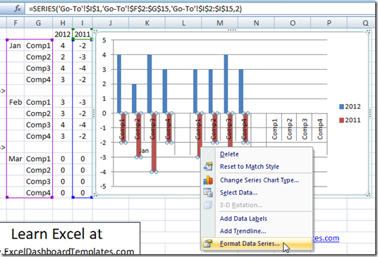
3) Okay, we can now create the Chart for our Executive Company Dashboard by highlighting cells F1:I15 and then insert a chart from the Insert Ribbon. Here is how your initial graph will look:
This is close because we set up our Excel Chart Range correctly, but we need to fix a few problems.
4) First we need to move the previous years data to the Secondary Axis. You can do this by right clicking on the previous year’s columns (shown in red) and then choose format data series.
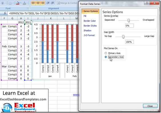
From this Format Data Series Dialog Box select Secondary Axis
and your chart will automatically change like this: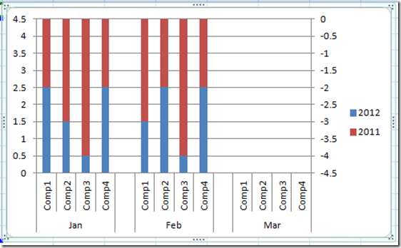
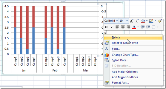
5) Not quite what we are looking for, so we need to delete the Secondary Axis and it will give us what we want. So right click on the Secondary Axis and Choose Delete from the Menu or just hit your delete key.
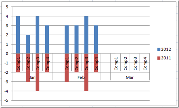
Once you delete that Vertical Axis your Excel Chart will now look like this:
Looks pretty good ![]() but we have one problem since the Primary Vertical Axis Numbers are displaying negative numbers. Not what the client wanted
but we have one problem since the Primary Vertical Axis Numbers are displaying negative numbers. Not what the client wanted![]() . But we can fix that
. But we can fix that ![]() No Problem.
No Problem.
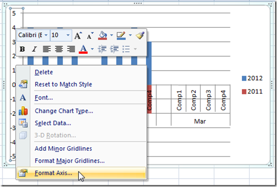
6) To adjust the vertical axis to only show positive numbers, we need need to adjust the number format for the vertical axis. We can do this by right clicking on the Primary Vertical Axis and then select Format Axis.
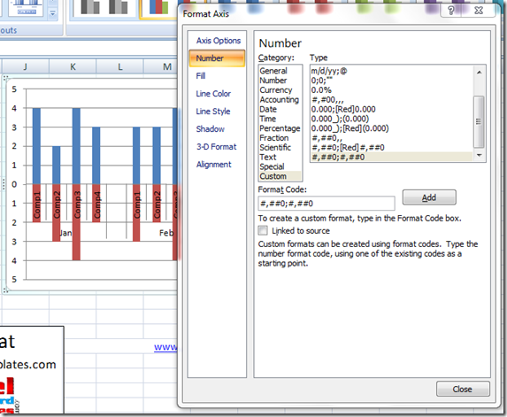
Then choose the Number Sub menu and Choose the Custom Category and place this number format in the Format Code text box
#,##0;#,##0
You will see it automatically change your Primary Vertical Axis to the desired affect as the Format Code tells Excel to format Positive Numbers before the ; and then how to format Negative Numbers just like the Positive Numbers.
Now we have our final chart and it is just what the Company Executives wanted.
Click Here To Download the Free Sample File with Instructions:
Excel-Horizontal-Tornado-Chart-Sample-File-Original.xlsx
Click here for a Free Video Demonstration on How-to Make a Horizontal Tornado Chart in Excel:
Please let me know if you found this post helpful by leaving a comment.
Also, don’t forget to sign up for the newsletter so you are sure to get the latest posting.
Steve=True

