Add Vertical Line Between Columns in Excel Stacked Column Chart
In this tutorial, you will learn how to QUICKLY add a vertical line between columns in a stacked column chart to visually separate your graph data. This request came from one of our fans as they wanted to know “How would you add a vertical line to a stacked chart without using shapes? Thanks.”
It is not too difficult, but there is a trick to understanding how Excel plots columns in an Excel Stacked Column Chart or an Excel Clustered Column Chart. Once you understand how to add a Vertical Line Between Columns, your Excel Skills will rise dramatically.
The Breakdown
1) Create Stacked Column Chart
2) Create XY Series Data
3) Add Series to Chart
4) Change Added Series to XY Chart Type
5) Update Added Series XY Values
6) Change Added Series Line Color
7) Delete Legend Entry
Step-by-Step
1) Create Stacked Column Chart
The first step is to create a stacked column chart as it will help us with setting where the vertical line should be placed. Assuming your stacked column chart data setup in the following cells and format:
| A | B | C | D | E | |
|---|---|---|---|---|---|
| 1 | Products | Services | Total | ||
| 2 | Southern Region | Florida | 51 | 47 | 98 |
| 3 | Georgia | 36 | 84 | 120 | |
| 4 | North Carolina | 15 | 17 | 32 | |
| 5 | South Carolina | 14 | 38 | 52 | |
| 6 | Northern Region | New York | 97 | 52 | 149 |
| 7 | New Jersey | 54 | 90 | 144 |
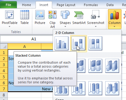
Highlight the range of cells A1:D7 and then go to the Insert Ribbon and Select Stacked Column Chart:
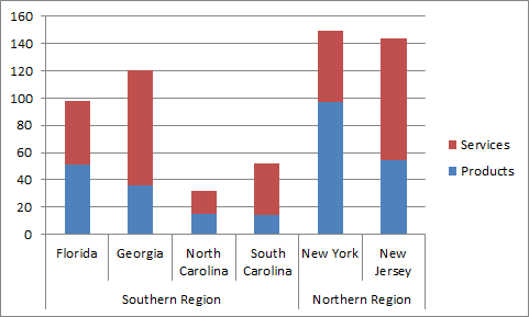
Your Chart should now look like this:
2) Create XY Series Data
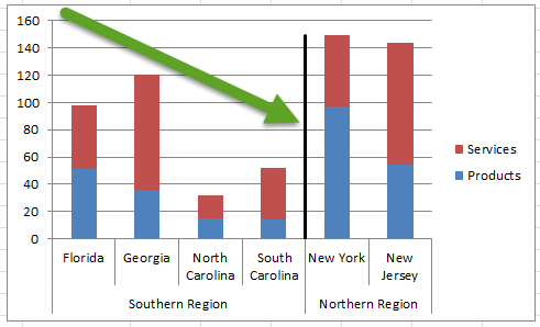
In order to create the vertical line, we need to create data to be used in an XY Scatter Chart. To do this, simply create a new data range for the vertical line. In this tutorial, we want to place the vertical line between the 2 regions (i.e Between South Carolina and New York). So we need to setup the following XY series data in these cells.
| A | B | C | |
|---|---|---|---|
| 9 | xy series | x | y |
| 10 | 4.5 | 0 | |
| 11 | 4.5 | 149 |
X Values:
The X data values will place the line between the 4th and 5th columns. Excel treats each column in increments of 1. So since we want to put the vertical line between South Carolina and New York, this would be a value of 4.5 for each of the X points.
Y Values:
The line will start at the horizontal axis, so we will need to enter a value of 0 for one of the Y values. The second value should be equal to the maximum of the total of the largest values of the stacked columns. In this case, you can enter a formula of =MAX(E2:E7) in cell C11. The resulting value will add a line at the top of the largest stacked column.
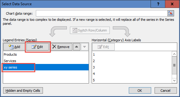
3) Add Series to Chart
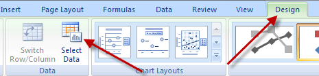
Now we can add the additional series to the chart that will be used for the Vertical Line Between Columns. In order to do that, first select the chart, then click on the Select Data button.
Then click on the Add button on the Legend Entries (Series) button:
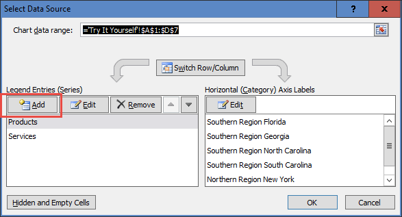
Next select the following cells and press okay to close all dialog boxes:
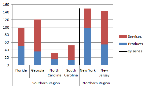
Your chart will now look like this:
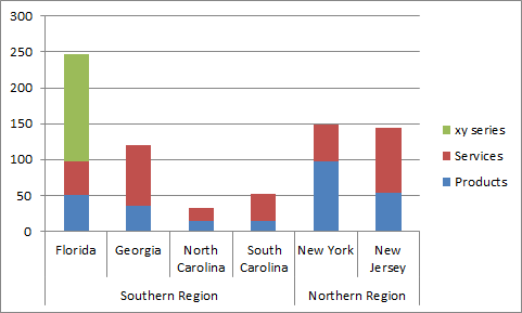
4) Change Added Series to XY Chart Type
Now that you have an additional series that will be used for the Vertical Line Between Columns we need to change the chart type to an XY Scatter with Straight Lines Chart. To do this, first select the chart, then select the XY Series and then select the Design Ribbon and press the Change Chart Type button:
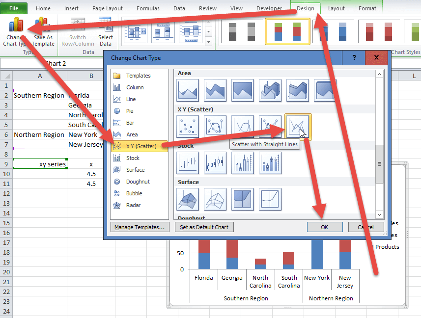
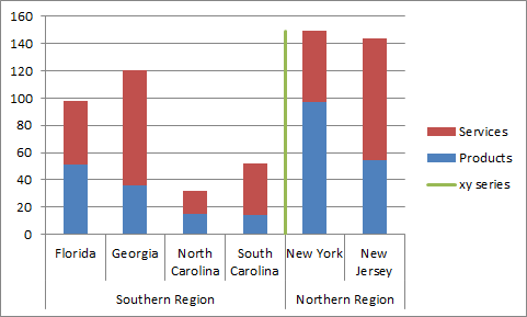
Your chart will now look like the following:

Don’t worry that you cannot see the XY Series, it will be visible and in the right position on the next step.
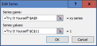
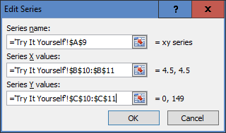
5) Update Added Series XY Values
To create the vertical line, we need to adjust the XY Series data points so that they have two x’s and y’s so that Excel can draw the line. To do this, first select the chart and then select the Design Ribbon and choose the Select Data button:

Then select the XY Series and press the Edit button in the Legend Entries (Series) area:
Next update the ranges of the X’s and Y’s to the ones you created in the previous step #2 as you see here:
Your chart should now look at this:
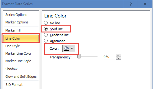
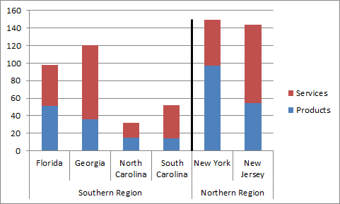
6) Change Added Series Line Color
With a vertical line added that separates our Excel chart, the graph is looking good, but I believe that to truly separate the regions the line should be bolder and set to a black line color. To do that, select the chart, then select the vertical line and then press CTRL+1 to bring up the Format Data Series dialog box. From there, navigate to the Line Color section and choose Solid Line and also change the color to Black from the Color section picklist as you see here:
Note: if you are having problems selecting the line, check out this tutorial:
How-to Select Data Series in an Excel Chart when they are Un-selectable?
The chart with a Vertical Line Between Columns should now look like this:
7) Delete Legend Entry
[The final chart clean up to do is to remove the legend entry for the XY series. To do this, first select the chart, then select the legend. Then select the XY Series legend entry and press the delete key. Your final chart will now look like this:
This is a simple technique that is an Excel combined chart of a Stacked Column with an XY Scatter with Straight Lines. If you get this trick down, you will always be able to plot what you need as well as understand how Excel plots data on a Column or Line chart as each Legend Entry on the horizontal axis has a value of 1 starting from the leftmost value and adding across.
Video Demonstration
Check out this Video tutorial on the techniques presented above.
Sample File Download
Click here to Download the Free Sample Excel Template File:
Add-Vertical-Line-Between-Columns-in-Excel-Stacked-Column-Chart.xlsx
Let me know if you will now use this tip instead of drawing shapes in the chart or if you think just drawing a straight line shape on top of the chart is easier in the comments below.
Steve=True


