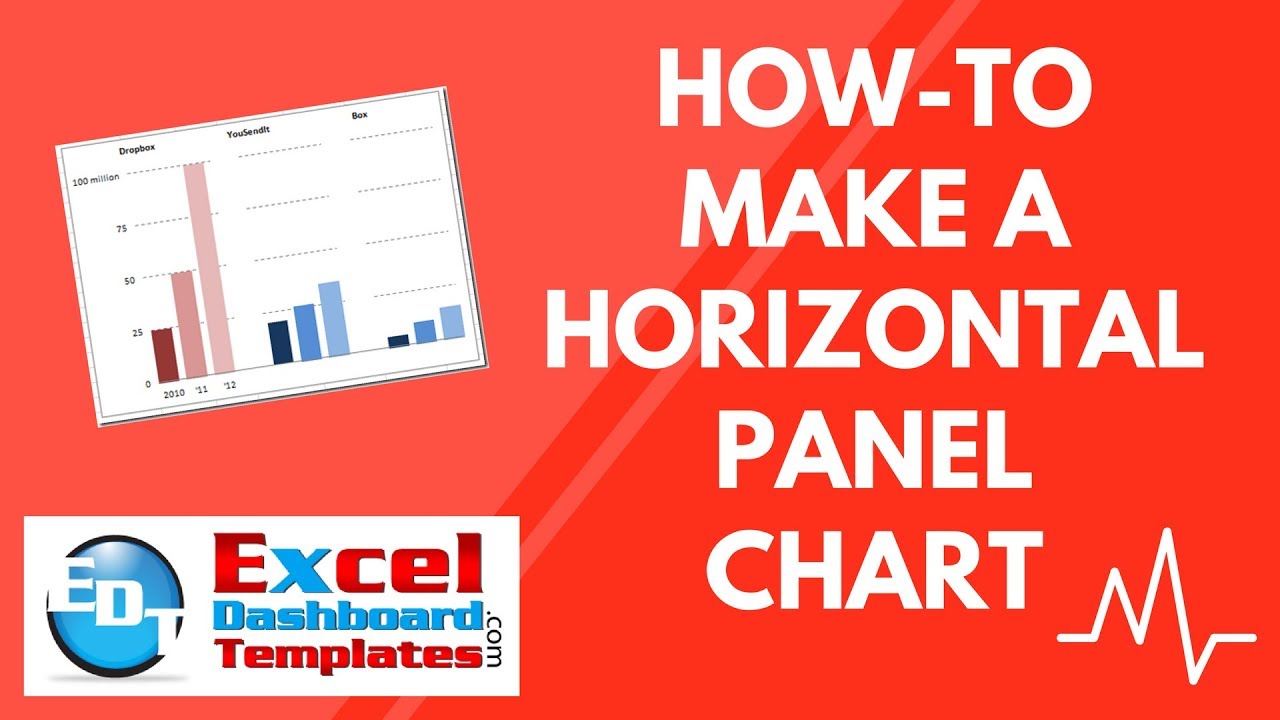
In a recent Wall Street Journal article I saw the following chart regarding Dropbox, YouSendIt and Box.com. The graph describes how many people use Dropbox vs YouSendIt vs Box. As you can see by the chart, Dropbox has almost double both of the other two services. The thing that intrigued me was how can you easily create this in an Excel Chart.

(Sorry for the poor quality ![]() , I took the picture with my IPhone.
, I took the picture with my IPhone.
Here is my rendition of the chart using an Excel Chart. This was all done by using the Excel chart functionality and there are no drawing or other shapes overlaid in the chart. It is just a chart.
The Breakdown
Here is what the chart has going for it and things you may wish to include in your Executive Dashboard Charts:
1) I have used another series to create what I call a Horizontal Panel Chart.
2) Also, I have 2 different label groupings/categories on the Top and Bottom of the chart that describes each one of the panel charts.
3) I have used special number formats to create the Vertical Axis.
4) I have modified the title with custom formatting.
5) I have changed the major gridline values and format.
6) I have removed the lines from both the vertical axis and the horizontal axis
And here is the final chart. Looks just like the original and all with the standard Microsoft Excel program.
Step-by-Step
1) Create the Data: Setup your data in the following fashion:
2) Create the Chart: Highlight cell range D3:G13
 and create a Column Chart by clicking on the Excel Insert Ribbon and then choosing a 2-D Clustered Column Chart from the Charts Group. Your chart will now look like this:
3) Fix the Primary Horizontal Axis:
a) No right click on the horizontal axis and then click on “Format Axis…” in the pop up menu.
b) In the Axis Options, choose “None” for the Major tick mark type:
c) Now click on the chart and then click on the Design Ribbon and then Click on Select Data button from the Data Group.
then click on the Edit button in the “Horizontal (Category) Axis Labels” from the Excel Select Data Source dialog box:

From the Axis Labels dialog box that pops up, please select cells C3:C13 and then press the OK button. 
You will now see the labels only show 2010, ‘11 and ‘12 on the horizontal axis only for the first data series.

4) Fix the Primary Horizontal Axis:
a) No right click on the vertical axis and then click on “Format Axis…” in the pop up menu.
b) Then change the Axis Options as follows:
Minimum = Fixed & 0
Maximum = Fixed & 1.05E8 (this equals 100 Million)
Major Unit = Fixed & 2.5E7 (this equals 25 Million)

c) Then click on the Line Color Options and choose “No Line”
d) Then click on the Number options and then click on Custom Category and input this in the Format Code: box and press Add button.
[>=100000000]0,,” million”;0,,

Here is another posting on making custom Vertical Axis number formats:
How-to Format Chart Axis for Thousands or Millions
Your chart should now look like this:
5) Change the major gridlines to a Dashed Line
Right click on any major gridline and then select “Format Gridlines…” from the pop-up menu.
then select the Line Style options and choose a Dash Type of “Dash” (the fourth one down)
Your chart will now look like this:
6) Fix the Column sizes, Colors and Axis Placement (this is how we make the panel chart look)
a) Right click on the left most data series in the chart and click on the “Format Data Series…” item from the Excel Chart pop up menu.
b) Now lets change the Series Options by changing the Series Overlap to 80% and a Gap Width to 0% or No Gap. Then Press Close.
Now your chart should look like this:
c) We will now create the horizontal panel chart look and feel. Select Series 4 by first Selecting the chart and then select “Series 4” from the Chart Elements Picklist in the Current Selection group.
You can check out a video on selecting data series in charts on this posting:
How-to Select Data Series in an Excel Chart when they are Un-selectable?

Then press Ctrl+1 or select the “Format Selection” button from the Current Selection group in the Layout Ribbon.
From the Series Options, change the “Plot Series On” to the Secondary Axis:
Then WITHOUT CLOSING THE DIALOG BOX, select the Fill options and change it to Solid Fill with a Color of White:
Now it won’t look like you have done anything, but you have and we will show you in a minute after we change the colors of the other series.
d) Finally, lets change the color of each data point that you can see on the chart. Start with the data point on the far left by first selecting the chart series on the left and then selecting a second time the far left data point. It will look like this: 
Now that you have selected the individual data point for this series, right click on the data point and choose “Format Data Point…”
Then from the Format Data Point Dialog Box, choose the Fill options and Solid Fill with a Color of Red Accent 2 25% and your charted data point will look like this:
For the data point directly to the right of the last one, follow the same steps to make that data point one shade lighter:
Continue this process making the left series shades of red and the right two the same shades of blue each in succession. Your resulting chart will look like this:
7) Create upper horizontal categories and horizontal panel.
We are almost done. Don’t worry ![]()
a) You need to click on the chart and then go to the Layout Ribbon. From there click on the Axes button from the Axes group. From there you need to select the Secondary Horizontal Axis and then choose “Show Left to Right Axis”

Your chart will now look like this:
Wow, it now looks like an Excel Horizontal Chart Panel. Notice the gridline breaks in between each series?
b) Now we need to replace the secondary horizontal categories (the upper one) with the words DropBox, YouSendIt and Box.com. To do this, select the chart and then open up the Select Data dialog box from the Chart Design Ribbon. 
From there, you need to select “Series 4” from the Legend Entries (Series) area and then click on the Horizontal (Category) Axis Labels “Edit” button on the right. You MUST click on the “Series 4” before you click on the Edit on the right. If you do not do this, you will change the wrong horizontal axis.
Then you need to select the range of B3:B13 to change the secondary horizontal category labels.
Your chart will now look like this:
c) Almost there. So lets get rid of the secondary horizontal axis line on the top. To do this, right click on the Secondary Horizontal Axis (the one on the top) and choose “Format Axis”:
From the Axis Options, change the “Major tick mark type” to “None”
And also change the “Line Color” Options to “No Line”
And then click on the Home Ribbon and click on Bold and then your chart should now look like this:
8) Hide the Secondary Vertical Axis (right one)
So lets get rid of the secondary vertical axis line and values on the right and on the secondary vertical axis on the right. To do this, right click on the Secondary Horizontal Axis (the one on the right) and choose “Format Axis”:
From the Axis Options, change both the “Major tick mark type:” and also the “Axis Labels:” to “None”:
And also change the “Line Color” Options to “No Line”
9) Clean up the chart by removing the Legend and then add/customize a Chart Title.
a) For the Legend, do this by selecting the Legend and pressing the delete key.
Your chart will now look like this:
b) For the title, I won’t show you how to do the Excel Chart Title because you should have learned that in my last post. Here is a link so that you can find it easily:
Customizing the Standard Excel Chart Titles
ALL DONE!! Lets look at the 2 charts side by side. What do you think? Looks the same to me.


VIDEO TUTORIAL
Here is a free Excel video tutorial show you how quick and easy to do this Horizontal Panel Chart tip and trick.
Let me know what you think in the comments on if you will use this technique.
Steve=True


