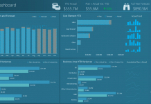
For this Friday Challenge, lets see if we can help this user with their data.
Read it over, but really, the last line of the request is my favorite “other ways”. This can be with one chart or with many in a dashboard style.
So have at it and if you want to send me your answers, leave me a comment below and I can send you an email for your submissions.
“Hi All, I have completed multiple charts and statistical analysis years ago in statistics class and I cannot remember how to do a simple analysis of a multiple year, weekly attendance record. I used the linear chart template and plotted the data that way, but I’d like to take it further and add a trend line so that I can get an idea of what’s going on overall, instead of just looking at the yearly averages. Data is provided below. If you’d like to provide other ways to consider presenting the data, please feel free to share!”
| A | B | C | D | E | F | G | H | I | J | |
|---|---|---|---|---|---|---|---|---|---|---|
| 1 | 2013 | 2012 | 2011 | 2010 | 2009 | 2008 | 2007 | 2006 | 2005 | |
| 2 | ??Jan | 242 | 270 | 242 | 286 | 279 | 292 | 314 | 322 | 315 |
| 3 | Feb | 237 | 240 | 256 | 235 | 290 | 292 | 280 | 298 | 311 |
| 4 | Mar | 277 | 243 | 257 | 311 | 275 | 366 | 297 | 319 | 395 |
| 5 | April | 222 | 322 | 348 | 295 | 354 | 306 | 346 | 400 | 324 |
| 6 | May | 235 | 229 | 229 | 242 | 273 | 312 | 274 | 300 | 330 |
| 7 | June | 197 | 219 | 226 | 236 | 242 | 268 | 253 | 298 | 313 |
| 8 | July | 203 | 197 | 183 | 212 | 212 | 282 | 252 | 283 | 275 |
| 9 | Aug | 210 | 211 | 212 | 221 | 247 | 272 | 254 | 292 | 276 |
| 10 | Sept | 202 | 213 | 223 | 266 | 236 | 319 | 305 | 313 | 305 |
| 11 | Oct | 219 | 221 | 229 | 240 | 243 | 259 | 280 | 300 | 311 |
| 12 | Nov | – | 234 | 272 | 278 | 289 | 280 | 315 | 281 | 340 |
| 13 | Dec | – | 237 | 266 | 255 | 237 | 276 | 301 | 356 | 349 |
| 14 | AVG | – | 236 | 245 | 256 | 265 | 294 | 289 | 314 | 320 |
| 15 | Diff. | – | 9 | 11 | 8 | 29 | -4 | 24 | 7 | – |
Looking forward to your submissions.
Steve=True


