In last week’s Challenge, I posted a question from an Excel User Forum that asked the following:
“I’ve used Excel 2010 to create a bubble chart plotting the risk-reward analyses of a portfolio of research projects. X-axis is the potential reward of the project, y-axis the probability of success, z-axis (bubble size) is the budget.
I would like to control the color of the bubbles by a fourth, qualitative text attribute of the project type. So each project (bubble) would be characterized as either “New Product”, “Optimization” or “Tech Transfer”.
Can this be done by conditional formatting? If you could point me in the right direction, it would be most appreciated. – Cheers, John”
Here is the dataset that I created based on the request to try and make solution:
| A | B | C | D | |
|---|---|---|---|---|
| 1 | ||||
| 2 | Type | X Reward | Y Probability | Z Bubble Size |
| 3 | New Product | 8 | 8 | 80 |
| 4 | New Product | 9 | 10 | 29 |
| 5 | Optimization | 1 | 9 | 13 |
| 6 | New Product | 10 | 0 | 62 |
| 7 | Tech Transfer | 9 | 9 | 52 |
| 8 | Optimization | 7 | 7 | 12 |
| 9 | Tech Transfer | 9 | 10 | 22 |
| 10 | New Product | 2 | 0 | 0 |
| 11 | New Product | 4 | 7 | 29 |
| 12 | Tech Transfer | 8 | 2 | 30 |
So how did you perform this task? I chose to use If statements with that utilize the NA() function. What does the NA() function do? The NA() Function will make your conditional formula an error value of #N/A. The resulting #N/A essentially says that there is no value available. We use #N/A to make the Excel Chart not display the value (mostly as if it were an empty cell). Now this may seem pretty straight forward for some users, but the other trick with this challenge is how you set up the chart data range so that you can easily create the Excel bubble chart.
The Breakdown
1) Setup the Chart Data Range
2) Create Chart Data Conditional Filters by Type
3) Create Excel Bubble Chart
4) Change Series Names to Type Names
5) Chart Cleanup
The Step-by-Step
1) Setup the Chart Data Range
So our original data range for our Excel Bubble Chart is from cells A2:D12. Lets go ahead and chart that in a Bubble graph. To do this, you only need to highlight cells B3:D12 (the actual data). It would look like this: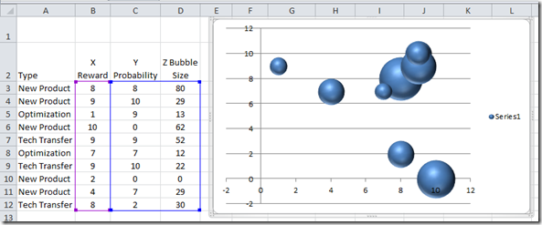
This is what the real data would look like. Here is a note, if you try and create a chart from the data and if you include the Types in column A, your chart will not look like what you wanted. Notice that it creates an additional series that doesn’t really exist. 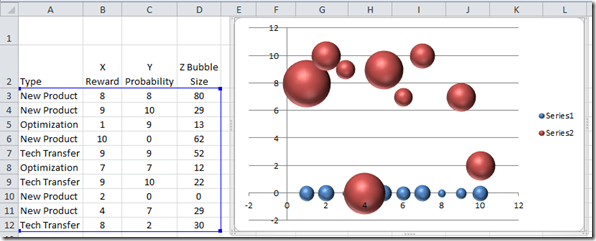
Then if you try and include the column headers in row 2, you will get this type of chart. It has our type names, but the data is not in the right place. So not good.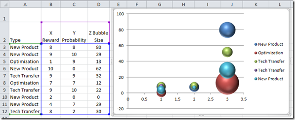
It is important to know that you only chart the data when making an Excel Bubble Chart. So with that in mind, we need to create our final chart data range. Here is the setup that we want.
| A | B | C | D | E | F | G | H | I | J | K | L | |
|---|---|---|---|---|---|---|---|---|---|---|---|---|
| 1 | New Product | Blue | Optimization | Red | Tech Transfer | Green | ||||||
| 2 | Type | X Reward | Y Probability | Z Bubble Size | X’s | Y Probability | Z Bubble Size | Y Probability | Z Bubble Size | Y Probability | Z Bubble Size |
Lets break this part down a little further.
a) Column F will hold the values for our X Values (horizontal axis). This is the main tip and trick for Excel Bubble Charts with multiple series. Each series will use the same X values.
Blue Series
b) Column G will contain our Y Values (vertical axis) when the type is equal to our value in cell G1 (New Product).
c) Column H will have the bubble size for this series when the type is equal to our value in cell G1 (New Product).
Red Series
d) Column I will contain our Y Values (vertical axis) when the type is equal to our value in cell I1 (Optimization).
e) Column J will have the bubble size for this series when the type is equal to our value in cell I1 (Optimization).
Green Series
f) Column K will contain our Y Values (vertical axis) when the type is equal to our value in cell K1 (Tech Transfer).
g) Column L will have the bubble size for this series when the type is equal to our value in cell K1 (Tech Transfer).
2) Create Chart Data Conditional Filters by Type
Okay, now that we have how we want our data set up, we need to make our Excel chart data range formulas.
a) The first one is easy. For our X values, since they are the same for all series, we just need to put this formula in cell F3
F3 =B3
b) For the New Product Y values in in cell G3, we need to create a quick conditional formula using an IF statement:
G3 =IF($A3=G$1,$C3,NA())
In written terms, if the Type in cell A3 equals the value that we have in our series name in cell G1, then put the value that exists in cell C3. If it is not equal, then put in #N/A. To get a final value of #N/A, we need to use the NA() function.
c) For our Excel Chart Bubble Size values in cell H3, we need to put this easier conditional formula:
H3 =IF(ISNA(G3),NA(),$D3)
This formula as written states that if cell G3 is equal to a #N/A value, then input a #N/A value in cell H3. If not, we should copy over the value in cell D3 for our bubble size.
Now one other note is that you may have noticed that not every cell reference is an Absolute Reference nor a Relative Reference. I did this so that we can simply copy over these formulas to the other 2 chart series for Optimization and Tech Transfer. For instance, when you only see one dollar sign ($) before a reference, it means that it will lock down the reference to the column or the row, but not both when we copy the formula. And when you don’t see any $, then the reference will move according to where you copy it. If you want to learn more about this, please check out this post:
Referring to Ranges in Formulas for your Excel Dashboard Templates
d) Now what we have our chart series formulas, we can copy them down and across our data range to make our new chart data range.
First, copy cells F3:H3 down to cells F4:H12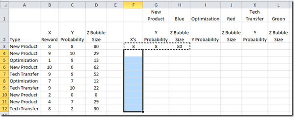
Now that you have done that, we need to copy the range of our Y values and Bubble sizes from G3:H12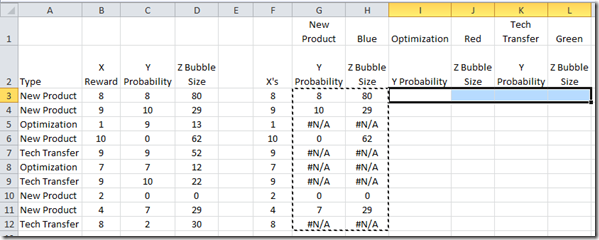
to cell range of I3:L12. Your new chart data range should look as follows: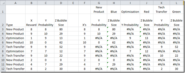
Looking at the chart data range, you will see that there is only one value for each line. This will break up our data into 3 series that will each be colored differently. This is how we conditionally create different colored series in an Excel Bubble chart.
3) Create Excel Bubble Chart
Okay, all the heavy lifting has been completed with our conditional Excel formulas. Now we need to make our chart. To do this, as I said before, we need only highlight our DATA to create the Excel Bubble Graph. So highlight the chart data range from F3:L12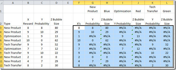
Then go to the Insert Ribbon and choose the Other Charts button from the Charts Group and then choose a Bubble chart type :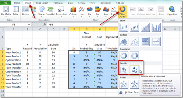
Your resulting chart should look like this: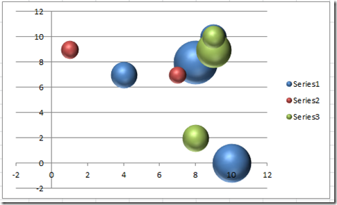
That is pretty close to what we wanted. However, since there is no easy way to tell Excel what our Series names should bee since we have multiple data points in each series, we should probably rename each series so that the Legend gives more information.
4) Change Series Names to Type Names
To change the series names, we need to first click on the chart, then go to the Design Ribbon and choose the Select Data button from the Data group: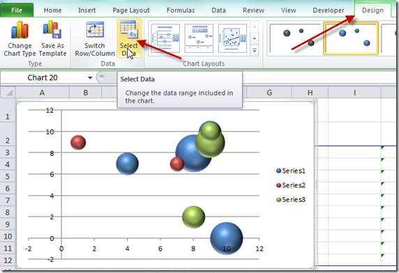
You will now see the Select Data dialog box. From there, select Series 1 in the Legend Entries (Series) area of the dialog box. And then choose the Edit button: 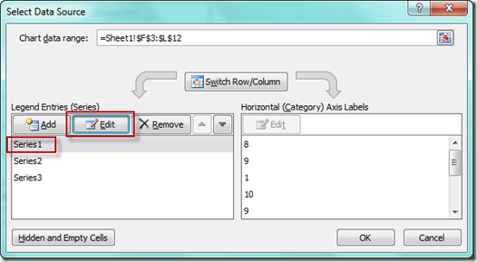
This will then bring up the Excel Edit Series dialog box. You should now click in the Series Name box and then click on cell G1: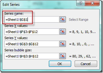
Click on OK. Then repeat this step for Series 2 and Series 3: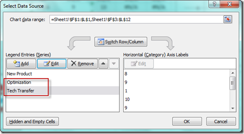
No your resulting chart should look like this with the updated legend: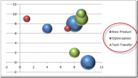
5) Chart Cleanup
Now the final thing you may have to do is to update the Minimum horizontal axis to Zero. Do this by clicking on the horizontal axis. Then press CRTL+1. You will now see the Format Axis dialog box.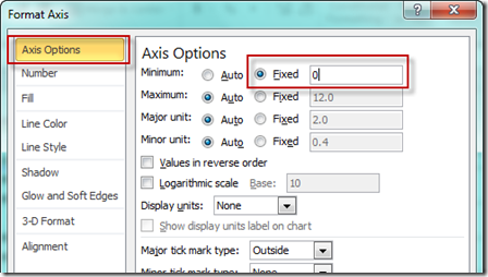
Then change the Minimum Axis Options choice to Fixed and a value of Zero (0). Your final chart should now look like this: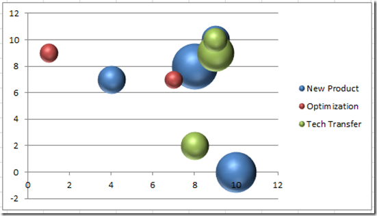
The Video Tutorial
Please check out the video demonstration here.
If you like it, please press the like (thumbs up button) for me ![]() .
.
The File Download
Your can download your free Excel dashboard dynamic bubble chart color template here:
Dynamically_Change_Bubble_Chart_Colors
Thanks for trying my challenge and hopefully you learned a new technique for your next Excel Company Dashboard. If you liked it, please share it with a friend and leave me a comment. Thanks and don’t forget to subscribe.
Steve=True


