So in yesterday’s post, I showed you that in Excel 2013, you can now add leader lines to your Line Chart. They are not just reserved for Pie Charts like in previous versions of Excel.
But I think this chart has gone way to far.
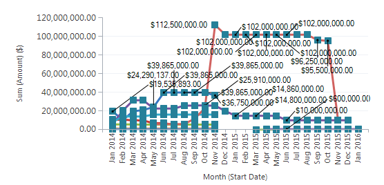
It is a base chart in Microsoft Dynamics CRM online.
I can’t figure out how to change it to remove the labels in leader lines with the basic options.
Does anyone know how to fix that in Dynamics CRM? Let me know in the comments below, because this chart is driving me crazy 🙂
What is the worst chart you have seen?
Leave me a comment below and I can contact you for a copy to share on a future Tuesday.
Thanks for being a fan!
Steve=True


