Here is a late entry 🙂 Thanks Leonid. This is an Awesome response!
Leonid was responding to this recent challenge: Friday Challenge – Pipeline Usage Chart
Leonid’s Solution:
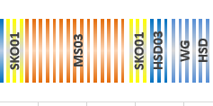
Essentially, this solution is a Clustered Column Chart. However, to achieve the labels, Leonid added another XY Scatter chart.
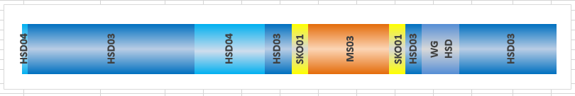 The ingenious design is that he used 100 columns of height 1 and eliminated the gaps to make it look like a Stacked Bar Chart.
Y positions for all labels is 0.5 (middle of the bar height) and X positions are calculated as midpoints of corresponding blocks of columns.
Number of columns in each block is rounded percentage to total for each product occurrence.
Cylinder visual effect was created using gradients.
Here is what his chart data table looks like:
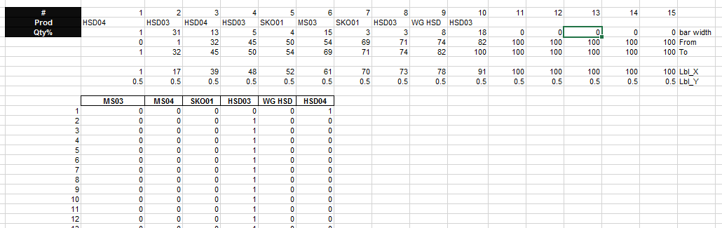
His first step was to calculate the percentage of the total for each pipeline usage by product.
Next he created a Chart Data table for his products in a length of 100 data points per product. Then using a SumProduct formula to determine the start and stop of each product from 1 to 100.
=SUMPRODUCT((D$43=$D$35:$R$35)*($C44>$D$37:$R$37)*($C44<=$D$38:$R$38))
What a great solution. Forcing the 100 percentage of pipeline usage into discreet 1% chunks of data that can be charted all at the same height to make a representative clustered column chart.
Only 1 issue that I can find with using this technique 🙂 But I think it can be fixed. The issue is what happens to usage values that are less than 1% of the total? In this case, if you enter something below 798 then that sliver of data doesn’t appear in the chart. I think the fix would be to increase the number of data points from 100 to something larger like 1000 or 100000. Then only values below 79 or 7.9 will be affected and either one of these may not be a realistic data points so it would be okay.
Download Leonids Pipeline Usage Sample Chart Solution here: Leonids Chart Challenge Answer.xlsx
Thanks again Leonid. I think it is an awesome solution! I liked it!! What do you think? Let me know in the comments below.
Steve=True


