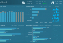
An Excel forum user posted the following question. I wanted to see how my readers would answer the following question. Tomorrow I will post my solution (although I am sure it is not the best). Please let me know you solution by posting a comment below. So read on and come back tomorrow.
Here is the question that was posted:
Presenting Metrics Data
Trying to find the best way to display some metrics and am coming up with a blank as I need to provide business metrics data for number of calls data and preferably with Excel 2010.
Initial thought was to create a line graph with points and hyperlink the points to the sub-topics but can’t figure out how to do that, then I thought about a bar graph with different layers to it as to each sub-topic with no such luck.
Example below:
Specific Administration is the overall topic with a total of 417 for all other categories with “Add/Edit Contacts, Policy, Proctor Password, Request to Change Data” all falling under Specific Administration.
Then Navigation falls under Add/Edit Contacts, and General, Refer to XYZ, Refer to XY all falling under Policy and of the 381 stats for Policy is broken down by those and so I need to put that information with the sub-topic but not all sub-topics will have a sub-topic layer 2Here is the sample the user provided
So how would you display the following information for an executive dashboard company presentation using Excel? Let me know in the comments below. Tune in tomorrow for the way I would present the data. See you tomorrow!
Steve=True


