While fooling around with Excel, I wondered if I could make an Excel chart look like a the Star Wars Death Star. Well, I think I was able to create a pretty good Excel Death Star chart. I have come to believe that we can do almost anything in Excel.
Here is what image I was using to try and recreate the Death Star in an Excel chart and graph:
Here is the Excel chart I was able to create. I think it looks very very close to the image above.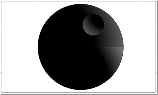
Note that this is all done with one pie chart. I have NOT drawn shapes or done any other trickery except to modify a Standard Excel Pie Chart.
Check it out how you can make your own Star Wars Death Star Pie Chart below:
The Breakdown
1) Setup the Data Series, Insert Pie Chart and Switch Row/Column
2) Move Small Circle to Secondary Axis
3) Change Small Circle Pie Explosion and Angle of First Slice
4) Add Boarder Color of Light Grey to Both the Large and the Small Circle
5) Change the Angle of First Slice on Large Circl
6) Change Small Circle Fill to a Gradient Fill
7) Change Fill of Large Pie Individual Data Points (Pie Slices) to a Gradient Fill
8) Manually Reposition Small Circle and Remove the Legend
Step-by-Step
1) Setup the Data Series, Insert Pie Chart and Switch Row/Column
First we need to set up the data series for the Excel Death Star Graph. It is a pretty simple set of data. Set up your chart data like this: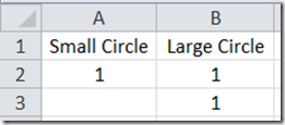
The data in column A will be what we use to create the death ray that comes out of the Death Star during the Star Wars movies. The data in column B will be used for the round moon like shape for the outside of the Death Star. The reason we have two 1’s in the Large Circle data points in column B is because we need to create an upper and lower sections of the Death Star separated by the service channel where Luke blows up the first Death Star.
Now lets create our chart, by highlighting the Excel range of A1:B3 – 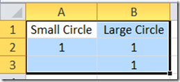
And then click on the Excel Insert Ribbon and choose the Pie chart button in the Charts group: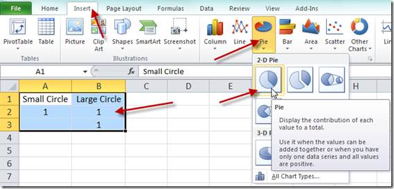
Your Death Star pie chart should look like this: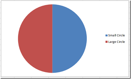
Now you are probably saying that this doesn’t look anything like a Death star, but we need to rearrange a few things to make it take shape. So let’s do that now. Click on the chart and then click on the Excel Design Ribbon and then choose the Switch Row/Column button in the Data group: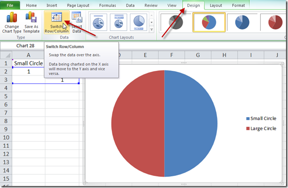
Your chart should now look like this: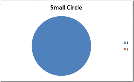
2) Move Small Circle to Secondary Axis
Now your version of Excel may have not labeled the series correctly. Notice above that it should show Series 1 as Small Circle and 2 as the Large Circle. So what we need to do is to move the “1” series you see in blue above to the secondary axis. You can do this by right clicking on the “1” data series and choose “Format Data Series…” from the pop up menu: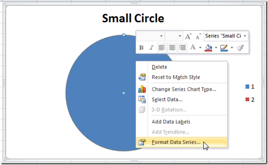
Then choose “Secondary Axis” from the Plot Series On of the Series Options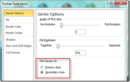
Now your chart won’t look any different, but if you press the “Switch Row/Column” 2 times, your chart legend will change automatically to look like this. Seems like a bug in Excel if you ask me ![]() .
.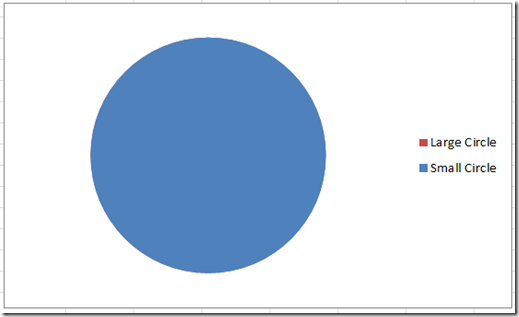
Notice how the Excel chart now has the Small Circle as the blue data series and not a “1”? Same for the Large Circle. If this is not a bug, please let me know in the comments.
3) Change Small Circle Pie Explosion and Angle of First Slice
Okay, our pie chart just looks like one big pie slice and not a Death Star, but here is where it starts to take shape. Click on the blue data series titled “1” or “Small Circle” and then press Ctrl+1 and you will then see the Format Data Series dialog box.
Then change the “Angle of first slice” to 210 and the “Pie Explosion” to 300: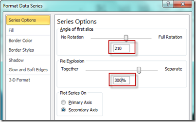
Your chart should now look like this: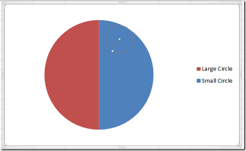
Now it doesn’t look like we changed much, but I have highlighted the Small Circle data series and you can see it if you look very closely, you can see the small circle faintly in the upper right hand corner.
4) Add Boarder Color of Light Grey to Both the Large and the Small Circle
Since we can’t see the small circle and so that we can make the final chart stand out, let’s change the border color of both of the data series to a light black color. You can do this by selecting the either of data series and then press Ctrl+1 to bring up the “Format Data Series” dialog box. Then choose the “Border Colors” from the left selections and then choose “Solid Line” and then choose a Black color of Lighter 15% as you see below. Repeat this step for the “Small Circle” data series as well.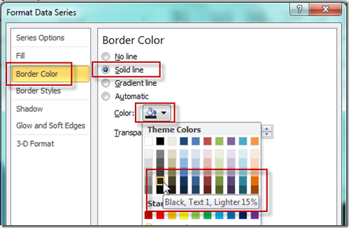
Now your Excel Chart should look like this: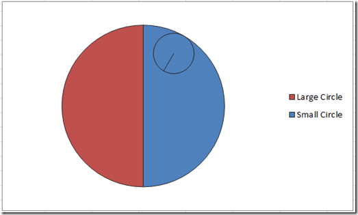
5) Change the Angle of First Slice on Large Circle
So we are getting very close, but we need to move the angle of the outside (Large Slice) of the Death Star so that the middle line between the slices is horizontal, not vertical. So to do this, we need to click on the Large Circle data series and then press Ctrl+1 to bring up the “Format Data Series” dialog box. Then change the “Angle of the first slice” to 90: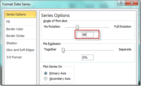
Your resulting chart should now look like this: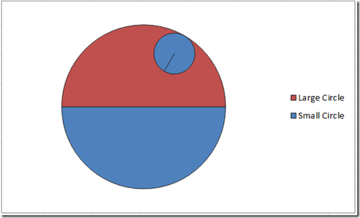
Looks really close now ![]() , way cool. Now we just need to change the color fill and make a few other changes.
, way cool. Now we just need to change the color fill and make a few other changes.
6) Change Small Circle Fill to a Gradient Fill
In the original Star Wars Death Star picture, you will see that a sun or light of some kind is casting a light on the Death Star that is creating shadows. To make this kind of effect, we will need to use a Gradient Fill color of black and grey. Select the small circle, then press Ctrl+1 and change the Fill settings to this:
Here is how I set up the gradient fills for the small circle. 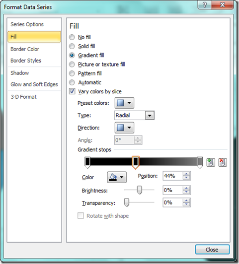
Your chart should now look like this: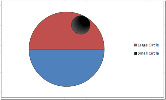
7) Change Fill of Large Pie Individual Data Points (Pie Slices) to a Gradient Fill
That is looking good, but we also need to change the fill of the Large Circle data series. You need to first start with the upper part of the large circle data series by double clicking in it. Then press Ctrl+1 and change the Fill settings to this: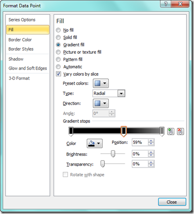
Now you need to work on the lower part of the large circle data series by double clicking in it. Then press Ctrl+1 and change the Fill settings to this: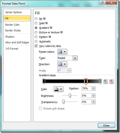
Your chart should now look like this: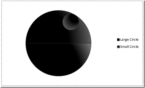
8) Manually Reposition Small Circle and Remove the Legend
Our Excel Star Wars Death Star chart looks almost complete. We just need to move the small circle and then delete the legend.
To move the small circle, you need to click on the Small Circle, then select it a few times with your mouse. Then drag and drop it down and to the left.
Also, click on the legend and press your delete key.
Your final chart should now look like this:
Video Tutorial
You can check out this entire process with this video demonstration of this pie chart technique here:
I think it looks cool. What do you think? Let me know in the comments. Also, don’t forget to subscribe to my blog so that you get discounts on future products.
Steve=True


