Hello everyone. Sorry, that I haven’t presented the solution to last Friday’s challenge yet, but I have been a bit under the weather and traveling, so I have been unable to get to it. I had two great submissions from Don and Pete and they matched pretty closely to my solution. However, mine has a few cool features that I wanted to share. I will try and post my solution shortly.
In the meantime, I wanted to tide you over with something to think about. In today’s Friday challenge, I present to you with this user conundrum. Although it appears to be easy upon reading, it may throw some of my readers for a loop when the sit down and try and recreate it.
********************************************************************
Stacked Bar With Distribution Within a Given Range
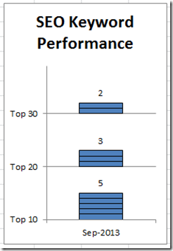
“I am looking to create a stacked bar with distribution within a given range for seo keyword performance reporting.
Say there are 10 keywords we are tracking.
5 are within the top 10 results
3 are within the top 20 results
2 are within the top 30 results
This would be one month – one plot on x axis.
The y axis should scale 0-30 at 10 point intervals, so 0, 10, 20, 30.”
– Excel User
********************************************************************
Here is your mission, should you choose to accept it:
1) Recreate this chart using a stacked bar chart: (Note: I didn’t follow their requirements 100% but I think my chart / infographic gets the message across that the user was trying to convey.)
2) Take it a step further and send me a better chart than my solution.
If you want to send me a submission, simple leave me a comment and one of the fields is your email address. I will then send you my email so that you can send me your submission.
I will post the submissions received and also how I made this chart in Microsoft Excel next week. Good luck!
Steve=True


