I thought I would give you all something to do before we finish the final posting on Excel Chart Sheets.
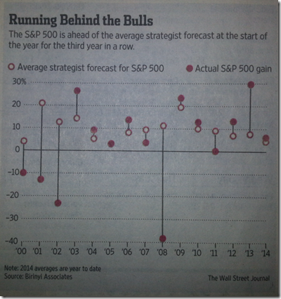
So I have been traveling for work a lot and that allows me to read more Wall Street Journals in the hotel. I saw this graph in Monday July 28, 2014 WSJ. 
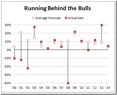
It depicts a year by year difference between analyst forecast for the S&P 500 and the Actual S&P 500 gains.
Here is my rendition using Excel standard charts.
See if you can recreate it. Below is the sample data to get you started and the reset is up to you.
Sample Data: Recreate-this-Excel-Chart.xlsx
If you want to send me your chart, leave me a comment and I will send you an email where you can send me your sample chart.
Also, I am not quite sure what to call this chart/graph since it is not a standard Excel format. How would you describe this chart? Leave me a comment with your chart type name below.
I will show you how I created this in my next posting. Thanks for being a fan!
Steve=True


