With the upcoming Open Championship (also known as the British Open) in Royal Lytham & St. Annes Golf Club, I wanted to see how far Tiger Woods fell and if we can determine if he has returned to t. So I decided to look at a few statistics and then create a charts that could be added to a Tiger Woods Dashboard.
In today’s post, I am just going to present the chart. See if you can recreate it. Then tomorrow I will post how I made it and a video demonstration to show you how to quickly make this Tiger Woods’ Dashboard chart.
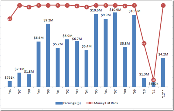
In this chart, I am going to compare how much Tiger has won year-by-year during his golf career and then also how his golf earnings rank year-by-year compared to the other golfers.
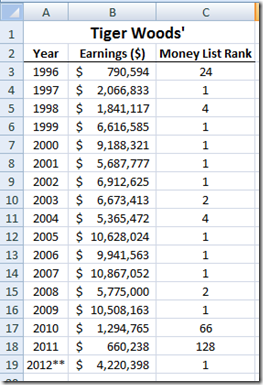
Here is how the data looks (Source: http://www.pgatour.com/players/00/87/93/results/):
Here is the chart that I created from this data. What do you think of this chart? Let me know in the comments…but here are my thoughts on Tiger’s rise and fall and perhaps…rise again?
From this chart it appears that Tiger may be back. What do you think? During Tiger’s darkest times, he fell all the way to 128 on the money list. However, for all but 3 years of his 17 year professional career, Tiger has been at worst 4th on the PGA Tour Money List. Fifty percent (50%) of the time during his career Tiger has been #1 (number 1) on the money list. He has been 12 out of 18 times been 1st or 2nd on the money list. That is 66.67% of the time, he has been 1 or 2. Wow, what a career so far.
So far, he has earned $99,037,940 during his career. If he wins just under $1 Million during the British Open (Open Championship), he will have surpassed $100 million in PGA Career tour earnings. That is amazing!!!
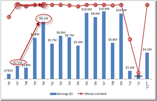
One other thing that is very apparent to me only when I created a dashboard chart is that Tiger Woods Effect. This being that Tiger Woods’ fame and inspiring more people to follow and watch golf, he has single handedly raised earnings for all PGA golfers. Check out the earnings Tiger won during 1997 and the DRAMATIC increase of earnings that Tiger won in 1999 and in 2000. In 2 years, 1st place on the money list increased 3 times from $2.1 million in 1997 to $6.6 million in 1999 and then again to 4.4 times to $9.2 million in the year 2000.
Here are some of the techniques I used to create this chart (without the arrows I added after the fact):
1) Right Function
2) Thousands and Millions Number Formatting
3) Secondary Axis
4) Combined Line and Clustered Column Chart
5) Chart Labels
6) Chart Legend
7) Axis Line Color
8) Marker Options
The chart has very little chart clutter and I think it is easy to understand, so I think that it would be a great component of any company dashboard. What do you think? Do you think Tiger will win the Open Championship? Will he remain #1 on the money list for the PGA Tour by the end of 2012? How else do you think we could graphically represent if Tiger Wood’s is back or if he is the best PGA Tour player in history?
See if you can recreate this chart in Excel. I will post the solution tomorrow.
Steve=True
(A True Golf and Excel FANatic!)


