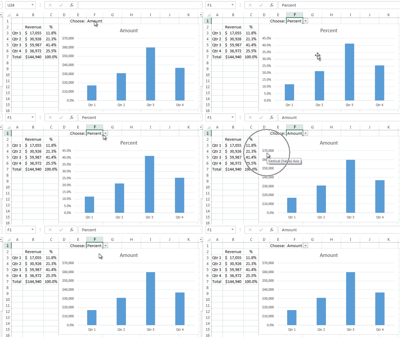
In case you were wondering, here is my solution to last Friday’s Excel Challenge.
Our challenge was to see if we could solve this question that an Excel user posted:
Can the data in chart change itself to be percentages & number
Can the data in chart change itself to be percentages & number ie, axis changing the format itself. i am trying to present a dynamic chart and trying to show both sales and % sales in same column chart (based on a drop down option)… is this possible?
Well, we had some great submissions for this challenge. It was so cool, because none of the submissions were the same and they were completely different than my solution. So check out their solutions here:
My solution is below. Maybe you can use these techniques in your next executive Excel Dashboard. Also, below you will find a free sample download file, video tutorial are step-by-step instructions.
The Breakdown
1) Create Pick List
2) Create Chart Range
3) Create Custom Number Format
4) Create Excel Chart
Step-by-Step
1) Create Pick List
First, as the request stated, we need to create a pick list or a drop down list that will change our Excel chart from a percent chart versus an amount chart. If you don’t know how to do this, you should check out this post that has a step-by-step and video tutorial on this technique:
Creating Pick Lists in Excel for your Dynamic Dashboard
Now, let us assume that our data is in cells A3:C7 like this:
Excel 2012
| A | B | C | |
|---|---|---|---|
| 1 | |||
| 2 | Revenue | % | |
| 3 | Qtr 1 | $ 17,055 | 11.8% |
| 4 | Qtr 2 | $ 30,926 | 21.3% |
| 5 | Qtr 3 | $ 59,987 | 41.4% |
| 6 | Qtr 4 | $ 36,972 | 25.5% |
| 7 | Total | $ 144,940 | 100.0% |
I want my dropdown list in cell F2. So select F2 and then go to your Data Ribbon and choose the Data Validation menu and then choose the “Data Validation…” menu option. Then from the Settings tab on the Data Validation dialog box, choose “List” from the Allow picklist and type in “Amount, Percent” in the Source text box.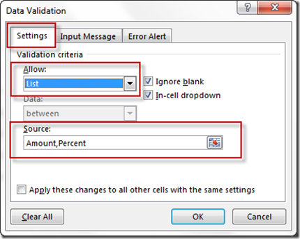
Your spreadsheet will now look like this: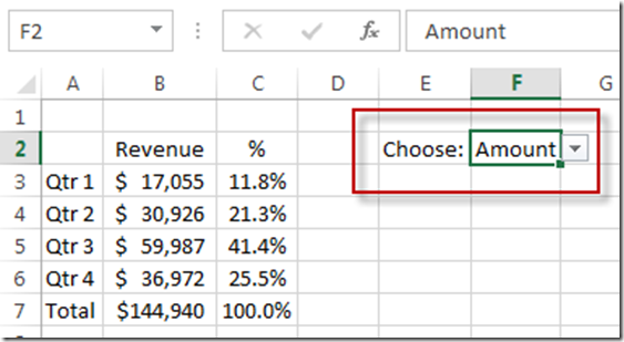
2) Create Chart Range
Now that we have made our picklist, we need to create a range of data for the chart that we want to create. It is pretty simple because it is just an IF statement for the chart data that we want to show based on the pick list data.
First, lets create our chart categories in cell E3 by entering in this formula: =A3
And then copy it down to cells A4:A6. Your chart data will look categories will now like this: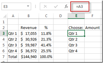
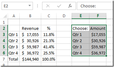
Now that you have created your categories, we need to create the chart data. So select cell F3 and put in this formula:
F3 =IF($F$2=”Amount”,B3,C3)
And then copy it down to the cell range of F4:F6. Your chart data range will now look like this: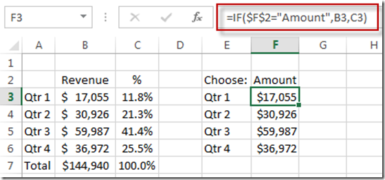
Now you are almost set to make your Excel chart, but there is one more step before we make our chart.
3) Create Custom Number Format
Now before we make our chart, if we perform this step, it will save us tons of time. This is the key to this demonstration as several other techniques that I and others tried didn’t work (even though I thought they would work). It is a simple, but very cool step.
The KEY: So as I was thinking about the problem, I thought that this user was plotting a large amount versus a percentage (which is a very small amount). Most percentages are not that much above 100% which is only a 1 whole numbers. In fact, most percentages are not above 1000% which is only a whole number of 10. On the flip side, most of the sales or revenue amount numbers are typically greater than 10 and typically range in the 100’s, thousands, millions and even billions. So they are very different numbers in terms of scale. So I decided that our break point was going to be greater or equal to 10 or less than 10 for my solution. What you may ask is my solution? Glad you asked. I had to resort to to an old trick of creating a custom number format that has a conditional element. You can learn more about this technique on these posts:
How-to Format Chart Axis for Thousands or Millions
Remove The Zero Point or Make a Hole in an Excel Radar Chart
(Don’t forget to watch the video as to why I had to resort to this solution and why others also found it hard to solve this seemingly easy task.)
Okay, to implement this step, highlight your chart data range from F3:F6
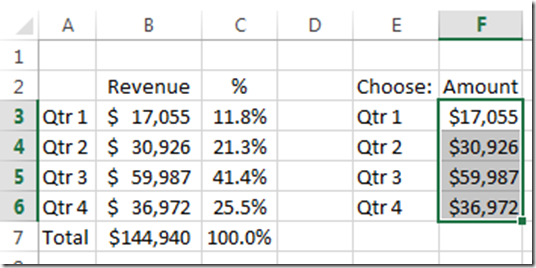
Now that you have the chart data range selected, go to your Home Ribbon and then select the Number Format picklist in the Number Group. Then from that menu, select the “More Number Formats…” option. 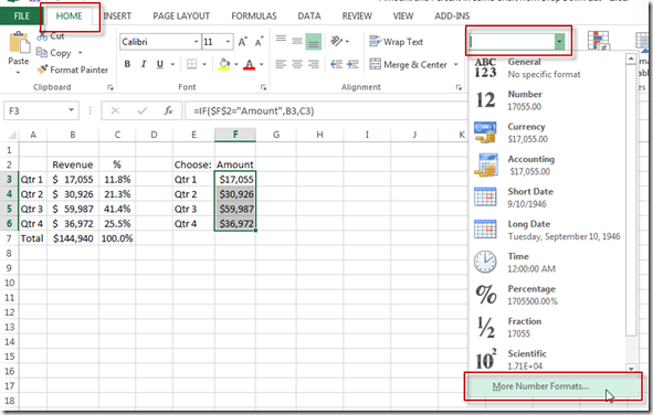
Then you will be taken to the “Format Cells” dialog box. You will want to choose Custom from the Number tab. Then in the Type field 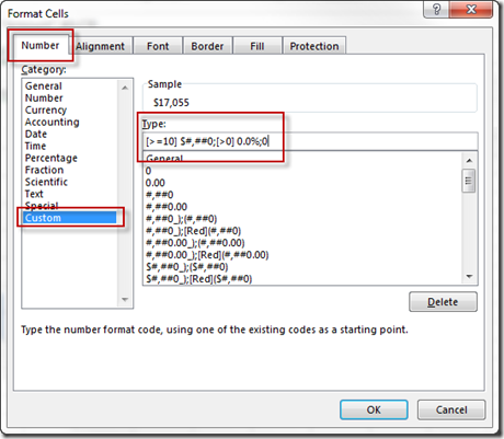
you should enter this formula:
[>=10] $#,##0;[>0] 0.0%;0
and then press the OK button. This will change the number format of your selection to a Percent when the values are less than 10 and change them to an dollar format when the are greater than or equal to 10. Now you are all set and there is just one step to complete the project.
4) Create Excel Chart
Now that we have created our custom number format for our chart range, we can create our chart. And the chart will take the number format that is in the range. So when you change the picklist to Amount or Percent, the chart will change accordingly.
and then go to the Insert Ribbon and choose Insert 2D Clustered Column Chart from the Chart Group.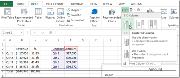
And you final chart will look like this: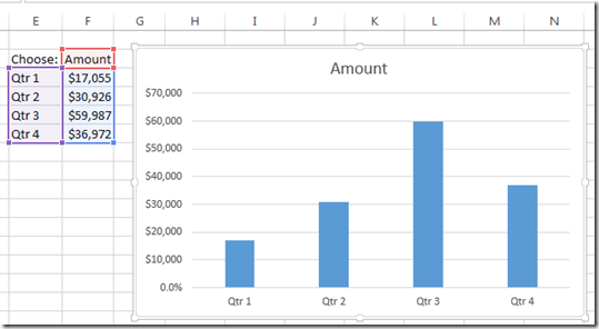
and when you change the pick list value from Amount to Percent, your chart will change accordingly: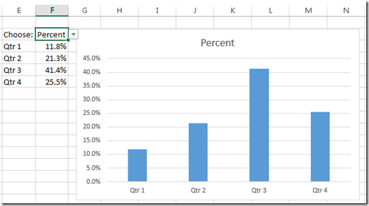
Wow, that was easy, but it was my 3rd try at making this chart. And other rock stars like Don and Pete struggled with it as well. So it wasn’t as easy as it seemed, but it means that where there is a will, there is most likely a way in Excel.
Video Tutorial
Check out the video to see my first solutions that didn’t work as well as the one that did:
File Download
Download the free sample file to see how this chart was made.
Amount-and-Percent-in-Same-Chart-from-Drop-Down-List.xlsx
Thanks for an awesome year on Excel Dashboard Templates and thanks for being a fan!! If you want to make sure you get the next post delivered directly to your inbox, please subscribe today.
Steve=True

