In a previous post, I showed you how to group a column chart with lines: 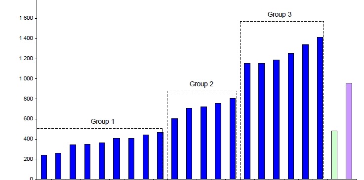
You can check out the posting here:
Group Column Chart with Lines for Excel Dashboard Presentations
Then I received a question from Eva P. from my Exceldashboard YouTube channel:
EVA P. writes:
this helped however need something additional!
my group starts above the x axis so I basically want to create a box…. so I can depict a range… how can I get to the chart to make the bottom line of the box? (a line going from e.g.point 672, 510.95 to point 216, 510.95
x y
216 510.95
216 2174
672 2174
672 510.95
So she wants to see how to do this same line grouping technique of a clustered column chart in Excel by adding a bottom line to the grouping. The bottom line would effectively create a floating box. Kinda like this:
The Breakdown
All we need to do is add one last data point equal to your first (bottom left) data point so that the line continues and closes back to your first point.
Step-by-Step
1) Set Up the Data
First you need to set up 2 series:
a) 1 for your clustered column chart;
b) 1 for your floating box made from an XY Scatter line.
2) Create Column Chart
Highlight your clustered column area in cells. In this data set above from A2:B20
Then go to the Insert Ribbon and Choose a Clustered Column Chart:
Your Excel Graph will now look like this:
3) Add Second Series
Now Select and COPY just the “Y” data points in cells E2:E6
Then Select your chart and then from the Home Ribbon, choose PASTE SPECIAL from the Paste button:
You will then see this Excel Dialog Box:
Click on the OK button and your chart will now look like this:
Notice the new second series in Red.
4) Change Second Series to XY Scatter Chart Type
Select the Second Series (as seen in Red above). Then change the chart type by choosing “Scatter with Straight Lines” from the Scatter button in the Chart group of the Insert Ribbon:
Your chart will now look like this:
5) Move Second Series to Primary Axis
We do not need to have this series on the Secondary Axis. Actually, if we don’t move it, it will just cause us problems since we will have to make the Secondary Axis match the Primary Axis. However, if the data changes, we will have to remember to change the Secondary Axis every time we change. So lets just move it back to the Primary Axis.
Right Click on Series 2 and choose “Format Data Series…”
Choose the Primary Axis from the Plot Series On Series Options
Your chart will now look like this:
Notice that the Secondary Axis’s are now gone.
6) Change the Chart Data Series Range for the Second Series
Final Step, we just need to add the X’s in your XY Scatter Line Series. To do this, select the chart, then choose the Select Data button from the Data group of the Excel Design Ribbon:
You will then see this dialog box where you should select “Series 2” and then press on the Edit button above it:
You will then see this Excel Dialog Box. Then Add the X Series Values of D2:D6 and then press the OK button.
You are now done as your chart will look like this:
As you can see, we have now created a floating line that is creating a box grouping in your Excel clustered column chart.
Video Tutorial
Please make sure you leave me a comment and let me know what you think of this technique and if you can see using it in your next Excel Dashboard.
Steve=True


