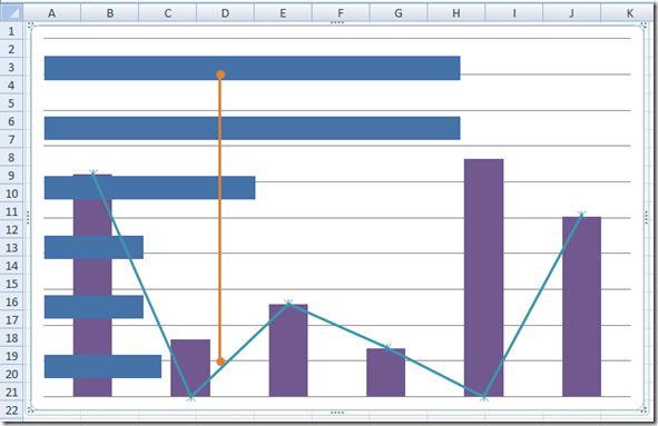
Have you ever seen a chart or graph like this in Excel?
I created this chart using Excel the other day.
It IS one combined chart using Excel.
It is is NOT Two charts overlaid on top of one another.
It DOES NOT have any lines or shapes drawn on top of a chart.
It is NOT a completely fake/drawn chart using shapes or another program other than Microsoft Excel.
It is a real chart that you can update and the values change accordingly. It is a combined Column Chart, Horizontal Bar Chart, Line Chart and XY Scatter Chart
And always remember, just because you don’t think you can do something in Excel, doesn’t mean you can without a little trial and effort. Don’t be afraid to try.
See what you can make using standard Excel charts and trying to combine them in weird and unique ways and see what you get.
Show me a weird chart that you have created or write a comment on the unique charts that you have made.
Steve=True


