How-to Make an Excel Clustered Stacked Column Chart Type
Have you been able to find the Excel Clustered Stacked Column Chart Type?
Well it is not there, unfortunately. But Excel is a powerful tool and we can user other options to create the chart we are looking for with this simple tip to make your own Excel Clustered Stacked Column graph. This tutorial is focused on Microsoft Excel 2013, Excel 2016 and Excel 2019. But it will most likely work for versions after 2019. If you want to see the steps required for Excel 20010 and Excel 2007, check out this tutorial: how-to-easily-create-a-stacked-clustered-column-chart-in-excel
The Breakdown
Here are the basic steps that we will walk through in this tutorial. The sample download file and video demonstration are at the end of the article.
1) Setup Data
2) Create Stacked Column Chart
3) Switch Rows/Columns of Chart (if needed)
4) Decrease Series Gap Width (as Desired)
Optional Steps for the Extended Chart Features:
5) Add Filler Series for Separation
5a) Insert Rows as Needed to Previously Created Chart
6) Add Vertical 2nd Axis Label Series
6a) Add Series
6b) Repeat Steps 2-3
6c) Move New Veritical 2nd Axis Label Series to 2nd Axis
6d) Change New Vertical 2nd Axis Label Series Fill to No Fill
6e) Decrease Series Gap Width (as Desired)
6f) Delete 2nd Axis Label Legend Entry
Step-by-Step
1) Setup Data
In order to create a simulated Clustered Stacked Column Chart type, we just need to perform 4 steps. Now this tip uses the Excel “Multi-level Category Labels” chart option for column charts. In order to use this option we need to setup our data in a certain way. So that is our first step.
Our scenario is that we are building a chart for the marketing team on amount spent and budgeted amount for 2 products on 4 media types (Print, Internet, TV, Radio). The data we received was in this format.
| A | B | C | D | E | F | G | H | I | |
|---|---|---|---|---|---|---|---|---|---|
| 1 | Sales Budget vs. Actual | ||||||||
| 2 | Radio | Radio | TV | TV | Internet | Internet | |||
| 3 | Budget | Actual | Budget | Actual | Budget | Actual | Budget | Actual | |
| 4 | Product 1 | 123 | 166 | 155 | 128 | 91 | 163 | 181 | 171 |
| 5 | Product 2 | 63 | 149 | 157 | 101 | 53 | 140 | 198 | 153 |
Original Data
To utilize the ” Multi-level Category Labels” option in a column chart, we need to setup our data with tiered categories. That means that we have a main category in one column and many categories in the column to the right. Therefore, we need to change our data to the following format.
| A | B | C | D | E | F | |
|---|---|---|---|---|---|---|
| 1 | Sales Budget vs. Actual | |||||
| 2 | Radio | TV | Internet | |||
| 3 | Product 1 | Budget | 123 | 155 | 91 | 181 |
| 4 | Actual | 166 | 128 | 163 | 171 | |
| 5 | Product 2 | Budget | 63 | 157 | 53 | 198 |
| 6 | Actual | 149 | 101 | 140 | 153 |
Basic Clustered Stacked Chart Setup
So you can see that our data has been rearranged so that Product 1 has 2 lines associated with it. One for the budget values and one for the actual values for all 4 types of media advertising. We are now ready to create the Excel Clustered Stacked Column chart.
2) Create Stacked Column Chart
To create our chart, highlight the data range in the data set above from A2:F6. Then go to the Insert Ribbon and click on the Stacked Column Chart in the chart button as you see here.
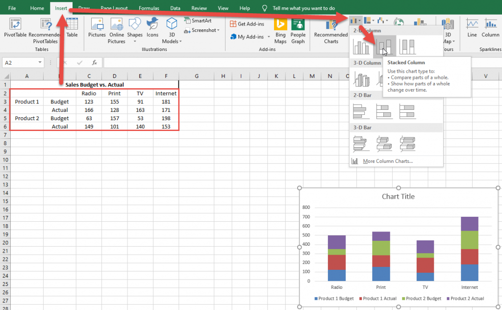
Your chart should now look like this:
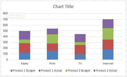
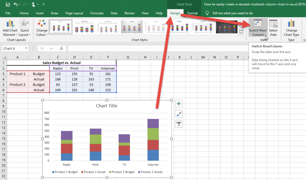
3) Switch Rows/Columns of Chart (if needed)
Our chart doesn’t quite look right. In most cases you need to switch rows/columns on your chart. Why do I need to do this? Check out this video here
To fix your chart, simply click on the chart and then go to the Design Ribbon and click on the Switch Rows/Columns button.
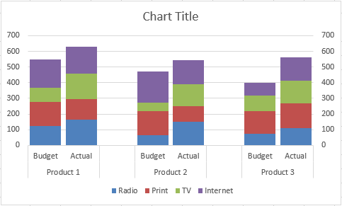
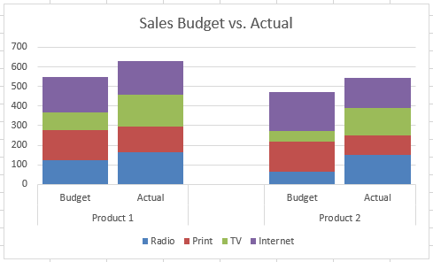
Your chart is now complete and should look like this:
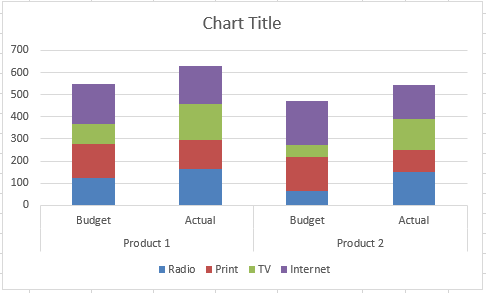
If you want to move the columns closer together follow the next step, but it is optional.
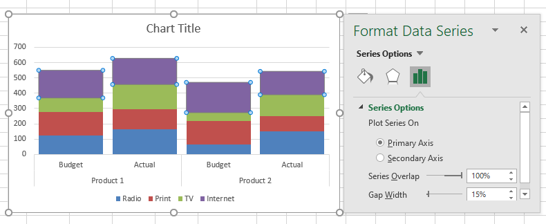
4) Decrease Series Gap Width (as Desired)
If you wish, and it is my preferred look, you can close the Gap Width of the columns. To do this, select the chart, and then select any data series and press CTRL+F1 (or right click and select Format Data Series). Then from the Format Data Series Dialog box, change the Gap Width to 15% or whatever you think looks best.
Your final chart should now look like you see above. But we are not done if you want to add some additional changes. Below is completely optional and as you desire, but I think it adds some clarity and additional detail that will help the reader.
Optional Clustered Stacked Column Chart Steps
5) Add Filler Series for Separation
If you want to separate the groupings follow this step.
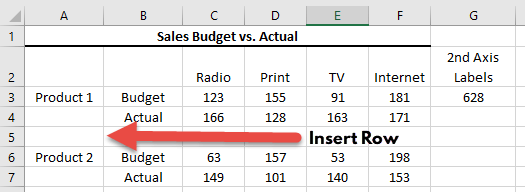
5a) Insert Rows as Needed to Previously Created Chart
Do this as you see fit, simply insert a row in your data and it will separate the groups.
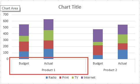
After you insert your row, you then must follow steps 1-3 above to create your chart from the beginning. When you complete steps 1-3 you will then see that your chart doesn’t quite look right as your product 1 group includes this new space as you see here:
To fix this, you need to fool Excel by creating another level one grouping that doesn’t show on the chart. This is very simple by just putting a space in the data set in the cell right above the Product 2 entry.
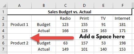
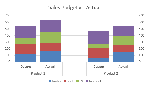
Your final chart with the added gap should look like this with the grouping fixed:
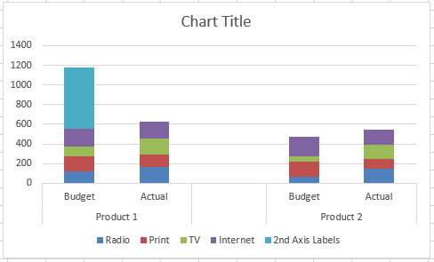
6) Add Vertical 2nd Axis Label Series
Optional Step 5 above looks good to me, but the product 2 data is farther away from the numbers so sometimes I like to add an additional chart series on the secondary axis to have the vertical axis numbers show closer to that series. This is an optional step, so only use it if you also like the look.
6a) Add Series
To make the secondary axis max limit value match the primary axis max limit, we need to create a formula for our additional secondary axis series. To do this, create a formula on the first row of data with a formula that calculates the maximum stacked column of all of the stacked columns that will be in the chart. Therefore, in cell G3, we create a MAX() formula with a sum of each row. See the Max and Sum formula below for more details.
| A | B | C | D | E | F | G | |
|---|---|---|---|---|---|---|---|
| 1 | Sales Budget vs. Actual | ||||||
| 2 | Radio | TV | Internet | 2nd Axis Labels | |||
| 3 | Product 1 | Budget | 123 | 155 | 91 | 181 | 628 |
| 4 | Actual | 166 | 128 | 163 | 171 | ||
| 5 | |||||||
| 6 | Product 2 | Budget | 63 | 157 | 53 | 198 | |
| 7 | Actual | 149 | 101 | 140 | 153 |
Optional 2nd Axis Chart
Worksheet Formulas
|
6b) Repeat Steps 2-3
Now that you have created your data set, you will simply follow all of the original basic steps 1-3 above to create your Clustered Stacked Column Chart but change your chart range to A2:G6 or A2:G7 if you have added an extra row for a gap between groupings. In my case I have added the gap row, so my chart range is A2:G7. Go ahead and create the initial chart as you see here:
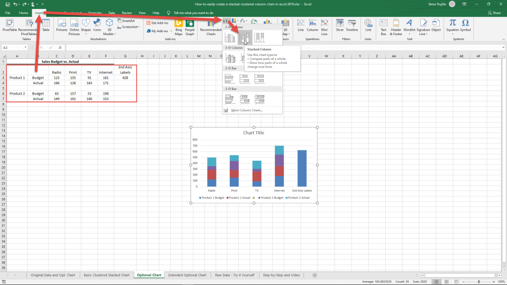
Your chart initial should now look like this if you have the gap row in the data series after step 2.
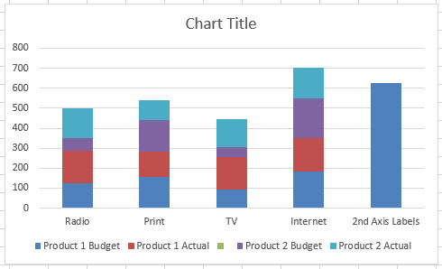
After you Switch Rows/Columns your chart will look like this after step 3:
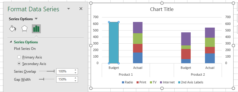
6c) Move New Veritical 2nd Axis Label Series to 2nd Axis
Our chart looks very similar to our basic chart, but there is an extra series that we will use for our secondary axis. So select the chart and then select the “2nd Axis Labels” series and press CTRL+F1 or right click on it and select the Format Data Series… option. This will bring up the option to move it to the Secondary Axis. Do that now.
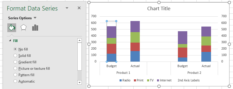
6d) Change New Vertical 2nd Axis Label Series Fill to No Fill
When we moved the series to the secondary axis, it covers up one of our stacked columns. So to get around this, we need to change the fill on the series to No Fill. If you are still in the Format Data Series dialog box, click on the Fill Options (looks like a paint can pouring) and change the Fill to No Fill.
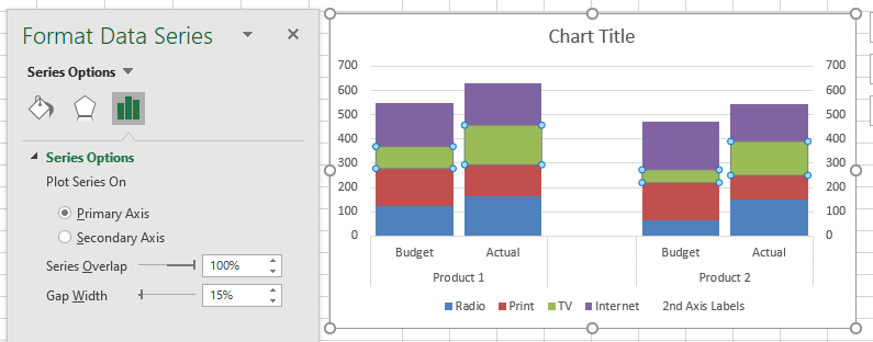
6d) Decrease Series Gap Width (as Desired)
This is the same as optional step 4 above. I changed the gap width of the Stacked Columns on the Primary Axis to 15% as you see here:
6f) Delete 2nd Axis Label Legend Entry
Last thing we need to do is to delete the “2nd Axis Labels” legend entry on the Legend. To do this, select the chart and then select the legend and then select the legend and then select the “2nd Axis Labels” legend entry and press the delete key.
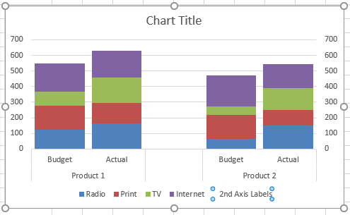
Your final chart will now look like this:
This is a great technique to make a combo chart that is frequently needed for complex data sets. It will even work for more product data sets. Here is sample of what another series would look like.
Video Demonstration
Check out this Video tutorial on the techniques presented above.
Sample File Download
Click here to Download the Free Sample Excel Template File:
Clustered-Stacked-Column-Charts
What do you think of this technique? Do you think that Microsoft should add this as a chart type in Excel? Let me know what you think in the comments below.
Steve=True


