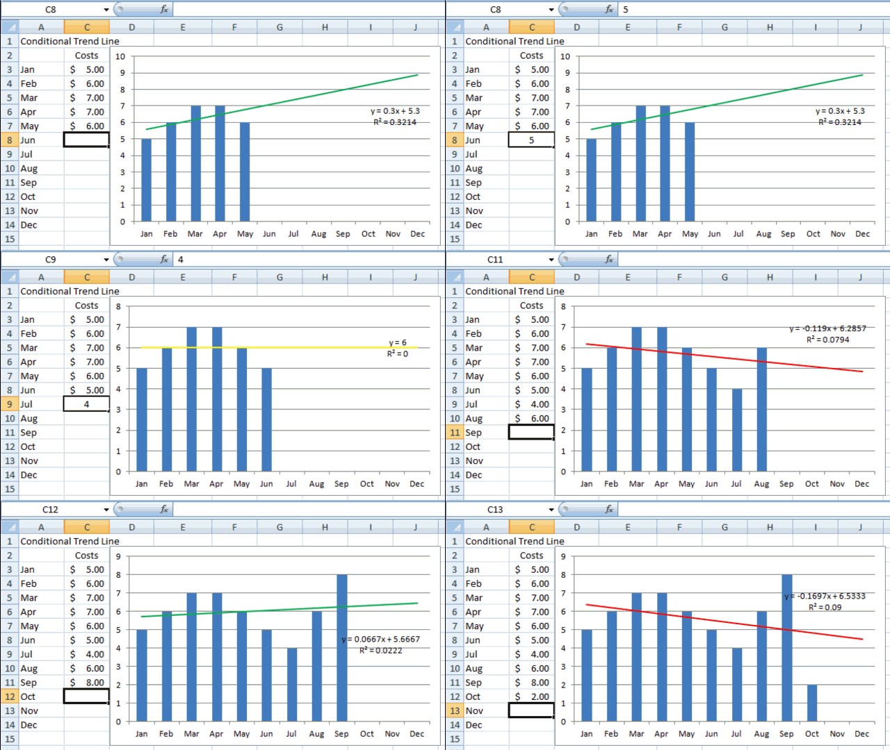
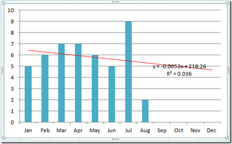
Many users use Trend Lines in Excel charts and graphs. They may also be used in Company Dashboards, but to you can make your trend line stick out by making it change Format Dynamically. Lets see how this is done.
Breakdown:
1) Create 3 Different Chart Series using the NA() Function
a) Red Series if trend is going down
b) Green Series if trend is going up
c) Yellow if the Series is flat
2) Add Trend Lines for each series
3) Format Trend Lines
4) Overlap 3 Series and Change 3 Series to look the same
Step-by-Step Tutorial
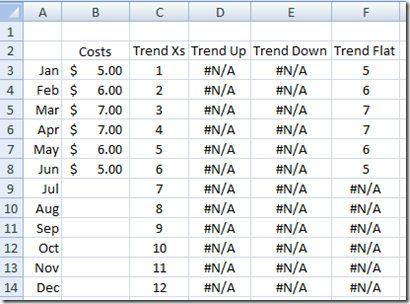
1) Here is how our starting data looks: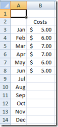
2) Next we need to create 3 Different Chart Series using the NA() Function.
Here is how the formulas look:
Trend X’s – Entered in Cell C3
=MONTH(A3)
Trend Up – Entered in Cell D3:
=IF(AND(TREND(OFFSET($B$3,,,COUNT($B$3:$B$14),1),OFFSET($C$3,,,COUNT($B$3:$B$14),1),MAX($C$3:$C$14)+1)>AVERAGE($B$3:$B$8),ISNUMBER(B3)),B3,NA())
Trend Down – Entered in Cell E3:
=IF(AND(TREND(OFFSET($B$3,,,COUNT($B$3:$B$14),1),OFFSET($C$3,,,COUNT($B$3:$B$14),1),MAX($C$3:$C$14)+1)<AVERAGE($B$3:$B$8),ISNUMBER(B3)),B3,NA())
Trend Flat – Entered in Cell F3
=IF(AND(TREND(OFFSET($B$3,,,COUNT($B$3:$B$14),1),OFFSET($C$3,,,COUNT($B$3:$B$14),1),MAX($C$3:$C$14)+1)=AVERAGE($B$3:$B$8),ISNUMBER(B3)),B3,NA())
Copy these formulas down to row 14 and your Excel data table will now look like this:
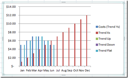
3) Highlight the data from cells A2:F14 and then insert a 2-D Column Chart and your new chart will look like this:
4) Now get rid of chart series that we don’t want to use that were in the range of data that we created:
a) Click on the Trend X’s series, shown in red, and hit your delete key.
b) Click on the Costs (Trend Ys) series, shown in dark blue, and hit your delete key.
Your chart will now look like this: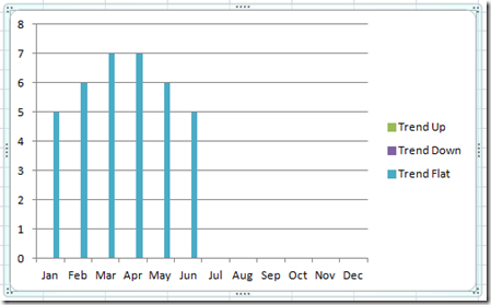
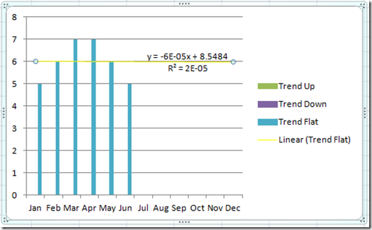
5) Select Trend Flat series, shown above, and Add a Trend Line. You can do this quickly by right clicking on you the series and selecting “Add Trendline…” from the menu.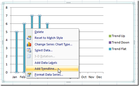
And your chart will now look like this: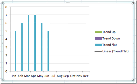
6) This chart line is our FLAT Trend Line. Now we need to format it. Right click on the Trendline and then choose “Format Trendline…” 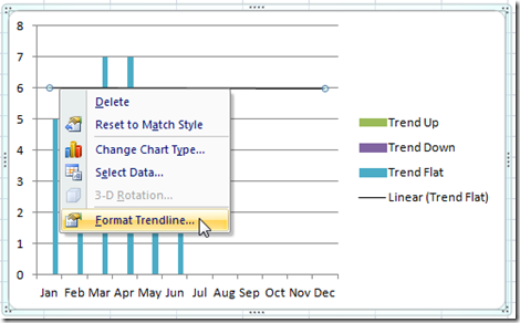
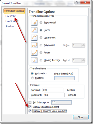
You will now see the “Format Trendline” dialog box. From here you choose to add the “Display Equation on chart” and “Display R-squared value on chart” at the bottom.
After that, lets change the color of the trendline by selecting the “Line Color” sub-menu choice. This is the first of our trendlines and it represents a Flat trendline so we want to change it to a Yellow color by selecting “Solid Line” and then select “Color:” and choose Yellow: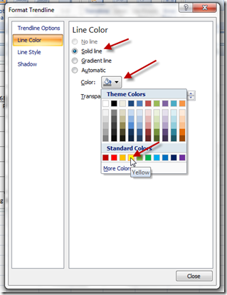
Your chart will now look like this:
Also, you may want to follow the same steps to change the chart series “Trend Flat” to a specific color of your choosing. If you do, please remember that color because you are going to change the color of the series (Trend Up and Trend Down) to this same color. I am going to leave my color as this standard blue and this is the color that I will change the other 2 series to as well. That way as the data changes the chart will appear the same but the Trendlines will change color.
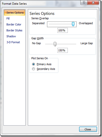
7) Overlap the 3 Series – Since we started with 2D Column chart, each series is plotted next to each other and when the data changes the columns will appear to move left or right. Select the “Trend Flat” series and right click on it and then choose “Format Data Series…” then change the Overlap percentage to 100%
8) Now we need to Format the “Trend Up” and “Trend Down” series as we did above by doing the following:
Format Trend Up Series
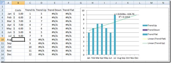
A) Add a data point that is Higher than the Flat Trend data. This will now show the “Trend Up” series on the Excel Graph. In my case I added a data point of “9” to cell B9. You will then need to do the following:
i) Change the Series Color equal to the “Trend Flat” series color.
ii) Add a Trendline to the Series.
iii) Format the Trend line to add the Trend Line Equation and R Value and also change the Trendline color to Green since it represents an increasing trend. This is a representation of that chart:
Format Trend Down Series
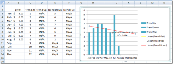
B) Add a data point that is Lower than the Flat Trend data. This will now show the “Trend Down” series on the Excel Graph. In my case I added a data point of “2” to cell B10. You will then need to do the following:
i) Change the Series Color equal to the “Trend Flat” series color.
ii) Add a Trendline to the Series.
iii) Format the Trend line to add the Trend Line Equation and R Value and also change the Trendline color to Green since it represents an increasing trend. This is a representation of that chart:
9) Clean up chart junk by deleting the Legend by clicking on the legend and then hit your Delete Key.
Now you are all done. Here is what your chart will look like:
Now this chart will quickly show your executives what the trend of the data is with a dynamic trend line that changes color to highlight the trend. That way they can quickly screen the dashboard and see where there are potential problems that need to be addressed or what is going well. All at a glance, it will help them focus on the information, not the data.
Free Template Sample Download File Including Detailed Instructions:
Dynamic-Excel-Trend-Line-Traffic-Light.xlsx
Video Tutorial:
Thanks for visiting my blog. Please do not forget to sign up for my newsletter /subscriber list. Also leave me a comment and let me know if this was helpful!
Steve=True

