What is an Excel chart sheet vs. an embedded chart?
With a project ending, interviewing for new jobs, vacation, traveling and taking a training class, it has been difficult to get back to making...
Friday Challenge Answers – The Boss Says…
I received some great responses from lots of fans. Thank you so much for all your great comments. I agree with most and my...
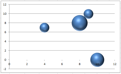
Friday Challenge – Conditionally Control Excel Bubble Chart Colors
Hi All,
Sorry this is a little late. But better late then never .
Here is this week’s Friday Challenge (on Sunday. I will post my...
Friday Excel Challenge Submissions–Which Chart Solution One Do You Like Best?
Sorry for the late posting. I was in Atlanta all week working on a new project and going out with the client at night,...
Friday Challenge – How Would You Chart It?
Today the ExcelDashboardTemplate.com Friday Challenge is up to you and your wildest imagination.
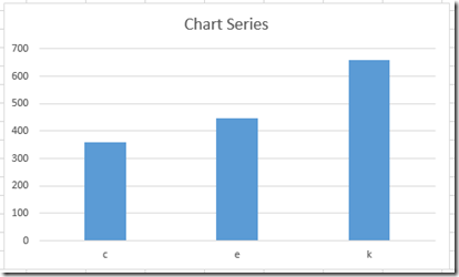
An Excel chart newbie posted this data set and wasn’t sure the...
Friday Challenge – Creating an Excel Graph of Cumulative Events Over Time
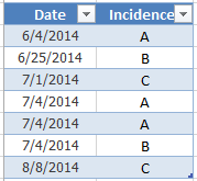
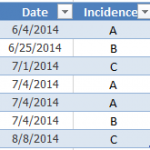
Here is a Friday Challenge that a lot of Excel users may run into.
Essentially, you are given a date and incident type that occurred...

